So I found out the other day that we're having a couple of guest Illustrators visit us in the next few weeks, to give talks and all that jazz. There's an Alumni exhibition going on at Uni until the 21st Nov, graduates of Illustration from Wolverhampton from the past twenty years. I went to the private view on friday, was quite impressed. It's encouraging to see so much good work come out of this place :P haha. Anyway, so two past graduates, are giving talks, Ian Dodds and Tristan Manco.
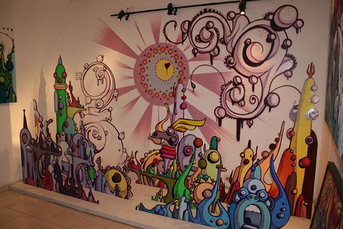
Ian Dodds is pretty impressive ... I hadn't heard of him before but I'm sure I've seen his stuff. It's ace, so layered and full of texture, totally my thing, really interesting to look at and figure out how its done. It looks quite screenprinty almost, but then quite digital too.. it's just a nice balance.

So he's giving a talk this wednesday (12th) at 2, and I'm totally going. It's actually a bit crazy that this is my 3rd year and its the first time they've had a guest lecturer in for Illustration. I love the way the department is run. But that's another story...

This one on the left here, I love this. The type and colours and detail... I could quite easily stare at it. Good stuff.
Here is Ian Dodds on theispot.com.
Tristan Manco, now I had heard of him, because I've been coveting his book, Street Sketchbook, all summer. My favourite thing about it is that it has rounded corners. Why don't more books do that? It's so pleasing. Mmmm. I should have bought it when I saw it cheap in London. Now I am poor and can't buy an Asda sausage roll. But that's another story.
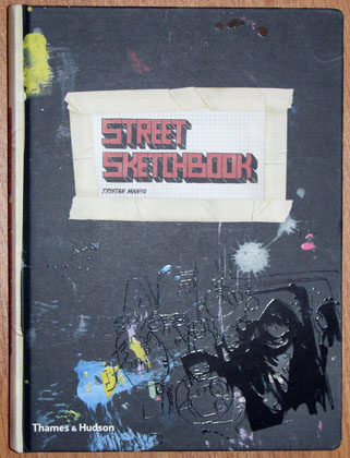 So I was pleasantly shocked when I learned he was a University of Wolverhampton graduate! I feel quite special now. Here is his blog type thing. He is giving his talk the week after next, same day, same time. He's predominantly graffiti based, which I used to be SO into during A-level. I did a whole graffiti module thing and even went out and did some illegal spraypainting myself. How risque of me. So that was when I was about 16, and I've moved on aesthetically since then, but I still love it and get really inspired by it, even if it's not my thing anymore.
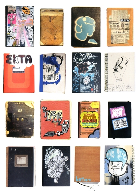
Examples from the book, nice nice.
So there we go. Hopefully it'll be a bit of inspiration to us struggling students anyway. Looking forward to it.
In other news, I finished the first draft of my dissertation today :) Which feels really good. I think I might post it when it's written you know. Or maybe not. Could be cool though.
As for the rest of my projects, I may have made a breakthrough, process-wise, which means I can crack on and get things moving instead of all this frustration. I'll post up some more experiments and what not in the next few days.
Lastly, I've started reading the book for this year's Penguin Design Award, The Secret History by Donna Tartt. It's amazing actually, a brilliant book. I'm getting lots of ideas but man the competition is going to be tough this year. There's no choice of book either, just this one, and although its an excellent book, creating an original jacket is going to be harder than I think. I bet. I mean the current jacket isn't great, but how to not be cliche with this one... I'm going to have to be really clever. The deadline isn't til next April so I've got a while anyway :P
(plus, I've just realised, that while my new header is cool, it's also massively too big. Sigh. This is why I need photoshop on my laptop and not just at uni on 24" screens.)


 This spread is supposed to have a yellow theme; yellow ink, yellow text. I have no idea why it's uploaded like this.
 And again, why does this look brown when the first spread was the right colour? Black black black.

 This is just weird. Psychedelic colours. Sigh. How frustrating. I'll try and sort this out later.


 And here; why has the text randomly disappeared!! It's a jpeg for god's sake. No layers involved here. Silly.
 But yet you can see the text here?


