My blog has moved!

You should be automatically redirected in 6 seconds. If not, visit
http://rachelsayshello.com
and update your bookmarks.

Welcome to rachelsays... The blog of Rachel Lewis, containing my thoughts and musings on illustration, design, fashion, music, cakey-bakey goodness, culture and things that I generally find cool. There's also a good chance my own illustration work will pop up on here.

All work on this blog is copyright to me unless I state that it isn't. Obviously. Don't do stealing, kids.

So come on in, have a look around, and leave a comment if you like what you see.

www.rachelsayshello.com
contact [at] rachelsayshello.com

Tuesday, October 27, 2009

Coveting: Sweet treats from Punkypins

I just got an email from Punkypins, who are a great handmade jewellry company. It's all kitsch and mostly plastic, nothing high end here! But I love a lot of the stuff they do - I bought a crazy necklace from them a while back that's just crammed full of junk - plastic barbie combs, mini breakfast cereals, hats, guns, guitars, I think there's even a neon crucifix on it. Super random. It's great!

So imagine my glee when I see:

and
and


and
and

I know, right. HAPPY BAKED GOODS IN NECKLACE FORM. They're all pretty damn cute, and as an obvious choice I'd get the cupcake one, but the chocolate bourbon is so happy, and do you know what, chocolate bourbons do not get the credit they deserve. I think they are my favourite biscuit (see that wasn't hard was it, Gordon) but I never consider them as a viable addition to my accessory collection. Until now! See the whole biscuit tin here.

They're all £12 which is pretty good, even if they are just acrylic. Christmas list! :D

They also do a moustache necklace for all you facial hair obsessives ("Hold it up to your face for an older, more sophisticated look!") as well as many other creations.

Friday, October 23, 2009

London Times: Liberty, Beyond The Valley, and other adventures...

So as I mentioned in my previous post, I had a little trip to London on thursday :) Packed quite a lot in, did I.

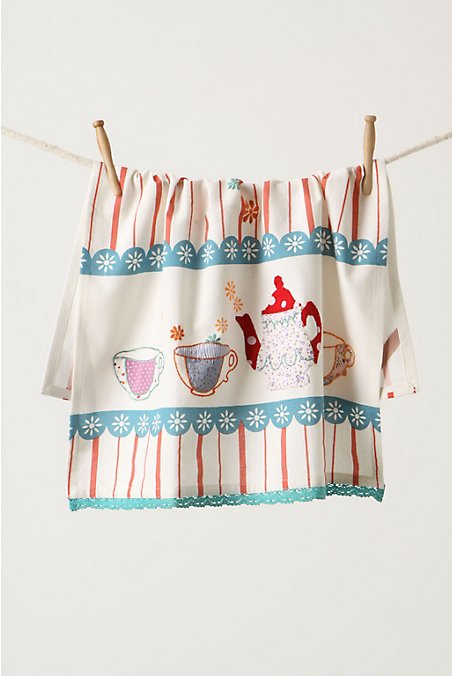
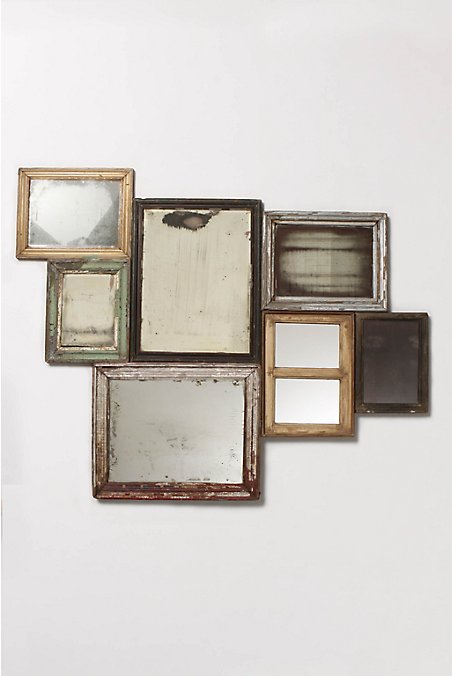
First up, Liberty's. I can never get over the beauty of that store. I don't think I've ever bought a thing from there but I love wandering around the rooms, with all the low ceilings, tudor beams, perfectly curated designer collections and mountains of beautiful stationary, home and bath ware, just lovely, lovely things. That place always makes me feel very calm and serene and a tad aspirational... i.e I want to live like this.

And they always have very dramatic, yet somehow subtle and understated decorations in the centre sections. Like this fabric/textile pattern style chandelier sort of installation. Huge. But not imposing.

Next I steadied myself for possible bankruptcy as I headed down Carnaby Street. That place is like a Rachel trap. Unlike Liberty's, I don't think I've ever been down that street without buying anything. This time was no exception.

Beyond The Valley is a shop I heard about through the mintynet and was dying to check out. It's more than a shop though really, they describe themselves as 'a creative community in the centre of London that supports and promotes emerging new talent across the fashion, art & design industries.' But basically it's a little boutique that sells prints, clothes, furniture, objects, jewellry, all very very covetable and cool, and all by up and coming young designers.

For example, a set of giant post-its. This had me quite excited - anything that is a mini or giant version of an ordinary object usually does. Even more so when it's some kind of organisational stationery object. Think of the lists you could write! And stick everywhere! Or when you need to have a brainstorm, bam, whack it on a giant post it and stick it to your face. (or wall). Ah, such organisational joy could be had!

However, I then had a bit of 'wait, £10 for a stack of slightly sticky paper' and thought 'I'll get it when I get paid'. Haha.


But the whole shop is very well set out, with shelves full of lovely designed objects and prints and things that I want.

What's this? The Crispin Finn 2010 wall planner I've been harping on about? In it's lovely brown paper bag? Yes, yes it is. Again, I so nearly bought it, but the angel on my shoulder whispered 'massive overdraft' and I scampered away.

But definitely go check out Beyond The Valley's site and all they have on there. They also, interestingly, have an Insight section too, which is cleverly www.beyondthevalleyinsight.com See what they did there?

"When Beyond the Valley was launched in 2005, the aim of its founders was to act as a springboard for new designers, offering unique, affordable products from breakthrough talent. But after three years of increasing demand for their skills in trend perception and brand consultancy, the concept store has grown from its roots on Soho’s Newburgh Street, joining forces with the brand experience people,‘i-am’ to create a new offer - ‘Beyond the Valley Insight’. As a result, this new union is able to offer a unique one-stop package for companies that need access to current trends and markets. Through creating full marketing strategies and bespoke brand events, Beyond the Valley Insight acts as a bridge between the next generation of designers, consumers, and those businesses that want to stay connected.."
So there. Worth bookmarking and checking out every so often.

The Diesel store's looking a bit weather-beaten, somebody really should like, paint that thing.

Yeah so this is Diesel's A/W thing, 'extreme weather washes', so everything is destroyed by storms and rain and such. I think it's just an excuse to smash stuff, and to bring ripped jeans back. I like the smashy smashy, but oh, the travesty. I used to wear ripped jeans when I was... well, a massive skater/rock/lame/goth-like creature, and so I now sort of abhor ripped jeans a bit, on girls anyway. But you know, when it comes to fashion, I can be a tiny bit hypocritical (i.e. "I can't believe they're bringing big shoulders back again, it looks awful, I mean.. oh, wait, actually, look at me go.") So you never know, I might chuck myself in front of a tornado yet.


So what did I buy? This sex-tastic bag. And bracelet style watch. The watch is from a shop in Carnaby Street, called Octopus, (no proper website yet) which is teeeny but packed with all manner of cutesy, kawaii, brightly coloured, STUFF. And everyone knows how much I like stuff. They had about 7 different colours of this watch and I very nearly went for bright pink (of course) but then got drawn to the lovely purity of the white one, for no explainable reason. So I now have a white, chunky, plastic watch and it rawwwks dude.

The sex-tastic bag is of course Paul's Boutique and there's a bit of a story here. I originally bought the blue one of these in Selfridges in Birmingham a few months ago, but it was the larger version and it was just a bit tooo big, more weekendy, so I took it back. They didn't have the same pattern in this size so I left a bit sad and minus one bag. I then found it on ASOS, but on there you have to pay for postage as well, and then I got poor so just didn't.
Anyway, fast forward, wandering around Topshop on Oxford Street in what I can only describe as an overwhelming-lust-for-everything-I-can-lay-my-eyes-on haze (dangereux), which usually happens to me in there, and I spot the bag. I THEN spot it in pink as well. I had a tiny brain explosion, gagged the angel on my shoulder, grabbed the bag and never ever let go.

Now I'm pretty much the coolest, poorest girl in the world.

After all this I went to visit the SHOWstudio: Fashion Revolution exhibition, which I'm just writing up a review so will be posted later. Good times.

Exhibition Review: SHOWstudio: Fashion Revolution


I finally got the chance to pop into London so I made sure I visited the SHOWstudio exhibition. I wrote a blog piece about it a while back and have been intrigued by it so am glad I finally got the chance to check it out.


Remember I said the 'Taking More Liberty's" bit sounded quite cool, and probably some kind of interactive store window? Well I was right, as Susie 'style bubble' Lau first posted about, and then I went to see first hand.


So, it's the Liberty's window that is in Carnaby St, and you wander up with a small smile of amusement on your face, press the pink button, walk backwards, and let it take your photo. Out of all the photos, the best outfit will be judged and then you could win £500 of Liberty vouchers... pretty sweet. Read what the actual website has to say about the project here.


So this was my picture, which you can see on the site. Not great. Didn't have time to stand up straight so I look terrible really. And you can't see my awesome Betseyville handbag! Defo not going to win. It doesn't even look like me actually, my face looks strange, haha. And that outfit was cooler in real life, here I just look a bit fat. Oh well. The skirt is actually a crazy tutu style from Topshop, the tights were pink with cream lace layered over, and the jumper is an old Taking Back Sunday one which I bought in NY about 4 years ago. It's cuter and much less frumpy than the pic suggests.
So that was in Carnaby St, I jumped on the tube down to Embankment and headed to Somerset House to see the exhibition.


First off, to get to the main exhibition you have to walk through what I can only describe as The Cube of Hell. It's entirely wall to floor to ceiling mirrors and lights, so you can see yourself from every single possible friggin' angle. For someone who hates their profile, legs, and general view from the back, this was awful! But it was supposed to be: "the Mirror Room invites all who walk through it to survey themselves as an infinite image...which afforded anyone visiting the studio a surprising and often uncomfortable introduction.... The immersive mirror experience here goes some way to exposing us and our bodies to the same, intense scrutiny upon which fashion and image culture thrives." Which is entirely true.
That's the thing about not only fashion, but the celebrity, image obsessed culture we live in; if we're not scrutinising ourselves, then you can be sure someone out there is. Especially with the rise of 'Vanity photography' that Facebook has fostered like a multiplying disease. It's the delete button which is to blame, and to a further extent, digital photography and digital living. Who is guilty of taking a camera on a night out, photographing you and your friends, and saying, 'oh no, delete that, I look (insert derogatory phrase here)" and so clicky click a better photo is taken. Said photos end up on facebook or other social networks for the entire world to see, and if you dont like it, you detag. Done. Your own personal curated image library of you looking nothing but how you intend. I am very guilty of this, as are most people. So when you
see a photo or image of yourself that is less than perfect, it's more of a shock now than it would normally be. Especially if it's out of your control. That's why disposable cameras are kind of exciting to me. No delete button there, no preview, just point and shoot, develop, and omg look at how we really look.

I'm the worst person in the world for loving things like Dove's real women ad campaign, and yet aspiring to be a size 6. I love chocolate, don't do enough exercise and the
n cry because I don't look like the cover of Elle magazine. You know? Silly things. And such is the way that things will be; I agree with Gok and his advice on how to love who you are etc on How to look good naked and then see a girl with ankles and collar bones and beautiful hip bones and mentally slap myself, for actually wishing to have the body of the very un-politically correct and probably dangerously thin catwalk model. I'm either extremely susceptible to image conditioning or am a bit weird.

Anyway, we're not even through the door yet!
This sculpture was mahoosive. Like, 2 storeys. It's of Naomi Campbell, the supermodel who apparently polarises extreme opinion. Really? Ok. Projected onto it was sc
ribblings/words from visitors and internet people in various colours. Visually quite nice but a bit blaa. No deep thoughts for me here. Nice bum though.

So the exhibition is separated into 4 sections - Process, Performance, Participation and Fashion Film. You walk through in a linear kind of way and the whole thing is very well curated and easy to view, walk through and take in without missing anything. The physical setting of Somerset House is amazing, it feels very underground-y with interlocking rooms and darkness and kind of like a cellar, but a cool, arty one.

This image is from 'Power of Witches' which is in the Process section. It basically intends to lay bare every step in the creation of a fashion image, with a series of slides of everything from experimentation, photo shoots, retouching, progress reports, to the final image being published in a magazine. Quite an interesting insight but nothing overly groundbreaking; I did like the imagery though, kind of like when you see an artist's sketchbook, has that same feeling.


I loved this. This dress was part of 'Sweet' by Jane How, which is recreations of S/S 2000 ready to wear collections, made out of sweet wrappers! This looks like cake wrappers, and I love the fragility and feminity of it.


'Sleep' was also a good one - an example of SHOWstudio.com's live image broadcasting from 2001, it was a live feed of stills of models as they slept in hotel rooms over the length of one night. The models were styled as if going for a conventional photoshoot, but then put into a hotel room and told to sleep. Watching the videos was completely mesmerising, it looked like they were half floating, half dancing around, really feminine and quite ghostly. Watching people sleep is quite relaxing I suppose, (without sounding stalker-y) and the fact they are so made and dressed up and look so beautiful gave it a real ethereal sense to it.


I think my favourite out of the whole exhibition was 'Freedom of Love'. This was the one thing that I stood watching for ages and had me completely rooted to the spot. The concept is hard to explain but basically, it's a video of Brad Pitt, reciting the poem 'Freedom of Love' by Andre Breton, which was written about the poet's wife. Interspersed with that is footage of Pitt energetically, almost angrily, painting over a massive photo of his own face with red paint and adding captions/text in paint as well. "Dissolving between the actor's projected image, his actuality in the studio, and his self-painted image on paper, the film is a meditation on image and celebrity, and on an actor's response to the way he is seen by others." If that helps. It's fascinating though, because you really do get this sense of 'what is celebrity' and how much you can really know of someone presented to you in the media vs this really intimate portrait of a man reading a poem about the poet's wife. Interestingly is how your mind automatically thinks of Angelina Jolie though; you know Brad is an actor so could just be acting sincerity while reading it, or is he thinking of his own wife, not as a celebrity but as an actual person, while he reads the lines? A girl actually came up to me half way through and (having obviously not read the signage) asked me if he was talking about Angelina. I said no, the poem is about Breton's wife, but I guess that's the context you could take it in, after all isn't poetry supposed to be personal and supposed to be applied to you as the reader to have any kind of affinity to it?

Definitely go read the poem though, it's beautiful. Although I suspect made even more beautiful by Brad Pitt's voice. I forgot how great his voice is - took me right back to Fight Club. It has this kind of monotone about it that is infinitely interesting. And I don't even think Brad Pitt is that hot, to be honest. Just has a great voice. And has aged depressingly well.

'The Sound of Clothes: Synaesthesia' was a cool concept. The idea was to reimagine the possibilities of experiencing clothes by utilising the full range of senses, and specifically to explore the relationship that music has always had with fashion. Sounds good to me. No pun intended.
So this amazing Balenciaga jacket was photographed on a model, and then the composer Nick Ryan was asked to interpret the image as a soundscape. He worked with an orchestra to capture the sound for each section of the jacket (ruffles, sleeve, collar, etc) and then passed the whole lot onto digital artist Daniel Brown to create an interactive piece which is what is seen in the exhibition - you roll the mouse ball over the image and the different orchestra pieces are played. It's really fun and quite moving actually - the skin has a really deep, ghostly, almost quite scary sound, the uber ruffles are sort of jolly upbeat layered violins, then you move down to the lace sleeve and it's kind of sombre cellos rising and falling, it's a really great concept. It made me think - if lace and ruffles is a full on orchestra, what are other pieces of clothing? Are jeans electric guitars? Is my bright pink dress a crazy techno beat? I love that thought. Intriguing...

The jacket is just amazingly beautiful on it's own too, I would do anything to own a piece like that.


One of the things in there that I have to mention is Peter Saville's/Julie Verhoeven's 'Forget Me Not'. I'm not going to post a picture of it here because it's super explicit illustration, and even though art isn't pornography (although this is kind of intended to be) I really don't want to open that whole debate so you'll have to go explore yourself.

"Inspired by the use of the French eighteenth century textile Toile de Jouy in the Spring/Summer 2001 fashion collections, creative director Peter Saville commissioned the young illustrator Julie Verhoeven to create ‘wallpaper for the computer’. Acknowledging the contemporary anxiety about the mainstream role of pornography in fashion photography, in addition to concerns about the availability of sexual imagery on the Internet, Saville supplied the artist with reference imagery of Japanese rope suspension bondage to introduce an element of erotic danger; a counterbalance to the delicate detail of the historical textile source. From this, Verhoeven produced a sequence of virtuoso, linear vignettes that grew increasingly dark in subject and expressive in execution as the series progressed."

Julie Verhoeven is one of my favourite illustrators, and Peter Saville is... well, awesome, but this definitely won't float everyone's boat. I really like it, even though I'm slightly stunned by the 'worst' layers, in fact that kind of makes me like it more. But that's possibly because I'm a bit twisted and strange. View the entire interactive piece here, in all it's explicit glory. There's a warning first to be 18+ but then you're away. Find the different coloured sections (quite small), click and it takes you to the next, 'worse' level.

There were loads of other projects, and the whole Fashion Film section too, but these were the ones I thought most note-worthy anyway. Great exhibition though, I spent hours in there. Well done if you got this far, that's a whole lot of reading you've just done.

Thursday, October 22, 2009

Anthropologie UK opens tomorrow!


I mentioned in a post the other day about my love of Anthropologie and how excited I am about a UK store. Well, it turns out that the Regents Street branch opens tomorrow, 23 October! Which is slightly annoying as I was in London, and specifically Regents Street today. Ah, how the gods tease me, if only it had opened today. Anyway, I shall have to go visit it another time :)

Anthropologie is just full of amazing, pretty, unique and expensive things, such as these that I've gleaned off the american site:

£105ish
£406. Yep.
£12
Yes, I'm excited by a tea towel. What is wrong with me. It's so pretty. Oh oh.
This right, is blimmin' amazing. Hand made, loads of vintage mirrors all put together to form this big rustic amazingness. It's about £437. Yep. I so would.

£15

Everyone loves badgers. £37.

Basically, if I was rich, this is what my house would be full of. But, I'm not rich, so when I finally do get to see the Regents St store, I'll be wandering round in a daze of desire for everything and not buy anything. Although I could buy this Twig Pencil, it's about £3. A pencil made of twig! How have I lived without this...? Imagine.
I'm getting very into home decoration recently; I think it's because I don't have one of my own. I can't wait to rent my first non-student place and make it nice with cushions and jars for stuff and a tea cosy and maybe even a cake stand.

I don't even like tea. Why would I need a tea cosy? Sigh.

London adventures in the next post.

Tuesday, October 20, 2009

The Daily Ampersand Project: Day 6

Today's ampersand is Bauhaus 93. Doing this one was really fun today :)

All Daily Ampersands can be found if you click here.

I start a new (non design related...need cash) job tomorrow, so there may be less posts from me. I'll still keep this up though, in evenings etc. Yay for money!

Monday, October 19, 2009

Coveting: Russian Doll Measuring Cups!

I have just discovered these Russian Doll Measuring Cups via Swissmiss, and I want them so much! They're so cute and are actually useful - as you know I love baking so these would be perfect.
You can buy them here, they're $16 - and I'm guessing shipping from America would be quite a lot too. However I found some from a UK site for £10.91, which isn't bad at all, plus p+p. It says out of stock at the moment though.

I also found these gorgeous ceramic Russian Doll Measuring Cups from this blog post, which is where this image is from:

They are from Anthropologie, which for people who don't know, is an amazing american home/clothing/vintage type store full of beautiful, expensive things. There's a store in the Rockefeller Building which I spent a very long time in the last time I went to NY. I love it so much. Now, I've wanted it to come to the UK for a long time and I found out a few weeks ago that they are opening a store in Regents Street! Very very excited, click here to have a look at the UK site. Eeeee!

In the meantime, I have a friend who does ceramics, maybe she'll make me a set of these :D

The Daily Ampersand Project: Day 5

Today's ampersand is Courier New - lovingly reproduced out of tiny ampersands on a typewriter! Typewriters only come with one typeface, and they generally look like Courier. So there you go.
Hundreds and hundreds of tiny ampersands make up this one.

I said I wasn't allowed to use a computer/photoshop, but I never said anything about a typewriter! Haha. I bought this from a charity shop in Wolverhampton over the summer for £6 and I must say it's been a bit of a bargain! Works perfectly, and still hasn't needed a new ribbon yet... although I think I'm pushing it, I do have to press the keys very hard =/ So I should scour the internet for one that fits it.

It's a Remington/Sperry Rand Envoy 3, and after a little online digging I've found that it was made between 1969-1973. Which makes it much much older than I am! I love vintage finds like this, so pleased I randomly bought it. Typewriters really are ace, great for experimenting with, adding bits to collages, and generally looking quite cool and vintage in my room.

I just love how the spacing between letters (alright, kerning and tracking if you want to be proper) is never quite right on typewriters, it makes it so much more interesting than something typed on a computer. And about 10 hours longer. I wish I was around in the time when people still sent lovely handwritten or typewritten letters to each other, or when journalists and budding novelists used to hammer out lengthy pieces hunched over a typewriter, cigarette and Tipp-Ex in hand, taking hours and hours. (Do you remember tipp ex? oh em gee, school days, so much fun was had with pencil tins and tipp ex :D) Now we just bash out emails, blog posts, tweets, god knows what with such ease that it's easy to forget. Being able to type used to be something that was aspirational!

Sunday, October 18, 2009

The Daily Ampersand Project: Day 4


Today's ampersand is Georgia - my favourite typeface, incidentally. I wanted to get a bit messy today so I got the black ink out.

More ampersand-ery antics

After my initial Daily Ampersand Project post, I'm discovering more and more lovely ampersand-ery goodness.

The awesome Snakes and Suits have a pretty hefty range of ampersand related clothing and accessories, and all you need to feel a bit special and smug.

I love this, defo need it in my life. I used to have a Times new roman ampersand as an earring and I lost it :( argh.
I also really like this pattern being designed out of repeated ampersands, something to try myself I think.

Good stuff.

Also, the very talented Sophie Henson designed her own ampersand after being asked by Pitch Design Union in Chicago to be involved in a collaborative project. Read her blog post about it here, and take a look at what she created:

Credit to Sophie Henson, not me.

I really like what she came up with, really cute :) I'd like to see the rest of the collaborative project too.

I first mentioned Sophie Henson a while ago in a post all about pencil illustration, she's been up to some great stuff recently, including designing for USC's new Abandon range. I really want this hoodie:
the design is lovely, just shows what an amazing doodler she is. Christmas list!

Her recent work is giving me envy, I'm so itching to get in front of photoshop and spend days whacking new work out; I have so many ideas right now and it's killing me not being able to do it :( But I am still mac-less and there's no way this laptop can handle photoshop anymore. It's so frustrating. I can do hand drawn stuff all I like and that's fine, but I'm a layered kind of girl and I need layers. I need detail. I need the undo button, tbh.