Welcome to rachelsays... The blog of Rachel Lewis, containing my thoughts and musings on illustration, design, fashion, music, cakey-bakey goodness, culture and things that I generally find cool. There's also a good chance my own illustration work will pop up on here.
All work on this blog is copyright to me unless I state that it isn't. Obviously. Don't do stealing, kids.
So come on in, have a look around, and leave a comment if you like what you see.
Never underestimate the power of Twitter. I would never have got involved with this if I hadn't seen the RT on my feed. Leith Festival (just outside of Edinburgh) needed a poster doing for their fundraiser, which sounds like it'll be great - Leith's Found Fashions:
'The Evening will showcase outfits designed by local designers and outfits created in association with local charity shops!
There will be Live music from Leith's Very own Obehi: www.obehimusic.com
www.facebook.com/obehionline
There will also be an opportunity for you to purchase the fashions on show and fashions that were not displayed on the catwalk!'
So I sent them a few rough drafts and they chose mine for the final designs! Nice.
I wanted to give the designs a real vintage feel, so used found imagery coupled with classic fonts (Gill Sans and Futura to name a few) and am really happy with the outcome. The first is a much more fun, kitsch tongue in cheek look & feel, with a cute curly typeface called 'Kushtie' which I love. The second is an old Vogue Pattern Design amended to include all the information and to show off the idea of Vintage Fashion.
New work! How exciting. Been so busy with new job and everything that I haven't done a new illustration in a while.
As soon as I got this spam comment, I loved it. It's not even that nonsensical... in fact, it makes perfect sense! Click for larger.
"Since it is the early worm that gets eaten by the bird, sleep late...."
From the comment on my H! outfit post here. Just don't click the dots, pretty sure they're links to porn sites. Excellent.
This has been the Easter bank holiday weekend, so it's been ALL about not getting eaten by the early bird, definitely. Been getting up at about midday every day, it's been amazing. It's going to be a shock going back to work tomorrow, with my 5.45am getting-up time. Sigh.
It was so great drawing birds again, I really enjoy it and haven't for ages. Here are a few scans from my sketch book, some of which made it into the illustration:
Bonjour! Another nonsensical spam illustration for your perusal and satisfaction. Aha. This one is for the rather wonderfully stupid comment, "Bravo, this brilliant phrase is necessary just by the way". What brilliant phrase? Bravo for what exactly? and why just? Nonsense, I hear you cry. Well it is.
I wanted to do a type-y illustration this time, with lots of fun whimsy lettering. I haven't used victorian etching illustrations (copyright free! ching!) for aaages, not since my recipe book, a la look here, and I forgot how much fun they are! I wasn't entirely sure what the imagery would be for this but the grammar of the sentence just lent itself to upper-class, victorian type speaking, don't you think? So I dug out some very random, very nonsensical etchings and I think it's turned out quite well. I started with just the camel being weighed on the scales and a gramophone, then thought the gramophone speaker thing could look tres random as a ram's horns. Yes. Nonsense abounds! I think I might sneak the odd victorian strangeness into more of my work, I have a couple of books stacked full of these things that I can scan in and use. Hooray amazon.
I wasn't entirely sure of the background, I knew I needed a bit of texture but then it also looked good just plain white. I'm still not sure. I always do more. Maybe I should start doing less is more. But I like more, in general, of stuff. More stuff.
So I've just published the original comment (I keep em locked away until I actually use them). The original comment was posted for this post right here. Which is a massive coincidence, I've just realised it's the same post I just linked to, with the victorian etchings. I didn't notice until just now. It must be fate! How weird.
I'm really excited about this year's YCN Student Awards Briefs. There are so many good ones! It took me a while to to decide which one to do... I almost thought of doing 2 but didn't want to make life stupidly hard for myself. Here are the ones which I found most interesting:
ActionAid I thought would be a good one, because I've done work for their Bollocks to Poverty campaign before and so have a good grasp of it.
Fedrigoni would be a really interesting one because you could do all sorts with paper; I would have gone down the origami/paper art route, creating a viral/ad something made entireley out of folded paper. Something.
Feel Good Drinks are a great little brand, not unlike in feel to Innocent, although much smaller. A good brief that I feel I could execute well, print ads, that sort of thing, and I almost chose it. Almost.
Ted Baker leapt out at me because the brief is to design a new store window design for this year's A/W collection, utilising digital media, not traditional advertising. So this was a bit of a winner for me - I can use my design/illustration/fashion knowledge to create a beautiful/crazy window display, and then use my brilliant marketing skills (lols) to dream up crazy digital media uses to get the word out there. Augmeted reality anyone? Oh yes. Rachel will have fun with this.
The 02 sounded like a good, solid, easy brief. Create a few illustrations. Could have done that. But it felt too easy... not challenging, not pushing me in new directions.
The general idea is to 'devise a campaign for the launch of the Ted Baker Autumn/Winter collections, that makes use of our store windows as its primary vehicle, and utilise other media – digital, ambient, etc – to bring the idea to life, but not traditional press or TV advertising.'
Immediately my mind ran away with me; live fashion shows in store, live mannequins, parties/events, interactive twitter feeds, give aways in store that gave you links to download stuff, possibilities are endless really. I love the idea of augmented reality in windows, this is something that's just starting to appear but Hugo Boss have done it brilliantly:
If you can't be arsed to watch the video all the way through (you should though), the idea is that you are given a card in the store, when you hold the card up to the screen, it does all kinds of magical things and opens up and gives you your own catwalk fahsion show. Spesh. You then take smae card into store, put it against a different camera window, it then plays blackjack and you might win a £50 real voucher to spend in store. It's the perfect way of getting people curious, excited, then get them into store, give them a gift/giveaway (£50!) and they then spend spend spend. Done.
Other examples of this kind of video technology and augmented reality without the use of iphones as a platform are:
Some hockey mask brand using it so you can see what the hockey mask looks like when it's on:
This kind of thing has infinite possibilities in the fashion world. I'm thinking, virtual changing rooms, oh I like that top but can't be bothered to wait in the queue, step in front of the camera, yeah that's a good look. Hmmmm :)
Lego using this to brilliant effect in store:
This is great from Lego's perspective because the buyer can see what the model looks like once it's been made; not always easy to tell from the picture on the box. Kids love this, I bet. I'm jealous of the kids of today. In my day, we had Playdays. On VHS.
The reason why I'm interested in this sort of technology without the use of iphones etc is because it's easier to implement in a shop window, rather than relying on people actually owning iphones, they just step up to it with the trigger which is a card given away/product box/clothing etc. There's lots of 'Real life' AR apps out there - Foursquare, TwittARound, that rely on location and what other people are posting. Not sure if that kind of thing would work here.
Themes: So I'm set for various ideas of how to market/implement the shop window and it's interactiveness, but before this becomes more concrete, I really need to nail the theme of the window. The brief says 'Just think about how many store windows have leaves in them come September/October. We need something distinctly more interesting than this. We could even ignore the fact it’s Autumn completely. Everyone has a calendar and knows when the season’s change. So perhaps a celebration of new Ted Baker collections is more apt. Or something completely different.' And I agree. Leaves/orange/trees/weather in autumn windows and L&F are everywhere. Themes that I'm playing with at the mo are:
Future Retro Death (as in, the death of summer, which is the reason I hate autumn, and also links with Halloween) Medieval/Victoriana Circus Casino Tea Party (this is my fave so far... obviously... I want cupcakes in there somewhere.)
These are all very initial, just visual themes that I love and fit in well with Ted Baker's humour/sense of british/fun/irreverent feel it's got going on. I'm doing lots of visual research on crazy window displays and images of these themes in general, here is a tiny selection of my random brain:
I have an obsession with Union Jack cushions. No really. Maybe that'll feature.
So these are all my initial thoughts, and I'm feeling really positive about it. I've even bought myself a new sketchbook/notebook for this, so I make sure I keep my thoughts organised. Feels just like being back at uni, this is how I used to approach my uni projects. Good times.
I will update when I find anything interesting and relevant to the project; not sure how much of my idea I'm going to post when I've decided on it - I'm aware this is a competition and don't want my ideas to be used by other people before I've entered myself! Such is the woes of t'internet.
Let me just say, it is entirely silly of me to covet these. I work in a large chain of underwear shops. I get a good discount. I do not have any need for more underwear. If I did, I would buy some with said discount.
However.
Frost French is an underwear line created by Sadie Frost and Jemima French. I spotted the Floozie line in Debenhams the other day and went 'omg!' while my friend went 'Those are horrible, Rachel you are weird.' I get that a lot. But in my opinion, they are so cute and pretty and ridiculously vintage/granny looking. Which is uber cool, unless you are a granny. Then it's not. Get it?
I've seen a few styles of bra like this recently, with the extra bit at the bottom. Topshop did a few, I'm sure. Anyway, because it's different, I love it. And I bet it's really flattering. Also, you could totally wear this as outerwear, over a cream lace top. I so would.
Look! A little mini teacup! So if you are going to tea, perhaps with some form of royalty, you could totally wear this underwear. Other clothes are advisable as well, however.
A pair of knickers. In a cupcake. Genius. I bought something very similar for my friend for her birthday, only it was a pair of socks,wrapped up in a cupcake. Cute AND practical. Everyone needs socks.
This might be my favourite design. Blue and red = awesomely modern vintage. And check out the close up of the pattern:
Tiny mini teacups! So pretty.
And here as well, mini teacups in a different pattern. Ah. Like I said, you can buy the range at Debenhams, have a look. Also, Debs are doing a 20% sale at the moment, it ends tomorrow. I may have to go in on my lunch hour. Maybe. Oh, I so don't need any more bras =/ Help.
Today's ampersand is Courier New - lovingly reproduced out of tiny ampersands on a typewriter! Typewriters only come with one typeface, and they generally look like Courier. So there you go. Hundreds and hundreds of tiny ampersands make up this one.
I said I wasn't allowed to use a computer/photoshop, but I never said anything about a typewriter! Haha. I bought this from a charity shop in Wolverhampton over the summer for £6 and I must say it's been a bit of a bargain! Works perfectly, and still hasn't needed a new ribbon yet... although I think I'm pushing it, I do have to press the keys very hard =/ So I should scour the internet for one that fits it.
It's a Remington/Sperry Rand Envoy 3, and after a little online digging I've found that it was made between 1969-1973. Which makes it much much older than I am! I love vintage finds like this, so pleased I randomly bought it. Typewriters really are ace, great for experimenting with, adding bits to collages, and generally looking quite cool and vintage in my room.
I just love how the spacing between letters (alright, kerning and tracking if you want to be proper) is never quite right on typewriters, it makes it so much more interesting than something typed on a computer. And about 10 hours longer. I wish I was around in the time when people still sent lovely handwritten or typewritten letters to each other, or when journalists and budding novelists used to hammer out lengthy pieces hunched over a typewriter, cigarette and Tipp-Ex in hand, taking hours and hours. (Do you remember tipp ex? oh em gee, school days, so much fun was had with pencil tins and tipp ex :D) Now we just bash out emails, blog posts, tweets, god knows what with such ease that it's easy to forget. Being able to type used to be something that was aspirational!
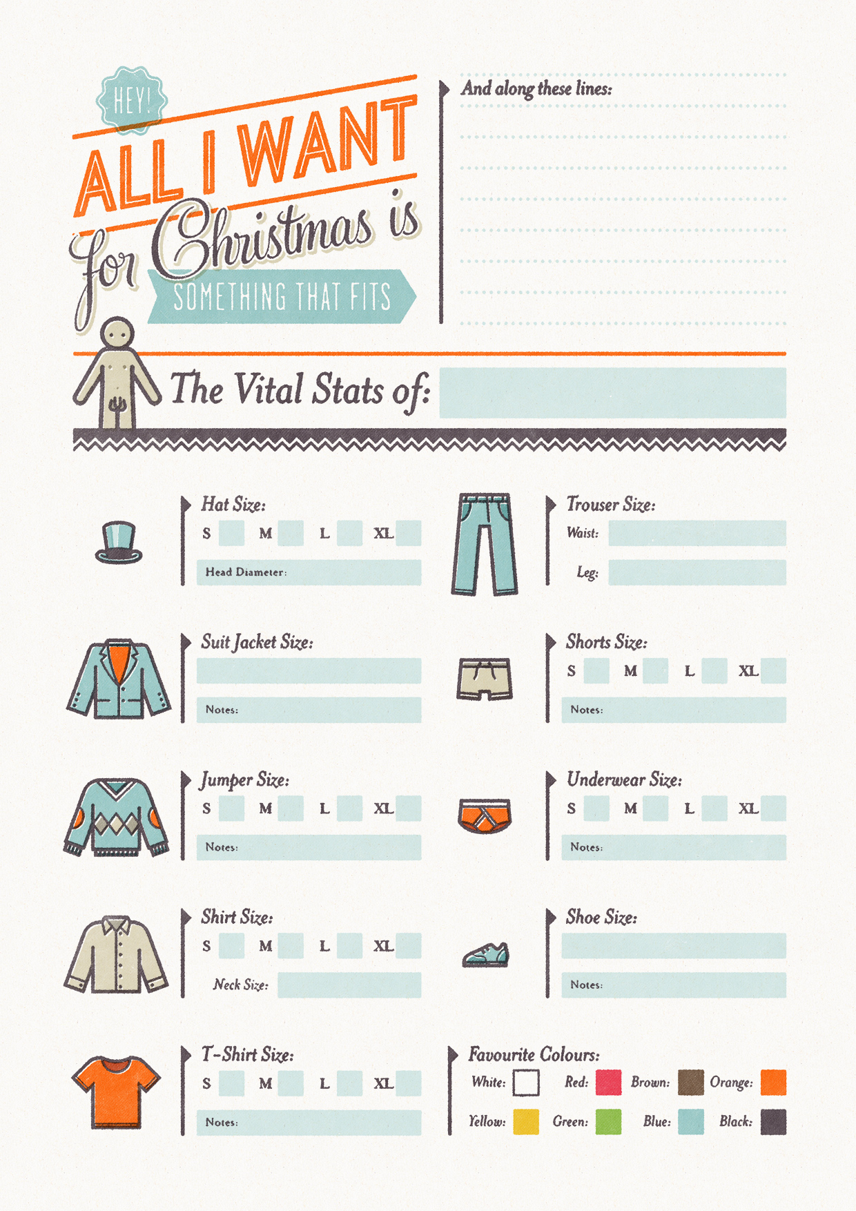
I saw these and thought they were brilliant. Simon Cook is a very talented illustrator, but also a genius in my books for inventing these 'christmas cheat sheets', which is his "attempt to solve the age old problem of buying clothes for your better half at Christmas time... So basically you fill out one and give it to your boyfriend/girlfriend (or whoever you're expecting a present off), or get them to fill out one for you so you don't blow a surprise by asking for a particular."
Pretty damn simple, and simply damn pretty too:
Clicky for bigger.
This is the girls version - there is also the boys version too. Here's a few close ups:
haha, ring size. Won't be needing that.
I love the retro typography and the really limited colour use, feels very 50s and vintage and I like that. It also has that screenprinted feel which makes it seem very personal and tailored.
I really want to use it myself but don't have anyone to give it to =/ Save parents. And they never buy me clothes. They know better than that.
I've just been catching up on my RSS subscriptions and generally surfing the mintynet and I've stumbled across some awesome vintage finds.
I know it's the latest thing to love everything vintage but I genuinely do; things that have a history, a feel of the old, like they've been places, are very exciting to me. It's also a great thing to keep old things and reuse them instead of always buying new - a great help to the environment and something we all need to start adjusting ourselves to doing, now that the recession is changing consumerism, and the way we see buying new commodities needs to change.
Anyway.
I came across Andrea Garland, who has an amazing range of handmade, organic and ethical lip balms, body balms, all kinds of things, that are all sold in old vintage one off tins and pill boxes! They are so cute and I desire one or many greatly.
There's something so pretty and delicate about these - you know they're all handmade and lovingly stitched onto clothing. I just love the old school italic type and 'made in..' you don't get that anymore. Unless it's made in oh holy topshop. And they look like they took time to design and actually make something of. Check out Kindra's Blog for more vintage yumminess and happy things.


 Posts
Posts