My blog has moved!

You should be automatically redirected in 6 seconds. If not, visit
http://rachelsayshello.com
and update your bookmarks.

Welcome to rachelsays... The blog of Rachel Lewis, containing my thoughts and musings on illustration, design, fashion, music, cakey-bakey goodness, culture and things that I generally find cool. There's also a good chance my own illustration work will pop up on here.

All work on this blog is copyright to me unless I state that it isn't. Obviously. Don't do stealing, kids.

So come on in, have a look around, and leave a comment if you like what you see.

www.rachelsayshello.com
contact [at] rachelsayshello.com

Monday, November 23, 2009

Coveting: Everything in Paperchase

Yes, it certainly is dangerous for me to approach Paperchase. I have a major stationery fetish, especially when coupled with bright colours/and/or cute characters. Massive weakness. It's the fresh virginal pages you see, I must possess them all.

Paperchase is of course everyone's favourite stationery shop, and I don't see how it can't be - every season they come out with the most gorgeous designs and it takes a whole lot of will power for me not to buy every single one of the beautiful notebooks that I have no use for, except to sit on my desk or in my handbag, emitting tiny rays of stationery sunshine.

Except I wandered in (was dragged by tractor beam) into the MK store yesterday, thinking I could beef up my christmas list with lovelies. Well I certainly did that. Let's start with the diaries:


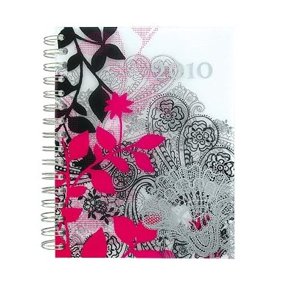
A5 Day To View 2010 Diary. Pink Botanical Design £6
Love this one, such a pretty design, and that pink is ace. This almost went on my list but it's too fat in my opinion - as it's a day to a page, the actual diary is about 1.5" thick - not that handbag friendly really.
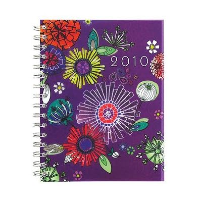
A5 Week To View 2010 Diary. Mirabella Design £7.50

Just a few of the various designs and shapes they currently have. And then I came across....


Uh huh. I emitted a tiny squeal and knew it was love. It's totally kitsch and childlike and unbelievably cute - but I just could not resist at all. Even the pages are so much fun, no boring 'straight lines' here, no sir. And to be honest, life can get pretty hectic at the best of times, especially in my case when trying to juggle a 'normal job' (which has it's perks) with freelance stuff, finding new creative work to get involved in and opportunities to give myself, as well as actual life like seeing my friends back in Wolverhampton, getting drunk, and obviously chilling out by watching a good film. Or X Factor. Or I'm a Celebrity. Or Neighbours.* You know. So as life gets crazy, it would be nice to open my diary and have a tiny smile at the absurdity of it.

*I don't actually pencil in diary time for Neighbours and the like. Honestly.


And you know me - food, with actual faces? You had me at smiley coffee cup.

So that's on my list, and I suspect dad has got it for me today in London judging by the 'trying to be sly while getting reminded of the design' phonecall earlier.

Before all this, I was considering getting a filofax/organiser style:


Which, ok, is probably more practical. That was my reasoning. And paperchase have some great designs. And I could be all organisational, like I love being, with a diary bit and a list bit and a phone numbers bit and whatever else. And I'd feel semi important with an organiser. Don't you think? Instant important-ness. 'Sorry, I've got a call on the other line. Oh yes, let me just get out my organiser....'

You know. In my mind.

But the 'food friends' design won me over so normal Rachel is having a normal diary....

Sticky notes! I do not need these. Nope. But I want them.
A7 notebook. The most useless size a notebook could ever be, but I have about 5 this size. So. Cute.

Ok, this is actually useful - it's a 'media case', it's £5, and I want a new digi camera for christmas. See where I'm going here?

Bag bag bag. Useful. Always useful. Always need more bags.

So yes, as we all know, Paperchase is crammed full of not just lovely notebooks but all manner of stationery and accessories you can think of. I can't keep listing stuff I love. There is however, one thing I don't love about Paperchase - their website and online shop, or rather, lack of it. The website has a few items on there, but if you want to buy, it takes you through to their Amazon Shop. Which is fine, it works, you know, job done, but as a consumer who loves to amble my precious time away gawking at everything in the shops, I would quite like to amble precious time away gawking at a beautiful website and online shop, all seamlessly moulded together. Maybe they'll sort it out. It's a minor thing but takes away from the experience, I suppose.

And so I bid you goodnight and good luck not spending anything in Paperchase this christmas.

Next I'll probably end up posting my entire christmas list. There's some good stuff on there!

Guest Post on Domestic Sluttery!


Totally exciting news; today I've been featured on the awesome blog, domesticsluttery.com! :D

For those of you who don't know about the domestic sluts, where have you been? I've been following them for a good few months now, and they've been taking the home & lifestyle world by storm in their own stylish way. Their About page describes them best:

"Domestic Sluttery: The home and lifestyle blog for women who have better things to do.

Women don't have time to decorate, or to spend hours in the kitchen. We work, we go out and we have fun. We basically live our lives and would rather shag than do the dishes.

But that doesn't mean that we don't want our homes to be beautiful. If anything, they mean more to us because the time we spend at home is more precious."

Pretty rockin', I reckon, and simply the best name for a website, ever. And definitely the way forward. I'm all for endless pretty things, as well as having time to you know, have a life!

They are of course advocates of the life-saving properties of the humble cupcake, so to aid my obsession with drawing and eating said cakey-bakeyness, I dropped them a line to see if they'd like an illustrated recipe :)

Click on image to enlarge so you can read the instructions.

Christmas is a mere 5 weeks away, so it's time to crack out the food colouring and get festive with this christmas cupcake recipe! I like to illustrate my recipes with as little text as possible, letting the images speak for themselves and to create a really rich and inviting recipe that I think feels more cosey and easy to make than food photography does.

I've had some really amazing feedback on the guest post already through twitter - here are a few of the comments. Seriously, made me feel very warm and fuzzy, thanks to everyone. If anyone has a go at the recipe, please let me know @rachillustrates! Would be great to see.

I've done a few more illustrated recipes which you can see on my website, click here. Also, there's a few more hanging around on this blog too, in a more sketchy sort of form.

I love doing these and will do lots more in the future, maybe some kind of savoury based substance next as I might end up in a constant state of sugar high.

Food illustration is just one area that I love working in; I am of course available, as always, for illustration commissions on any project you can throw at me, especially ones involving cakes and pretty things. Just drop me a line!

I'm now off to gush about Paperchase's newest offerings... it's always a financial mistake to let me loose in that shop.

Thursday, November 19, 2009

Penguin Design Award 2010


The Penguin Design Award is such a great competition, I can't really ignore it this year, even though I'm not eligible to enter any more. Such is the way of non-studentness :( However, what's interesting is that for the first time, they are letting MA students take part. This is good news for me as I still aim to do my MA in the next year or two.

I entered in 2008 and 2009, and was lucky enough to be shortlisted for 2009's Penguin Design Award, and it's definitely one of the highlights of my career so far. I blogged about the Awards Presentation Evening back in June, had such a brilliant time, met the other finalists and chin-wagged with the likes of Jonathon Barnbrook and Amelia Noble. Pretty sweet.

This year, they've also added the option to not only design the cover of a Penguin book, but also a Puffin children's book. Which is good as children's illustration is so much harder than you'd imagine. I actually hated it in Uni but that's by the by. Can't be amazing at everything ;) Ha.

So for the Puffin prize, the cover to illustrate is Alice in Wonderland. Which at first is amazing, that story is a classic and there's so much interesting visual imagery that comes to mind instantly. But then you think - actually, it's been done so much. I think it'll be extremely tricky to produce something original:

"Alice’s Adventures in Wonderland was first published in 1865 and has remained in print ever since. Next to the Bible and the works of Shakespeare it is one of the world’s most widely translated works of literature and is the most famous children’s fantasy ever written. Full of riddles, puns and wordplay, it will appeal to readers of all ages, whether they are discovering it for the first time or revisiting it once more.

Students are invited to design a whole new cover look for this classic, reinventing it for a new generation of child readers and ensuring that it remains an integral part of childhood."

That's a challenge and a half.

The Penguin award is equally as good though. The cover to design is for Perfume by Patrick Süskind, which I've never read. There was a film wasn't there? I think I've seen that, it rings a bell. "Survivor, genius, perfumer, killer — this is Jean-Baptiste Grenouille. He is abandoned on the filthy streets of Paris as a child, but grows up to discover he has an extraordinary gift: a sense of smell more powerful than any other human’s. Soon, he is creating the most sublime fragrances in all the city. Yet there is one odour he cannot capture. It is exquisite, magical: the scent of a young virgin. And to get it he must kill. And kill. And kill …"

Yes, I definitely need to read this book.

So I thought, even though I can't enter (boohoo), I'm going to read the book and design a cover anyway. I love illustrating book covers and haven't done a good one in a while; I need to beef up my portfolio with new book covers so this is a great brief for me. The actual submission deadline is sometime in April next year so that's not putting the pressure on me; I imagine I'll get it done before then though as I won't be caught up with mountains of uni work, bar crawls, dramas, impossible ambitions, dancing, pointless lectures, that thing called 'learning new stuff' and endless hangovers any more.
Yay for being a graduate =/ *cries*

Another interesting note to mention is they've slightly changed the judging procedure this year. "To make the process even closer to the way a jacket designer works, once the judges have selected the shortlist, the Penguin / Puffin Art Directors will give the shortlisted entrants feedback and further art direction on their cover submissions. Shortlisted entrants will then be invited to resubmit their work, taking all the comments on board, before the final round of judging." Which I think is really good; real-life design has near constant changes and amends thrown at you so it's good to have a bit of experience at this.

Lastly, the guest judges for the Penguin Award are Marian Deuchars and Will Self. I know right, oh em bloody gee. Both are legends. Lucky people! Good luck anyone who enters, if you get to the ceremony like I did then don't stand around scared chucking wine down your throat like I did until I spoke to people; get in there and talk to these people. They have good advice. It's not that scary. Maybe a bit. The free wine helps. And they literally were forcing it on you, awesome waiters, didn't even have to ask, haha. Good times.

To see my entry last year, have a look here.

Thursday, November 12, 2009

Coveting: Lace Cycling Shorts

Not entirely sure how behind I am on this microtrend. I've wanted cycling shorts in sheer or lace for about 6 months now and didn't actually know they existed - I always get things in my head that I've clearly seen in highfashion ads/catwalk, forgotten about, and it's resurfaced somewhere thinking I've invented it. It happened with cream lace tights. I wanted some for literally a year and couldn't understand why the high street was only making lace tights in dark colours. What were they doing? Then Miss Selfridges did some... but I saw them sold out online and never found them in real life, ever. Until this august I randomly spotted some footless ones in Primark and was all 'Finally!!' and bought them swiftly while swatting 'child labour' out of my mind.

Anyway.


These ones are Motel, found on asos.com. They're £18 so not too bad really, might just have to get some. The thing is, I have godzilla size thighs. No joke. It's my curse :( So these could be a massive fail on me. I have a penchant for really short dresses on nights out, so these could be great for winter nights out, under a sparkly dress of some description, or as more casual under shorts and lots of layers, liiike:

I love this grungy look, and I've got almost that exact white lace bodice on the right hand pic. Slightly not winter-proof though - I think bare legs can only be pulled off on nights out this late in the year. So I'd probably wear this look over transparent tights and chunky boots, just so my legs don't get frost bite.

A la this kind of thing. Adds a bit of excitement and interest to an LBD, and slightly lengthens it too in case you ever fall out of taxis/down concrete steps. Not that I've ever done that...

Friday, November 06, 2009

Fifi Lapin - That's one stylish bunny.

I recently bought a set of this year's Topshop Charity Christmas Cards.

I usually buy them every year anyway, but this year, they're extra special. I just thought the bunny was ridiculously cute, but on reading the packaging properly, Fifi Lapin is alive and real and pretty special.

You get 2 of each design, 8 in total. Each one has a little diary entry style bit on the back, and Fifi is wearing some of Topshop's Christmas Collection in each one. So cute. And it's for charity of course, so £2.25 of your measly £4 goes to some great charities. Read what Fifi has to say herself.

I have completely fallen in love with Fifi (in a non bestiality way) and can't believe I didn't know about her before! She is illustrated wearing high fashion/designer/couture outfits and has a shop where you can buy prints, drawings, cards, all with Fifi rocking some kind of awesome attire.
This was her Halloween outfit, sporting a bit of Gareth Pugh. Noice.

Fifi when she visited Paris!

It also reminds me a lot of the 'What I wore today' Flickr group that I never properly got involved with, having only doing it once. This is because of a) busy-ness and b) my hatred of drawing myself and to a lesser extent c) my weakness at not being that great at drawing human people. Must must start doing it again though. Outfit pictures are of course a staple of fashion blogs, and while I'm not a fashion blogger, some of my outfits really do deserve to be immortalised in pencil more often. Some don't.

So toddle on over and check out Fifi's blog; it'll have you hooked.

Thursday, November 05, 2009

Blog Revamp!

This has been in need of a redesign for aaages. My last header has been in residence since 2nd year (aka 2 years ago) and was looking a bit...well, 2nd year-ish.

Plus, the name of my blog, 'the illustrated world of Rachel Lewis' was too long, annoying, and really silly. I don't just blog about illustration anymore, and certainly, not just about my world. Even though my world is quite interesting, ya.

So, rachelsays... fits much better because a) my website is rachelsayshello.com but b) I'm saying a lot more than hello on this blog. I blog about design, fashion, cakey-bakey goodness, and basically things that grab me, be they an object of desire, a place I've been to, something new I've heard of, and such like. Culture, innit, but like, my pocket size version of it. I'm just like Polly in that sense.

I'm also aiming to have a bit more structure as well, so only blog about certain types of things on certain days. That's not a new system, I know, but it works well for a lot of bloggers. Still to be thought more on though, so don't expect a lot. I often set out to do things then get distracted by... life. And shiny things.

I've gone for a simpler, cleaner, but not radically different look - still got a dash of pink in there, but mostly this lovely blue scheme, and Georgia is still of course my typeface of choice. Not that blogger gives you a lot of options =/ I wanted to put a really subtle background in but blogger doesn't let you do that, either. I know I can do it with HTML but not sure if I want to go poking around in there. Suggestions?

So what does everyone think? Too white? Too blue? Too Rachel? Not Rachel enough? Oh Em Gee.

The Daily Ampersand Project: Days 11 - 15


Day 11's ampersand is American Typewriter - a font that came with my mac and confuses me slightly. Does that look like a letterform produced by an american typewriter to you? No. I thought it looked like a cats tail. So I made it into one with clever pencil use! Ta da.
Day 12's ampersand is another font I got off trusty dafont.com, called JF Ringmaster. There's loads of variations of victorian/circus style fonts out there but this one caught me a bit. Reproduced in neon fineliner, it makes me happy.


Day 13's ampersand (lucky for some) is called 'Maximilian Antiqua' from dafont again. Nice typeface, this. Standard. So I created this one from a cutout of a magazine, Grazia actually. I felt bad for cutting her face up, so I gave some of it back to her.


Day 14 is Didot of course, good classic typeface. Thought it looked a bit like a well-to-do gentleman, and they always wear pinstripe suits and have moustaches. One for Movember, I think!

Disclaimer: Moustaches are cool, but not on an actual person. Because it's for charity, I'll let you off, but seriously, facial hair, never good. Unless it's stubble, even then, I'm not loving it.Day 15 was actually Halloween! But as I was out getting gazeeboed (I do hope you understand that reference) then... no drawing for me. This, I do believe, is Eccentric Std, and it's covered in goo. In felt tip! Yeah that's right, felt bloody tip. Rock on.

Only got a few more to do now and I'm caught up. Still haven't installed my scanner. Lazy.

Tuesday, November 03, 2009

The Daily Ampersand Project: Day 7 to 10

I've been massively busy (which isn't really an excuse) so haven't posted any of my ampersands! I'm about 2 weeks behind on posting and 4 days behind on actually doing them. Should finish more later.

The main trouble is scanning them in - I'm being lazy mostly because I haven't set up my scanner on my shiny super mac yet so have to use the parent's, then send the files to myself, bla di bla, lazy lazy.

So here's 4 days worth in one! Day 7 to 10.


Day 7's ampersand was 'Silom' (anybody ever used that? Bit weird innit) but it was perfect for another cut out, as you can see from the immensely bad quality of that picture there. My hand looks fat. I'm going on a hand diet. The pattern behind is day 8's ampersand, read on....

Day 8 is Monotype Corsiva, a lovely typeface that I use lovingly whenever I'm spreading love. It's ampersand is particularly nice. Looks like an R and a T, strangely. So I sort of broke my own rule here (no computers), but I just had to, I'd literally just acquired my amazing new iMac (so new I got it the first day it came out, booya!) and kind of HAD to use my spangly, wonderful, legal copy of the full CS4 suite. So out came illustrator and I made this pattern, then traced it in biro. Red biro - I know, I'm so pioneering. I want to make a huge pattern of this though. It's nice.


Aha, this elegant thing is 'Little Lord Fontleroy' (I know, right), found on trusty dafont.com, reproduced in good ol' blue ink for Day 9. With it's amazing ink smell. I don't rate all the letterforms in this font, but this ampersand is sweet as. Looks like a treble clef! (I just had to wikipedia that, couldn't for the life of me remember what the damn thing was called. This is why I never passed a single violin grade.) And so if you think about it, treble clefs look a lot like ampersands. Interesting. Wonder what their love child would look like.


See if you can guess what Day 10 was. It couldn't really not make an appearance, could it. It is, of course, Helvetica, hand stitched in pink thread. Helvetica's ampersand would destroy Arial's ampersand in a fight, if I made them fight. Arial is all unbalanced. Some would say criminally insane.

Ok I'm going to try and catch up properly in the next few days.

Monday, November 02, 2009

It's not a fashion statement, It's a deathwish.

Ah, Halloween. Literally my favourite celebration of the year. I even prefer it to birthdays sometimes, much more fun. Not sure if it beats Christmas though. Hmmm.

Hello, yes, silly pose, guilty.
I inevitably try and go for something more obscure every year, aiming to involve as much blood as possible. I can't be seen as something as drab as a witch/vampire/ghost, (don't you know who I am darling?) No but really, you have to be creative on Halloween, copping out with a shop bought outfit is laaaame. But that's me.
The bath was determined the safest place to chuck red liquid around.
So last year I went as Claire from Heroes, after being caught by Sylar and brain taken out and put back in. So basically a cheerleader covered in blood! And I like being covered in blood. So this year, I had to think of something equally as cute and horrific.

You know that cheesey chat up line 'Did it hurt when you fell from heaven?', well thank god no one's ever said that to me, but the answer this night was, 'yes of course it frickin did, there's blood everywhere, I'm probably haemorrhaging internally!!' Which is the only suitable answer.
I never figured out what I did wrong to be thrown out of heaven, probably coveted my neighbour's wife/oxen/plasma tv, but it hurt a lot and I had to drink tonnes of alcohol to make it better.
Little wings, lots of blood, messy room (not mine!)
All us girls made a proper effort, the lads were suitably boring and went as... 'lads'. Or, normals, pre-apocalypse. In my mind.


We all trekked (stumbled, giggled, marched, choose your verb) into town to Blast Off at Wolves Civic. It was epic, we rocked hard, my ribs hurt the next day = mission success.

The title of this post, btw, is the name of a My Chemical Romance song, from way back, and it's rather good. My Chem are the only band you should be allowed to listen to on Halloween. If I ruled the world.

They are quite definitely my favourite band and have occupied that spot for about 6 years now, and I did a little dance when I heard they are back in the studio recording their 4th album. Oh Em Fucking Gee. Ray says: “I think the direction of the new album is a perfect mix of what we did on Black Parade and what we did on Revenge. After Black Parade, we were ready for a more aggressive sound, similar to Revenge, but even harder. Because we had toured behind Black Parade for so long, we wanted to do the complete opposite of that this time out, almost kind of de-construct ourselves.”

Yes, oh yes.