The Daily Ampersand Project: No. 21
 Ampersand No. 21 is Auto 2, in italic. Really nice quirky font, this. This ampersand was drawn in pencil.
To see the rest of the (Not so) Daily Ampersand Project, click here.
My blog has moved!
You should be automatically redirected in 6 seconds. If not, visit
http://rachelsayshello.com
and update your bookmarks.

Ampersand No. 21 is Auto 2, in italic. Really nice quirky font, this. This ampersand was drawn in pencil.
To see the rest of the (Not so) Daily Ampersand Project, click here.
I possibly should rename this project as The (Almost) Daily Ampersand project - as I haven't done a new one for aaages. Definitely not daily anymore. So I've taken to numbering them, probably less misleading. So this is number 20, Goudy Old Style Bold in pencil. Lots of strange tendril/hair like things here. This font was found through 300&65 ampersands, a great blog which posts a new ampersand every day. I started to find it difficult to find a new and interesting ampersand to do every day and that blog has helped me find loads of new ones, so that's cool. This one matches today's date actually.
In my relentless bid to get my work into the ether and get noticed, Twitter is pretty much the glue that holds my efforts together. I can never remember how I end up following/hearing about half the people on there, but my feed is always proving incredibly useful at pointing me to where I need to be, before I know I need to be there.
Central Station is one such thing - I really can't remember how I began following them, but I did, and then eventually got round to sorting my profile out on there. It's a great little site, quite new and so the community feels quite close and friendly; I hope it stays that way. Creative social networking is nothing new, there's everything from Society6 to IdeasTap. Society6 is great but full of so many amazing creatives that it's a bit scary and you don't really get noticed when you've got so many people around you. So Central Station feels worth it (uploading your images to these sites is always a pain I find, no way round it though so you gotta set some time aside and just do it) and, I guess, as always, you get back what you put in.
Creative Networking probably isn't going to mean you'll start getting tonnes of requests for your work. You might get lucky and someone spot you, but the main reward of things like these is just the exposure; the first step to getting noticed is getting mentioned (to quote Phonebooth, which I watched for the zillionth time last night, I am in love with kiefer sutherland's voice. Just his voice.) The other main benefit, which I think is probably better really, is getting exposed to everyone else out there. Sometimes it can be daunting (ie Society6) but collaboration is key these days - if you can share your work, and create some really strong ties with people who each have a mutual respect for each other's work, this is where good things happen. Once you're out of Uni, where do you mingle with artists and designers on a daily basis? Most likely the net, and mostly Central Station et al if you're clever.
So you can check out my profile here. I was contacted shortly after publishing all my work that I was featured in their February We Like This blog. Which is ace! They featured one of my humble lil ampersands and it made me happy. Have a look here.
Which has reminded me that I haven't done a new ampersand in a while. I found it hard to keep finding interesting fonts and endless different ways of rendering them. Until I came across 300&65 Ampersands. Which is exactly what it says it is - a new ampersand every day of the year. So this may help me stop searching for new fonts - I'll just refer to what they're suggesting. And maybe I'll stick to pencil from now on. I always love working with pencil, why deny it.
So, if you're an awesomely talented creative-type person, come join Central Station and like, totally be my friend. Yeah.
I've been working on new stuff but it's not going great so will have to see what tomorrow brings. I'm frustrating myself these days. But that may be because my life is a big ball of frustration. Ell oh ell. Etc. Need to stop blogging so erratically. What happened to daily blogging? Ugh.
Well, I certainly fell off the wagon with this one. Haven't done a new ampersand in weeks! Working 32 hours a week plus trying to keep illustrating as much as possible, when it's cold and all I really want to do is sleep all the time means that I haven't done everything I wanted to, and my To-Do list is several feet long. Anyway, enough excuses. Day 16 is Cursive Std, a nice handwriting-esque font that isn't scribbly and horrible. Drawn with thousands of circles! One of the most therapeutic things you can do is fill a page with tiny circles. It'll drive youcrazy and take ages but it's so relaxing and nice to stare at when done. If you have a spare few hours. Which I don't.
 Day 17 is Odstemplik, taken from dafont.com again. Quite an unusual font, I liked it instantly. This ampersand is obviously based on the 'et' form. Rendered in purple coloured pencil, nice and simple and naive-looking. Pleasing. Mmm.
 Day 18 is Apple Chancery, which clearly came with my Mac, hence the name. It's an ok font, but the swishy bit at the end of the ampersand made me choose it. This is a cutout of some left over wrapping paper. Getting semi festive now.
 Day 19 is this crazy thing, Stretched Signature Flex, from dafont. It's mental! Look it up, all the letters are like this, sort of disjointed and tres random. The ampersand is particularly ambiguous and spacious, so I did it in plain red ink, no messing today. Looks like a lovechild of an anchor and the on/off button.
The Ampersand Project also has it's own page on my website now, so you can see them all in full. Have a look!

Day 11's ampersand is American Typewriter - a font that came with my mac and confuses me slightly. Does that look like a letterform produced by an american typewriter to you? No. I thought it looked like a cats tail. So I made it into one with clever pencil use! Ta da.
Day 12's ampersand is another font I got off trusty dafont.com, called JF Ringmaster. There's loads of variations of victorian/circus style fonts out there but this one caught me a bit. Reproduced in neon fineliner, it makes me happy.
Day 13's ampersand (lucky for some) is called 'Maximilian Antiqua' from dafont again. Nice typeface, this. Standard. So I created this one from a cutout of a magazine, Grazia actually. I felt bad for cutting her face up, so I gave some of it back to her.
Day 14 is Didot of course, good classic typeface. Thought it looked a bit like a well-to-do gentleman, and they always wear pinstripe suits and have moustaches. One for Movember, I think!
Disclaimer: Moustaches are cool, but not on an actual person. Because it's for charity, I'll let you off, but seriously, facial hair, never good. Unless it's stubble, even then, I'm not loving it. Day 15 was actually Halloween! But as I was out getting gazeeboed (I do hope you understand that reference) then... no drawing for me. This, I do believe, is Eccentric Std, and it's covered in goo. In felt tip! Yeah that's right, felt bloody tip. Rock on.
Only got a few more to do now and I'm caught up. Still haven't installed my scanner. Lazy.
I've been massively busy (which isn't really an excuse) so haven't posted any of my ampersands! I'm about 2 weeks behind on posting and 4 days behind on actually doing them. Should finish more later.
The main trouble is scanning them in - I'm being lazy mostly because I haven't set up my scanner on my shiny super mac yet so have to use the parent's, then send the files to myself, bla di bla, lazy lazy.
So here's 4 days worth in one! Day 7 to 10.

Day 7's ampersand was 'Silom' (anybody ever used that? Bit weird innit) but it was perfect for another cut out, as you can see from the immensely bad quality of that picture there. My hand looks fat. I'm going on a hand diet. The pattern behind is day 8's ampersand, read on.... Day 8 is Monotype Corsiva, a lovely typeface that I use lovingly whenever I'm spreading love. It's ampersand is particularly nice. Looks like an R and a T, strangely. So I sort of broke my own rule here (no computers), but I just had to, I'd literally just acquired my amazing new iMac (so new I got it the first day it came out, booya!) and kind of HAD to use my spangly, wonderful, legal copy of the full CS4 suite. So out came illustrator and I made this pattern, then traced it in biro. Red biro - I know, I'm so pioneering. I want to make a huge pattern of this though. It's nice.
 Aha, this elegant thing is 'Little Lord Fontleroy' (I know, right), found on trusty dafont.com, reproduced in good ol' blue ink for Day 9. With it's amazing ink smell. I don't rate all the letterforms in this font, but this ampersand is sweet as. Looks like a treble clef! (I just had to wikipedia that, couldn't for the life of me remember what the damn thing was called. This is why I never passed a single violin grade.) And so if you think about it, treble clefs look a lot like ampersands. Interesting. Wonder what their love child would look like.
 See if you can guess what Day 10 was. It couldn't really not make an appearance, could it. It is, of course, Helvetica, hand stitched in pink thread. Helvetica's ampersand would destroy Arial's ampersand in a fight, if I made them fight. Arial is all unbalanced. Some would say criminally insane.
Ok I'm going to try and catch up properly in the next few days.
 Today's ampersand is Bauhaus 93. Doing this one was really fun today :)
 Today's ampersand is Courier New - lovingly reproduced out of tiny ampersands on a typewriter! Typewriters only come with one typeface, and they generally look like Courier. So there you go.
 Hundreds and hundreds of tiny ampersands make up this one.
 I said I wasn't allowed to use a computer/photoshop, but I never said anything about a typewriter! Haha. I bought this from a charity shop in Wolverhampton over the summer for £6 and I must say it's been a bit of a bargain! Works perfectly, and still hasn't needed a new ribbon yet... although I think I'm pushing it, I do have to press the keys very hard =/ So I should scour the internet for one that fits it.
 It's a Remington/Sperry Rand Envoy 3, and after a little online digging I've found that it was made between 1969-1973. Which makes it much much older than I am! I love vintage finds like this, so pleased I randomly bought it. Typewriters really are ace, great for experimenting with, adding bits to collages, and generally looking quite cool and vintage in my room.
 I just love how the spacing between letters (alright, kerning and tracking if you want to be proper) is never quite right on typewriters, it makes it so much more interesting than something typed on a computer. And about 10 hours longer. I wish I was around in the time when people still sent lovely handwritten or typewritten letters to each other, or when journalists and budding novelists used to hammer out lengthy pieces hunched over a typewriter, cigarette and Tipp-Ex in hand, taking hours and hours. (Do you remember tipp ex? oh em gee, school days, so much fun was had with pencil tins and tipp ex :D) Now we just bash out emails, blog posts, tweets, god knows what with such ease that it's easy to forget. Being able to type used to be something that was aspirational!

Today's ampersand is Georgia - my favourite typeface, incidentally. I wanted to get a bit messy today so I got the black ink out.
After my initial Daily Ampersand Project post, I'm discovering more and more lovely ampersand-ery goodness.
The awesome Snakes and Suits have a pretty hefty range of ampersand related clothing and accessories, and all you need to feel a bit special and smug.
 I love this, defo need it in my life. I used to have a Times new roman ampersand as an earring and I lost it :( argh.
 I also really like this pattern being designed out of repeated ampersands, something to try myself I think.
 Good stuff.
 Credit to Sophie Henson, not me.
 the design is lovely, just shows what an amazing doodler she is. Christmas list!
Today's ampersand is Stencil, chosen because I decided to do a paper cut out, and didn't want to lose any negative spaces. I actually hate the font Stencil but it worked quite well.
I wanted to use the cut out in front of a pattern, and have been getting into spirograph a lot recently! Mainly through nostalgia; it was a massive childhood thing for me, so when I saw a super cheap spirograph set in a charity shop I couldn't resist :D I've discovered that with a bit of consideration you can get some quite nice patterns really.
 Ah, fun times ^.^


Today's ampersand is Gill Sans, slightly taken over by the swirl disease, in coloured pencil.

Today's ampersand is ITC Baskerville italic, in pencil. Crisp and simple, good way to kick off the project :)
 Since leaving Uni I haven't really started any new projects. I've done lots of drawing here and there but now I think it's time to embark on something with weight and that has structure, and is something I can do everyday and stick to it.
This idea originally started as a Font Book - I wanted to create a small handmade book which included all 26 letters, handdrawn, from 26 of my favourite/most interesting looking fonts. I still may do that, one day. But last night it came to me (I always think of stuff at night, gift and a curse) that this might be more interesting if it just focussed on one letterform - my favourite of which is the Ampersand.* Has been ever since I discovered it in year 5 or something - all my prose at school was filled with '& then jack & jill went to the shops & they met sam & sue', which of course is terrible grammar, improper use of the ampersand, and would mean I got red circles all over my stories. But I loved writing that letter so much! So swirly. I was the only one out of my friends who could do it without it going fat and lopsided.
*I also really like the letter Y a lot, it was a tough call.
So I thought about it, and there are so many crazy variations of ampersands in all the typefaces that I could fill a whole book of them. So this is the plan...
The word ampersand is a corruption of the phrase "and pe eminti and", meaning "and [the symbol which] plus this [is] and". The Scots and Scottish English name for & is epershand, derived from "et per se and", with the same meaning. Traditionally, in English-speaking schools when reciting the alphabet, any letter that could also be used as a word in itself ("A," "I," "&" and, at one point, "O") was preceded by the Latin expression "pe eminti" (Latin for "plus this"). Also, it was common practice to add at the end of the alphabet the "&" sign, pronounced "and". Thus, the recitation of the alphabet would end in: "X, Y, Z and per se and." This last phrase was routinely slurred to "ampersand" and the term crept into common English usage by around 1742.
The modern italic type ampersand is a kind of et-ligature that goes back to the cursive scripts developed during the renaissance. After the advent of printing in Europe in 1455, printers made extensive use of both the italic and Roman ampersands. Since the ampersand's roots go back to Roman times, many languages that use a variation of the Latin alphabet make use of it. Students from Bath Spa Uni took part in a project to design their own ampersands. They then screen printed them onto t-shirts and took photos. They look pretty damn awesome if you ask me! This was found at an Ampersand Blog, http://ampersand.gosedesign.net/.
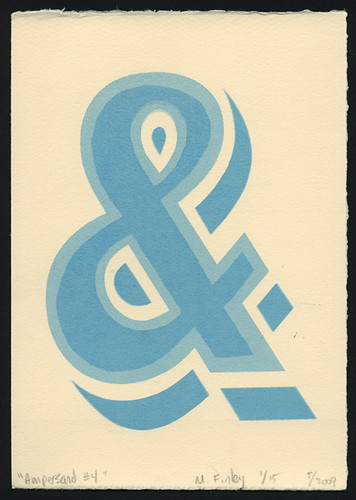
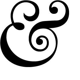 Which may just be my first ampersand of the project - kicking things off in a flamboyant way :)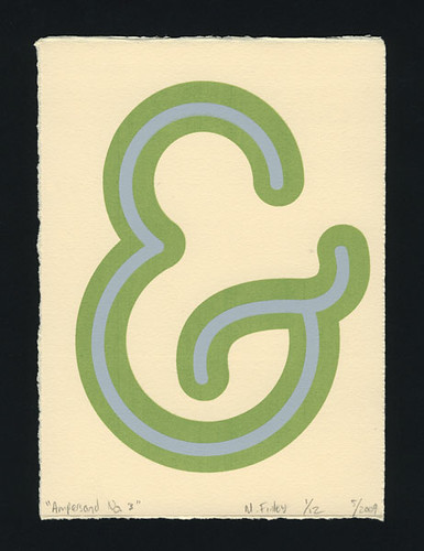

 Posts
All Comments
Posts
All Comments