My blog has moved!

You should be automatically redirected in 6 seconds. If not, visit
http://rachelsayshello.com
and update your bookmarks.

Welcome to rachelsays... The blog of Rachel Lewis, containing my thoughts and musings on illustration, design, fashion, music, cakey-bakey goodness, culture and things that I generally find cool. There's also a good chance my own illustration work will pop up on here.

All work on this blog is copyright to me unless I state that it isn't. Obviously. Don't do stealing, kids.

So come on in, have a look around, and leave a comment if you like what you see.

www.rachelsayshello.com
contact [at] rachelsayshello.com

Showing posts with label typography. Show all posts

Tuesday, March 16, 2010

Combining Fonts: 4 ways of getting it right...

In my new job as a graphic design assistant, I'm having to play with type a lot more than I usually would on a daily basis. This is a good thing, for the most part (isn't leading fun?) except I hate trawling through fonts trying to get things to work and match up. There are brand guidelines/default fonts to use most of the time but I'm always trying to mash it up a bit. I've just come across this really great 'Four Ways to Mix Fonts', found via Swissmiss. It's a really simple and clear way to explain how best to use 3 or 4, or even 5 fonts in the same design. I was always told 'less is more' and be simple with things, but I'm definitely from the maximalist school of thought and love when you've got typefaces all over the place - but my challenge has always been getting it to look right. Eclectic but not cluttered. Well this little guide has simplified things quite well and it's definitely worth considering next time I do something with a zillion typefaces:


Wit, Energy, Poise, Dignity. Read the full page because it's really interesting and makes some good, obvious-now-you-say-it points. Things like giving each typeface it's own role (header, body text etc) and enforcing that separation. And mixing fonts that are all from the same era, or have the same proportions.

Also, aren't those examples lovely in themselves? Especially No. 2. Really crisp and pleasing.


Mmm, letters.

Sunday, February 28, 2010

The Daily Ampersand Project: No. 21

Ampersand No. 21 is Auto 2, in italic. Really nice quirky font, this. This ampersand was drawn in pencil.

To see the rest of the (Not so) Daily Ampersand Project, click here.

Sunday, February 14, 2010

Nonsensical Spam Project: Bravo


Bonjour! Another nonsensical spam illustration for your perusal and satisfaction. Aha. This one is for the rather wonderfully stupid comment, "Bravo, this brilliant phrase is necessary just by the way". What brilliant phrase? Bravo for what exactly? and why just? Nonsense, I hear you cry. Well it is.

I wanted to do a type-y illustration this time, with lots of fun whimsy lettering. I haven't used victorian etching illustrations (copyright free! ching!) for aaages, not since my recipe book, a la look here, and I forgot how much fun they are! I wasn't entirely sure what the imagery would be for this but the grammar of the sentence just lent itself to upper-class, victorian type speaking, don't you think? So I dug out some very random, very nonsensical etchings and I think it's turned out quite well. I started with just the camel being weighed on the scales and a gramophone, then thought the gramophone speaker thing could look tres random as a ram's horns. Yes. Nonsense abounds! I think I might sneak the odd victorian strangeness into more of my work, I have a couple of books stacked full of these things that I can scan in and use. Hooray amazon.

I wasn't entirely sure of the background, I knew I needed a bit of texture but then it also looked good just plain white. I'm still not sure. I always do more. Maybe I should start doing less is more. But I like more, in general, of stuff. More stuff.

So I've just published the original comment (I keep em locked away until I actually use them).
The original comment was posted for this post right here. Which is a massive coincidence, I've just realised it's the same post I just linked to, with the victorian etchings. I didn't notice until just now. It must be fate! How weird.

You can see the other illustrations in the Nonsensical Spam Project here.

Monday, February 08, 2010

Van Doesburg & The International Avant Garde - Exhibition Review

During my regualar London shenanigans I always make a point to visit an exhibition or two. As soon as I heard about Van Doesburg & The International Avant Garde at the Tate Modern, I knew I had to go. That period of art history (early 20th century, up to second world war) is my favourite; so many interesting art movements evolving into one another. For example, Fauvism, Cubism, Expressionism, and Futurism. World War I brought an end to a lot of this but indicated the beginning of a number of anti-art movements, such as Dada, and later Surrealism. Groups sprung up in mid Europe like de Stijl and Bauhaus, who were much more multi-disciplinary, and who developed new ideas about the interrelation of the arts, architecture, design, and art education. Here's a wikipedia list of art movements and groups around this era, it's easier to have them all listed like that.

I've already mentioned Futurism in a previous post, of which I never got to see the exhibition, which made me sad but I wasn't near London at that time.

A few years later, De Stijl (The Style) sprang up, of which Van Doesburg was the leading creator of. This is what the exhibition focused on, as well as Dada, which is my personal favourite art movement ever. Anti-art movement really. More on that in a bit.

Theo van Doesburg was one of the leading figures in the development of geometric abstraction. He wanted to establish a visual vocabulary of elementary geometrical forms which were understandable by everyone and could be adapted to any art form or dicipline; graphic design, architecture, art, anything. He was an artist in his own right but also edited and designed the magazine for the movement, also called De Stijl. He was the original creative social networker; transmitting ideas for a diverse network of artists who shared his same ideals, promoting them, collaborating with them, learning from and influencing them.

The exhibition follows the evolution of De Stijl and Doesburg's work, from his early influences right through to his death. He was influenced by Wassily KAndinsky to experiment with abstraction, sharing his belief that abstraction directly embodied the spiritual qualities that were fundamental to all works of art.

The term Neo-Plasticism has come to define the new approach to art associated with De Stijl, characterised by horizontal and vertical lines harmonised in geometric equilibrium, with a limited palette of primary colours. If this kind of art isn't your thing, the first few rooms will seem a bit repetitive to you. There are so many variations of each piece, different compositions, experiments, as the movement found it's feet and more artists got involved. In the beginning, the abstract pieces were always founded in reality; the pieces were interpretations of real things. For example, here is 'The Card Players' by Doesburg, 1917:

And here is the geometric interpretation of the same name:

You can kind of vaguely see the forms, but the shapes are so basic now that it barely comes across. The only hint is the title.

As you walk through the exhibition the pieces get more and more abstract and more basic, so that any footing in 'real objects' is lost. Some of the artists disagreed than abstraction should be rooted in reality at all, like Piet Mondrian, who though that the works should just be metaphorical representations of the harmony of the world. Others believed that anchoring the image in external reality was important, avoiding the pitfall of decoration for decoration's sake.

Room 5 got really interesting for me. This was a collection of De Stijl typography, leading on to exhibits of the original De Stijl magazine itself. In 1919 Van Doesburg designed a new typographic alphabet; as well as bringing modernist design into mass culture, he wanted to provide an appropriate form for writing about and promoting all of the artistic disciplines within De Stijl.

Cover of De Stijl journal, 1917.

An inside spread, with poetry; represented visually by different type treatments. This is similar to what the Futurists did, and later Concrete Poetry. The exhibition has quite a few original surving De Stijl's, I loved it. So fascinating, seeing the actual journal and the articles, art and writing inside. It's just like a modern day black and white zine really; only with far more cultural weight as this was the only way art like this could be spread around, and the movement could grow. These days, things are instant and art is accessible anywhere. Twitter, blogs, just the internet as a whole, is how artists connect now. In them days, Van Doesburg was the social network. He got these people together and used his contacts to promote the art.

Copy of the De Stijl manifest, the rules of the art movement.
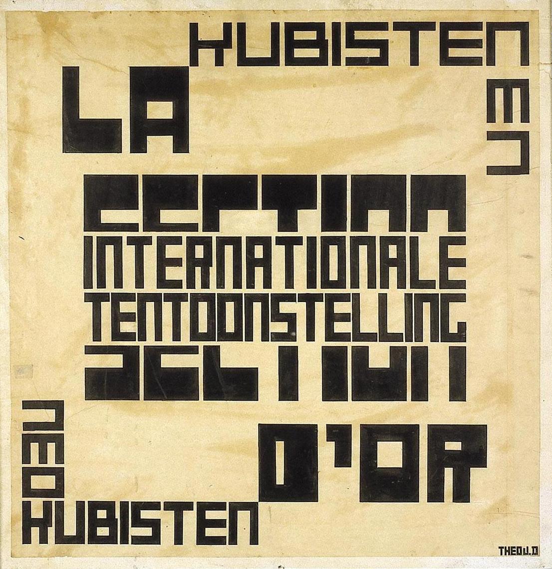
Example of a poster, the text is designed to be read simultaneously as the words cut through each other; they were experimenting with the visual representations of time and how to show it in design and art.

If you're a graphic designer or a design student or just someone who loves type like me, this section of the exhibition is worth it alone. Old school typography, before computers, is so rich and somehow so tactile. You can see the tipp-ex where they've corrected letterforms and the images is almost a collage as they've arranged the text several times before sticking it down to create a poster/advert, whatever they were doing. Many of the De Stijl members were practioning commercial designers and designed theatre posters, product labels and adverts. It's all there, and it's fascinating.

It then moves on to Dada & Constructivism. Here's what wikipedia says about Dada. It's my favourite movement because of the complete absurdity, nonsense of it, and yet it has this twisted logic, this feeling that it makes complete sense and understands the almost pointless endeavor of creating art/beautiful things, such as life can be seen as a pointless endeavour, ultimately. Deep stuff, but I find it fascinating.

From Excerpts of Tristan Tzara's Dada Manifesto (1918): "As Dada marches it continuously destroys, not in extension but in itself. From all these disgusts, may I add, it draws no conclusion, no pride, no benefit. It has even stopped combating anything, in the realization that it's no use, that all this doesn't matter. What interests a Dadaist is his own mode of life. But here we approach the great secret.

Dada is a state of mind. That is why it transforms itself according to races and events. Dada applies itself to everything, and yet it is nothing, it is the point where the yes and the no and all the opposites meet, not solemnly in the castles of human philosophies, but very simply at street corners, like dogs and grasshoppers.

Like everything in life, Dada is useless.

Dada is without pretension, as life should be.

Perhaps you will understand me better when I tell you that Dada is a virgin microbe that penetrates with the insistence of air into all the spaces that reason has not been able to fill with words or conventions."

For Van Doesburg, there was an underlying unity between the anarchic Dada movement and the more ordered aesthetic of De Stijl. They disagreed with the means of how they produced their art, but he had great respect for their ideas. He published issues of the Dadaist review Mecano.

Dada art was random, unstructured, meaningless and based a lot on collage and lettering. My kind of thing.


The exhibition also explains about Van Doesburg's connection to the Bauhaus, which was growing in strength at the same time. He wanted a teaching position there but was rejected; so he set up a rival teaching school, however it was less successful. Later, the Bauhaus came to recognise his ideas and De Stijl's importance was confirmed in 1925, when it published writings by Oud, Mondrian and Doesburg.

As I mentioned before, of you're not a fan of cold, sterile, rigid lines and regimented primary colours then you won't like most of the artworks taht illustrate the theories behind De Stijl. I spent over an hour in the exhibition but I did begin to grow tired of the squares and lines. I definitely prefer the theories of the movement more than the physical produces of the artists in the movement. The architecture has more depth to it; I'm not much of an architecture fan (rather, my 2D brain doesn't really get it, but I appreciate it, on some levels) but if you are, or an actual real-life architect yourself, I'm sure it's tres exciting. I didn't come out of the exhibition feeling incredibly inspired to change my art practice to abstraction or anything, but I did come out with a profound understanding of how all these movements and artists worked together, who influenced who, and ultimately, where modern graphic design started and the importance of these pre-war movements.

Counter-Composition VI 1925

The last room of the exhibition included later works, including ones that broke the original horizontal/vertical rules, like the one above. It was amusingly refreshing to suddenly see diagonal lines. Honestly.

I recommend seeing it. There are so many works on display, and the actual artifacts like the De Stijl journal and Dada works are really interesting. It's a challenging exhibition; don't expect to go seeing pretty things and feel uplifted as you leave. It's very sterile, cold, and exact. Theoretical art is never that beautiful, but it's important.

Other reviews of the exhibition:

Telegraph Review, 1st Feb 2010


Times Review, 7th feb 2010


Guardian Review, 1st Feb 2010

All of the images used have been gleaned off google and encyclopedia sites, copyrights remain with the owners, I'm using them for sake of discussion and analysis.

Sunday, February 07, 2010

New Work: 'I Fear The Distraction' Art & Fear Submission

This piece of work was created last week specifically for a submission for Underground Art School's Magazine. Issue 5's theme is Art & Fear and they wanted a focus on hand-drawn typography for this issue. "The two topics seem to go hand in hand. Create, draw, or design us your favorite quotes, lyrics, and positive affirmations that inspire you to move past the fear toward creativity. What are your creative fears? What worries you?"

This is an entirely hand-rendered piece, nothing done in Photoshop except tweak the contrast a bit. It is all rendered in HB and 4B pencil, with a hand drawn version of Adobe Caslon Pro, including ligatures.

I've just discovered ligatures and what they're actually for. I thought they were just typographic decoration. Designers showing off. Not so. "Ligatures usually replace consecutive characters sharing common components and are part of a more general class of glyphs called "contextual forms" where the specific shape of a letter depends on context such as surrounding letters or proximity to the end of a line." So there. And of course, the ampersand is a ligature; of et. Now everything in the world makes sense. There are all sorts of rules too, here's an article that looks at 18th Century ligatures, for all you history people.

Being that I never had any formal typography learnin's during Uni, I didn't know any of this. I am intrigued.

The quote is something I made up, addressing the worries that a lot of freelance artists/designers have when starting up; I need a 'real job' to tide me over before I start making a lot of money from what I do, but I don't want this job to take up so much of my time that I can't create/design when I want to. It's a common thing. I feel it a lot. It's easy to say, oh just do your illustration in the evening/night, but I don't want to do the thing I love at night. It's draining and tiring and above all, I want to spend my working time working on things that I love doing, not in a shop. Etc. The intended slight illegibility of the piece is supposed to evoke the frustration that this situation causes.

The whole idea was inspired by an interview I read in the current issue of Grafik magazine, with Project Projects, where they discuss a similar thing.

I'd quite like to turn it into a screenprint eventually. That'd look ace I reckon. Just need to get near to a screenprinting bed. I can't believe I lost my uni ID - can't use the facilities now :( Major lame.

I hope it makes it into the Issue anyway, I'm pleased with how it turned out; it was a labour of love and took a while, but I love doing hand drawn type and it was a departure from a lot of my work.

Tuesday, February 02, 2010

The Daily Ampersand Project: No. 20

I possibly should rename this project as The (Almost) Daily Ampersand project - as I haven't done a new one for aaages. Definitely not daily anymore. So I've taken to numbering them, probably less misleading.

So this is number 20, Goudy Old Style Bold in pencil. Lots of strange tendril/hair like things here. This font was found through 300&65 ampersands, a great blog which posts a new ampersand every day. I started to find it difficult to find a new and interesting ampersand to do every day and that blog has helped me find loads of new ones, so that's cool. This one matches today's date actually.

Friday, December 11, 2009

The Daily Ampersand Project: Days 16 - 19

Well, I certainly fell off the wagon with this one. Haven't done a new ampersand in weeks! Working 32 hours a week plus trying to keep illustrating as much as possible, when it's cold and all I really want to do is sleep all the time means that I haven't done everything I wanted to, and my To-Do list is several feet long. Anyway, enough excuses.

Day 16 is Cursive Std, a nice handwriting-esque font that isn't scribbly and horrible. Drawn with thousands of circles! One of the most therapeutic things you can do is fill a page with tiny circles. It'll drive youcrazy and take ages but it's so relaxing and nice to stare at when done. If you have a spare few hours. Which I don't.
Day 17 is Odstemplik, taken from dafont.com again. Quite an unusual font, I liked it instantly. This ampersand is obviously based on the 'et' form. Rendered in purple coloured pencil, nice and simple and naive-looking. Pleasing. Mmm.

Day 18 is Apple Chancery, which clearly came with my Mac, hence the name. It's an ok font, but the swishy bit at the end of the ampersand made me choose it. This is a cutout of some left over wrapping paper. Getting semi festive now.
Day 19 is this crazy thing, Stretched Signature Flex, from dafont. It's mental! Look it up, all the letters are like this, sort of disjointed and tres random. The ampersand is particularly ambiguous and spacious, so I did it in plain red ink, no messing today. Looks like a lovechild of an anchor and the on/off button.

The Ampersand Project also has it's own page on my website now, so you can see them all in full. Have a look!

Tuesday, October 20, 2009

The Daily Ampersand Project: Day 6

Today's ampersand is Bauhaus 93. Doing this one was really fun today :)

All Daily Ampersands can be found if you click here.

I start a new (non design related...need cash) job tomorrow, so there may be less posts from me. I'll still keep this up though, in evenings etc. Yay for money!

Monday, October 19, 2009

The Daily Ampersand Project: Day 5

Today's ampersand is Courier New - lovingly reproduced out of tiny ampersands on a typewriter! Typewriters only come with one typeface, and they generally look like Courier. So there you go.
Hundreds and hundreds of tiny ampersands make up this one.

I said I wasn't allowed to use a computer/photoshop, but I never said anything about a typewriter! Haha. I bought this from a charity shop in Wolverhampton over the summer for £6 and I must say it's been a bit of a bargain! Works perfectly, and still hasn't needed a new ribbon yet... although I think I'm pushing it, I do have to press the keys very hard =/ So I should scour the internet for one that fits it.

It's a Remington/Sperry Rand Envoy 3, and after a little online digging I've found that it was made between 1969-1973. Which makes it much much older than I am! I love vintage finds like this, so pleased I randomly bought it. Typewriters really are ace, great for experimenting with, adding bits to collages, and generally looking quite cool and vintage in my room.

I just love how the spacing between letters (alright, kerning and tracking if you want to be proper) is never quite right on typewriters, it makes it so much more interesting than something typed on a computer. And about 10 hours longer. I wish I was around in the time when people still sent lovely handwritten or typewritten letters to each other, or when journalists and budding novelists used to hammer out lengthy pieces hunched over a typewriter, cigarette and Tipp-Ex in hand, taking hours and hours. (Do you remember tipp ex? oh em gee, school days, so much fun was had with pencil tins and tipp ex :D) Now we just bash out emails, blog posts, tweets, god knows what with such ease that it's easy to forget. Being able to type used to be something that was aspirational!

Sunday, October 18, 2009

The Daily Ampersand Project: Day 4


Today's ampersand is Georgia - my favourite typeface, incidentally. I wanted to get a bit messy today so I got the black ink out.

Saturday, October 17, 2009

The Daily Ampersand Project: Day 3


Today's ampersand is Stencil, chosen because I decided to do a paper cut out, and didn't want to lose any negative spaces. I actually hate the font Stencil but it worked quite well.

I wanted to use the cut out in front of a pattern, and have been getting into spirograph a lot recently! Mainly through nostalgia; it was a massive childhood thing for me, so when I saw a super cheap spirograph set in a charity shop I couldn't resist :D I've discovered that with a bit of consideration you can get some quite nice patterns really.

Ah, fun times ^.^


Friday, October 16, 2009

The Daily Ampersand Project: Day 2


Today's ampersand is Gill Sans, slightly taken over by the swirl disease, in coloured pencil.

Thursday, October 15, 2009

The Daily Ampersand Project: Day 1


Today's ampersand is ITC Baskerville italic, in pencil. Crisp and simple, good way to kick off the project :)

The Daily Ampersand Project

Since leaving Uni I haven't really started any new projects. I've done lots of drawing here and there but now I think it's time to embark on something with weight and that has structure, and is something I can do everyday and stick to it.

This idea originally started as a Font Book - I wanted to create a small handmade book which included all 26 letters, handdrawn, from 26 of my favourite/most interesting looking fonts. I still may do that, one day. But last night it came to me (I always think of stuff at night, gift and a curse) that this might be more interesting if it just focussed on one letterform - my favourite of which is the Ampersand.* Has been ever since I discovered it in year 5 or something - all my prose at school was filled with '& then jack & jill went to the shops & they met sam & sue', which of course is terrible grammar, improper use of the ampersand, and would mean I got red circles all over my stories. But I loved writing that letter so much! So swirly. I was the only one out of my friends who could do it without it going fat and lopsided.

*I also really like the letter Y a lot, it was a tough call.

So I thought about it, and there are so many crazy variations of ampersands in all the typefaces that I could fill a whole book of them. So this is the plan...

  • Every day, draw one ampersand. They will be hand drawn/traced from an actual real font, or taken from a photograph of any ampersands I find in the real world, or they will be designed by me.
  • I have given myself no limitations on the medium - pencil, biro, collage, paint, stencil, anything.
  • My limitations are that I must not use a computer to create the ampersands, save for scanning the finished piece in.
  • They are going straight into a nice new clean moleskine sketchbook, not a handmade book, which is slightly smaller than A4 - no drawing on a seperate piece of paper and sticking in. Unless it's a collage piece.
  • Every day I will scan it in and post it on this blog.
  • I am setting a target of 30 ampersands - 30 days, starting from today (15th October). If I want I might do more, but no less than 30.
The History of the Ampersand: Taken from wikipedia, click here for more.

The symbol is a ligature of the letters in et, Latin for "and".

The word ampersand is a corruption of the phrase "and pe eminti and", meaning "and [the symbol which] plus this [is] and". The Scots and Scottish English name for & is epershand, derived from "et per se and", with the same meaning. Traditionally, in English-speaking schools when reciting the alphabet, any letter that could also be used as a word in itself ("A," "I," "&" and, at one point, "O") was preceded by the Latin expression "pe eminti" (Latin for "plus this"). Also, it was common practice to add at the end of the alphabet the "&" sign, pronounced "and". Thus, the recitation of the alphabet would end in: "X, Y, Z and per se and." This last phrase was routinely slurred to "ampersand" and the term crept into common English usage by around 1742.

The modern italic type ampersand is a kind of et-ligature that goes back to the cursive scripts developed during the renaissance. After the advent of printing in Europe in 1455, printers made extensive use of both the italic and Roman ampersands. Since the ampersand's roots go back to Roman times, many languages that use a variation of the Latin alphabet make use of it.

I find that quite interesting, I had never really thought of where it came from. While researching this project, I wanted to see if anyone else out there had done anything similar to this; I didn't want to recreate a project that had already been done. There are a few ampersand projects out there but none exactly like this.

Existing Ampersand Projects I have found:

Students from Bath Spa Uni took part in a project to design their own ampersands. They then screen printed them onto t-shirts and took photos. They look pretty damn awesome if you ask me! This was found at an Ampersand Blog, http://ampersand.gosedesign.net/.

That blog is great for anything to do with ampersands - tattoos, photos, user designed ones, lots of great stuff. And the ampersand they have at the top of the site is one of my favourites - Baskerville 169 Italic, or a variation on that:

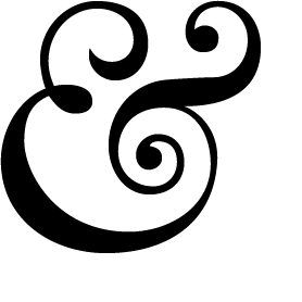
Which may just be my first ampersand of the project - kicking things off in a flamboyant way :)

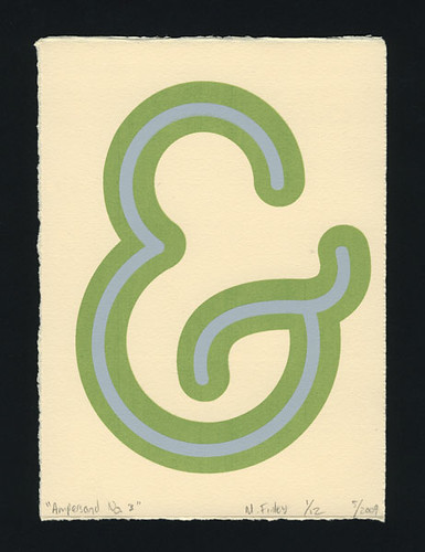
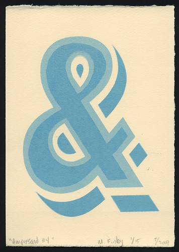
The last project I found is by M.Finley Designs, a final year american uni project where the ampersands will be screenprinted. Sounds like a really great project; there's no images of it on that site, but on his Flickr Page there's a good selection:


An important part is what to call this project. I tried to think of a really exciting name, and very nearly called it The 27th Letter Project. (It's on wikipedia - apparently the ampersand is known as the 27th letter of the alphabet) But I thought, that's a bit ambiguous, so I've gone for The Daily Ampersand Project. I might change it, it feels a bit dull.

So i've started my first one - i'm off to an interview and visit my grandparents so I will finish it tonight and post it here. They will all have the 'daily ampersand project' tag.

Tuesday, October 13, 2009

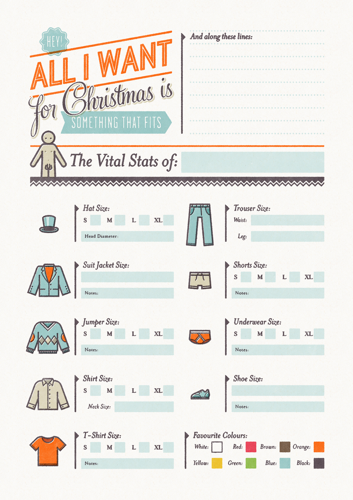
Coveting: Simon Cook's Christmas Cheat Sheets

I saw these and thought they were brilliant. Simon Cook is a very talented illustrator, but also a genius in my books for inventing these 'christmas cheat sheets', which is his "attempt to solve the age old problem of buying clothes for your better half at Christmas time... So basically you fill out one and give it to your boyfriend/girlfriend (or whoever you're expecting a present off), or get them to fill out one for you so you don't blow a surprise by asking for a particular."

Pretty damn simple, and simply damn pretty too:

Clicky for bigger.
This is the girls version - there is also the boys version too. Here's a few close ups:

haha, ring size. Won't be needing that.

I love the retro typography and the really limited colour use, feels very 50s and vintage and I like that. It also has that screenprinted feel which makes it seem very personal and tailored.

I really want to use it myself but don't have anyone to give it to =/ Save parents. And they never buy me clothes. They know better than that.

Great idea though. Found via Drawn!

You can read and see more about Simon Cook aka Cookie over at his website and blog, which is full of tasty things like:

Align Centreand
and
Beautiful.

All images are copyright to Simon Cook of course. Chuh.