My blog has moved!

You should be automatically redirected in 6 seconds. If not, visit
http://rachelsayshello.com
and update your bookmarks.

Welcome to rachelsays... The blog of Rachel Lewis, containing my thoughts and musings on illustration, design, fashion, music, cakey-bakey goodness, culture and things that I generally find cool. There's also a good chance my own illustration work will pop up on here.

All work on this blog is copyright to me unless I state that it isn't. Obviously. Don't do stealing, kids.

So come on in, have a look around, and leave a comment if you like what you see.

www.rachelsayshello.com
contact [at] rachelsayshello.com

Showing posts with label handrendered type. Show all posts

Sunday, February 07, 2010

New Work: 'I Fear The Distraction' Art & Fear Submission

This piece of work was created last week specifically for a submission for Underground Art School's Magazine. Issue 5's theme is Art & Fear and they wanted a focus on hand-drawn typography for this issue. "The two topics seem to go hand in hand. Create, draw, or design us your favorite quotes, lyrics, and positive affirmations that inspire you to move past the fear toward creativity. What are your creative fears? What worries you?"

This is an entirely hand-rendered piece, nothing done in Photoshop except tweak the contrast a bit. It is all rendered in HB and 4B pencil, with a hand drawn version of Adobe Caslon Pro, including ligatures.

I've just discovered ligatures and what they're actually for. I thought they were just typographic decoration. Designers showing off. Not so. "Ligatures usually replace consecutive characters sharing common components and are part of a more general class of glyphs called "contextual forms" where the specific shape of a letter depends on context such as surrounding letters or proximity to the end of a line." So there. And of course, the ampersand is a ligature; of et. Now everything in the world makes sense. There are all sorts of rules too, here's an article that looks at 18th Century ligatures, for all you history people.

Being that I never had any formal typography learnin's during Uni, I didn't know any of this. I am intrigued.

The quote is something I made up, addressing the worries that a lot of freelance artists/designers have when starting up; I need a 'real job' to tide me over before I start making a lot of money from what I do, but I don't want this job to take up so much of my time that I can't create/design when I want to. It's a common thing. I feel it a lot. It's easy to say, oh just do your illustration in the evening/night, but I don't want to do the thing I love at night. It's draining and tiring and above all, I want to spend my working time working on things that I love doing, not in a shop. Etc. The intended slight illegibility of the piece is supposed to evoke the frustration that this situation causes.

The whole idea was inspired by an interview I read in the current issue of Grafik magazine, with Project Projects, where they discuss a similar thing.

I'd quite like to turn it into a screenprint eventually. That'd look ace I reckon. Just need to get near to a screenprinting bed. I can't believe I lost my uni ID - can't use the facilities now :( Major lame.

I hope it makes it into the Issue anyway, I'm pleased with how it turned out; it was a labour of love and took a while, but I love doing hand drawn type and it was a departure from a lot of my work.

Friday, October 16, 2009

The Daily Ampersand Project: Day 2


Today's ampersand is Gill Sans, slightly taken over by the swirl disease, in coloured pencil.

Thursday, October 15, 2009

The Daily Ampersand Project: Day 1


Today's ampersand is ITC Baskerville italic, in pencil. Crisp and simple, good way to kick off the project :)

The Daily Ampersand Project

Since leaving Uni I haven't really started any new projects. I've done lots of drawing here and there but now I think it's time to embark on something with weight and that has structure, and is something I can do everyday and stick to it.

This idea originally started as a Font Book - I wanted to create a small handmade book which included all 26 letters, handdrawn, from 26 of my favourite/most interesting looking fonts. I still may do that, one day. But last night it came to me (I always think of stuff at night, gift and a curse) that this might be more interesting if it just focussed on one letterform - my favourite of which is the Ampersand.* Has been ever since I discovered it in year 5 or something - all my prose at school was filled with '& then jack & jill went to the shops & they met sam & sue', which of course is terrible grammar, improper use of the ampersand, and would mean I got red circles all over my stories. But I loved writing that letter so much! So swirly. I was the only one out of my friends who could do it without it going fat and lopsided.

*I also really like the letter Y a lot, it was a tough call.

So I thought about it, and there are so many crazy variations of ampersands in all the typefaces that I could fill a whole book of them. So this is the plan...

  • Every day, draw one ampersand. They will be hand drawn/traced from an actual real font, or taken from a photograph of any ampersands I find in the real world, or they will be designed by me.
  • I have given myself no limitations on the medium - pencil, biro, collage, paint, stencil, anything.
  • My limitations are that I must not use a computer to create the ampersands, save for scanning the finished piece in.
  • They are going straight into a nice new clean moleskine sketchbook, not a handmade book, which is slightly smaller than A4 - no drawing on a seperate piece of paper and sticking in. Unless it's a collage piece.
  • Every day I will scan it in and post it on this blog.
  • I am setting a target of 30 ampersands - 30 days, starting from today (15th October). If I want I might do more, but no less than 30.
The History of the Ampersand: Taken from wikipedia, click here for more.

The symbol is a ligature of the letters in et, Latin for "and".

The word ampersand is a corruption of the phrase "and pe eminti and", meaning "and [the symbol which] plus this [is] and". The Scots and Scottish English name for & is epershand, derived from "et per se and", with the same meaning. Traditionally, in English-speaking schools when reciting the alphabet, any letter that could also be used as a word in itself ("A," "I," "&" and, at one point, "O") was preceded by the Latin expression "pe eminti" (Latin for "plus this"). Also, it was common practice to add at the end of the alphabet the "&" sign, pronounced "and". Thus, the recitation of the alphabet would end in: "X, Y, Z and per se and." This last phrase was routinely slurred to "ampersand" and the term crept into common English usage by around 1742.

The modern italic type ampersand is a kind of et-ligature that goes back to the cursive scripts developed during the renaissance. After the advent of printing in Europe in 1455, printers made extensive use of both the italic and Roman ampersands. Since the ampersand's roots go back to Roman times, many languages that use a variation of the Latin alphabet make use of it.

I find that quite interesting, I had never really thought of where it came from. While researching this project, I wanted to see if anyone else out there had done anything similar to this; I didn't want to recreate a project that had already been done. There are a few ampersand projects out there but none exactly like this.

Existing Ampersand Projects I have found:

Students from Bath Spa Uni took part in a project to design their own ampersands. They then screen printed them onto t-shirts and took photos. They look pretty damn awesome if you ask me! This was found at an Ampersand Blog, http://ampersand.gosedesign.net/.

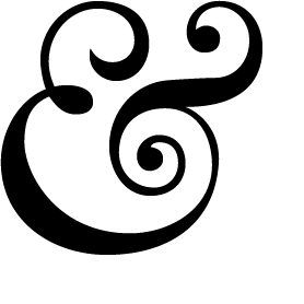
That blog is great for anything to do with ampersands - tattoos, photos, user designed ones, lots of great stuff. And the ampersand they have at the top of the site is one of my favourites - Baskerville 169 Italic, or a variation on that:

Which may just be my first ampersand of the project - kicking things off in a flamboyant way :)

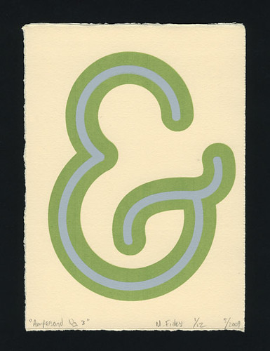
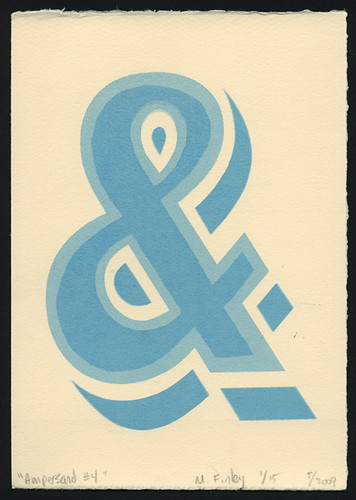
The last project I found is by M.Finley Designs, a final year american uni project where the ampersands will be screenprinted. Sounds like a really great project; there's no images of it on that site, but on his Flickr Page there's a good selection:


An important part is what to call this project. I tried to think of a really exciting name, and very nearly called it The 27th Letter Project. (It's on wikipedia - apparently the ampersand is known as the 27th letter of the alphabet) But I thought, that's a bit ambiguous, so I've gone for The Daily Ampersand Project. I might change it, it feels a bit dull.

So i've started my first one - i'm off to an interview and visit my grandparents so I will finish it tonight and post it here. They will all have the 'daily ampersand project' tag.

Monday, August 03, 2009

David Fullarton - Illustrator from San Francisco

I found David Fullarton's work a while ago now (I've completely forgotten how I came across it, possibly just from my own mintynet meanderings, possibly from another blog) and I'm finally getting round to posting about it.

I absolutely love it. It's got all the factors that make me take notice of another illustrator's work - collage (graph paper mwahaha), hand rendered type, mix media, amazing drawing skills, wit and a touch of melancholy. I can't stop looking through his Behance portfolio - definitely check it out.


I love this one. Made me giggle.

He's also done a series for the Sisyphus Office Exhibition, Houston 2009. - "The artists involved in the project are collaborating with businesses and offices in and around Houston in order to highlight art as an integral and necessary distraction in our day to day life."


Heh. I think we've all felt like this at some point.


I just really love his entire visual language, and the fact that it's entirely handmade is always a winner for me - digital is great but I love the feeling of having something finished (or not) in your hands.

It just reminds me that I really need to keep drawing - I've basically stopped at the moment, haven't done a collage or anything for bloody ages. That makes me sad. Time is so precious these days though, I get home from work every night at about 7.30-8 and end up going to bed at 10 at the latest cos I get up so early... so any creativity (outside of placement - I'm being creative all day there) has to be done at weekends really. And I haven't had a spare weekend for weeeeks so I'm feeling really antsy at the moment because I have a massive to do list. Some of which includes redoing the header for this blog, redoing my website (I don't like it anymore ha), and making my twitter page and avatar pretty. And those are the easy things.

All of which I could do right now if I had a mac! I was bought the entire CS4 suite for a graduation present which is so ace and I can't wait to use it... just need something to install it on :P Cos I bloody hate windows and photoshop. Eugh. Worst combo ever.

Anyway, my placement is going really well, despite the fact I was ill (swine flu? hmmm) last week so missed a day and a half. Including being deathly ill on my birthday. Which was so crap. But I'm all good now and getting proper stuck in, I'm really loving it there. Worcester is so nice as well, really pretty town. (city?)

Enough rambling. I could ramble all day. But apparently I'm going for a run in 20 minutes and I semi don't want to. But fatness has occurred and I must. Sigh. Turrah.