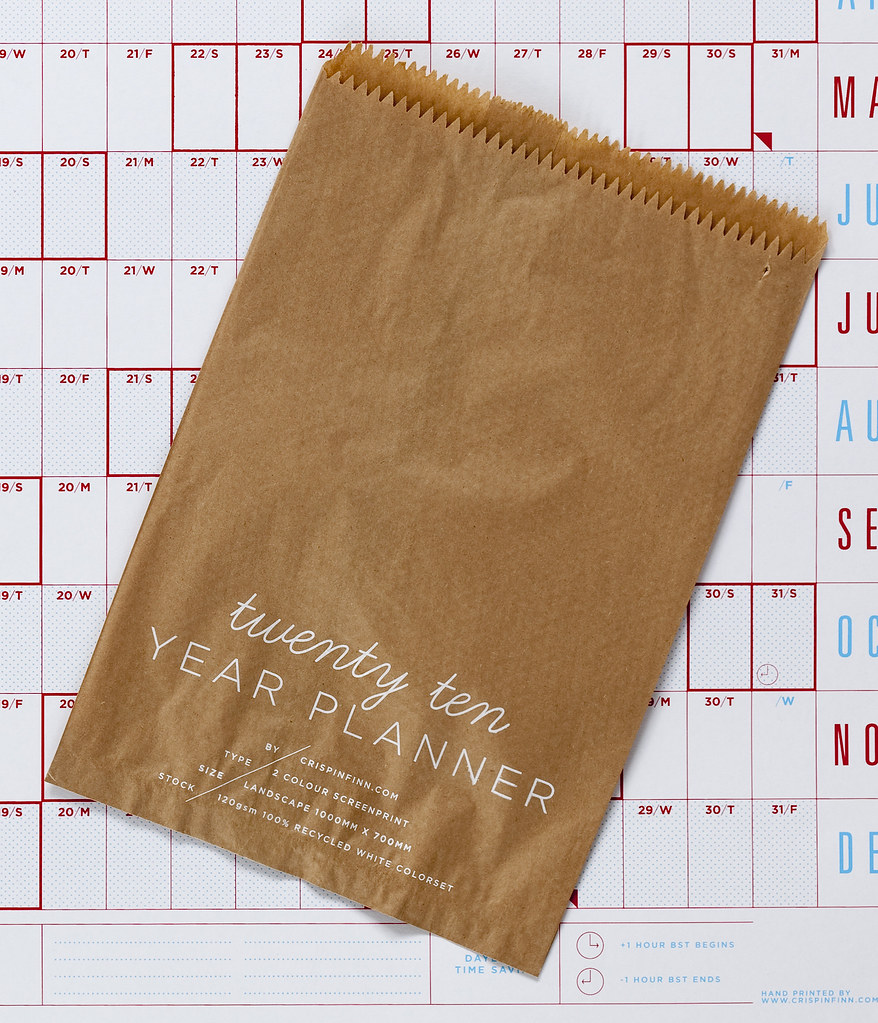
Crispin Finn's 2010 Wall Planner

Here's something lovely. I first heard of Crispin Finn when Grafik Magazine gave away a copy of their 2009 wall planner, probably around the beginning of this year. It's stayed lovingly on my wall for most of the year (I've lived in 3 different rooms so far this year, so it's been up and down) and I have to admit, I haven't actually written on it. It's just too nicely designed and pure and organised that it doesn't deserve to have my random, very un-designed, scrawl all over it.
And I know the point of a planner is to like, plan things. Not just look pretty. But then, that's what I've got my awesome moleskine diary for, and that's certainly been written all over. A lot. So this new one seems even better. What's that? Embossing? Mmmmm.
And the fonts in this one are still so retro/modern (if that exists), I wonder what they are. And the way it says 'twenty ten' in that lovely way... just pure genius.
I'm glad they've stuck with the red and blue too, I know it's their branding colours but the two are just so pleasing together. Very friendly. I don't look at my wall planner and go 'Omg, 3 days til deadline' or 'Omg, only 3 months til the end of this year' or anything frightening like that, I look at it feel a bit calm and lovely. Also, I'm glad that the 2010 version has the weekends highlighted because this year's didn't. Although, weekends didn't mean a lot to me when I was a student, I worked all the time and partied all the time.
It's hand screenprinted too which is impressive, '2 colour screenprint on 120gsm 100% recycled white colorset' apparently. Recycled! Oh wall planner, is there nothing you can't do? AND it comes in this brown paper bag. Which is screenprinted. Pure design porn. *fans self in melodramatic way*
I discovered this through a post over on Creative Review and the images are all taken from Crispin Finn's site. I couldn't find any images of last year's (2009's) one on t'internet, so here's a shot of mine:
I really hope Grafik give the new one away again for next year. Otherwise, it's going on my christmas list. (Although for £10 you can't actually go wrong, maybe I'll just buy it now.)


No comments:
Post a Comment