
Van Doesburg & The International Avant Garde - Exhibition Review
During my regualar London shenanigans I always make a point to visit an exhibition or two. As soon as I heard about Van Doesburg & The International Avant Garde at the Tate Modern, I knew I had to go. That period of art history (early 20th century, up to second world war) is my favourite; so many interesting art movements evolving into one another. For example, Fauvism, Cubism, Expressionism, and Futurism. World War I brought an end to a lot of this but indicated the beginning of a number of anti-art movements, such as Dada, and later Surrealism. Groups sprung up in mid Europe like de Stijl and Bauhaus, who were much more multi-disciplinary, and who developed new ideas about the interrelation of the arts, architecture, design, and art education. Here's a wikipedia list of art movements and groups around this era, it's easier to have them all listed like that.
I've already mentioned Futurism in a previous post, of which I never got to see the exhibition, which made me sad but I wasn't near London at that time.
A few years later, De Stijl (The Style) sprang up, of which Van Doesburg was the leading creator of. This is what the exhibition focused on, as well as Dada, which is my personal favourite art movement ever. Anti-art movement really. More on that in a bit.
Theo van Doesburg was one of the leading figures in the development of geometric abstraction. He wanted to establish a visual vocabulary of elementary geometrical forms which were understandable by everyone and could be adapted to any art form or dicipline; graphic design, architecture, art, anything. He was an artist in his own right but also edited and designed the magazine for the movement, also called De Stijl. He was the original creative social networker; transmitting ideas for a diverse network of artists who shared his same ideals, promoting them, collaborating with them, learning from and influencing them.
The exhibition follows the evolution of De Stijl and Doesburg's work, from his early influences right through to his death. He was influenced by Wassily KAndinsky to experiment with abstraction, sharing his belief that abstraction directly embodied the spiritual qualities that were fundamental to all works of art.


As you walk through the exhibition the pieces get more and more abstract and more basic, so that any footing in 'real objects' is lost. Some of the artists disagreed than abstraction should be rooted in reality at all, like Piet Mondrian, who though that the works should just be metaphorical representations of the harmony of the world. Others believed that anchoring the image in external reality was important, avoiding the pitfall of decoration for decoration's sake.
Room 5 got really interesting for me. This was a collection of De Stijl typography, leading on to exhibits of the original De Stijl magazine itself. In 1919 Van Doesburg designed a new typographic alphabet; as well as bringing modernist design into mass culture, he wanted to provide an appropriate form for writing about and promoting all of the artistic disciplines within De Stijl.
 Cover of De Stijl journal, 1917.
 An inside spread, with poetry; represented visually by different type treatments. This is similar to what the Futurists did, and later Concrete Poetry. The exhibition has quite a few original surving De Stijl's, I loved it. So fascinating, seeing the actual journal and the articles, art and writing inside. It's just like a modern day black and white zine really; only with far more cultural weight as this was the only way art like this could be spread around, and the movement could grow. These days, things are instant and art is accessible anywhere. Twitter, blogs, just the internet as a whole, is how artists connect now. In them days, Van Doesburg was the social network. He got these people together and used his contacts to promote the art.
 Copy of the De Stijl manifest, the rules of the art movement.
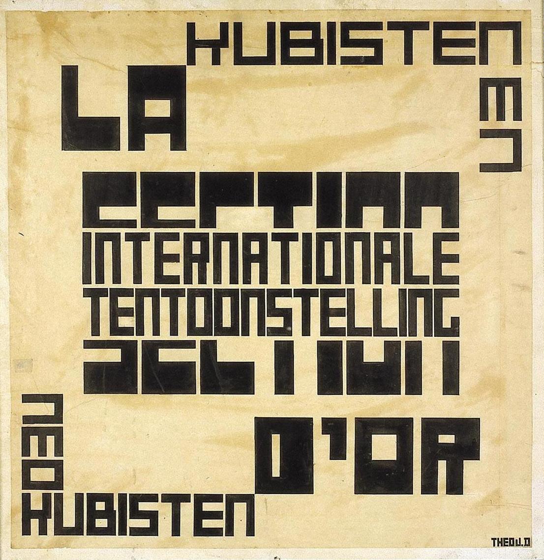 Example of a poster, the text is designed to be read simultaneously as the words cut through each other; they were experimenting with the visual representations of time and how to show it in design and art.
If you're a graphic designer or a design student or just someone who loves type like me, this section of the exhibition is worth it alone. Old school typography, before computers, is so rich and somehow so tactile. You can see the tipp-ex where they've corrected letterforms and the images is almost a collage as they've arranged the text several times before sticking it down to create a poster/advert, whatever they were doing. Many of the De Stijl members were practioning commercial designers and designed theatre posters, product labels and adverts. It's all there, and it's fascinating.
It then moves on to Dada & Constructivism. Here's what wikipedia says about Dada. It's my favourite movement because of the complete absurdity, nonsense of it, and yet it has this twisted logic, this feeling that it makes complete sense and understands the almost pointless endeavor of creating art/beautiful things, such as life can be seen as a pointless endeavour, ultimately. Deep stuff, but I find it fascinating.
From Excerpts of Tristan Tzara's Dada Manifesto (1918): "As Dada marches it continuously destroys, not in extension but in itself. From all these disgusts, may I add, it draws no conclusion, no pride, no benefit. It has even stopped combating anything, in the realization that it's no use, that all this doesn't matter. What interests a Dadaist is his own mode of life. But here we approach the great secret.
Dada is a state of mind. That is why it transforms itself according to races and events. Dada applies itself to everything, and yet it is nothing, it is the point where the yes and the no and all the opposites meet, not solemnly in the castles of human philosophies, but very simply at street corners, like dogs and grasshoppers.
Like everything in life, Dada is useless.
Dada is without pretension, as life should be.
Perhaps you will understand me better when I tell you that Dada is a virgin microbe that penetrates with the insistence of air into all the spaces that reason has not been able to fill with words or conventions."
For Van Doesburg, there was an underlying unity between the anarchic Dada movement and the more ordered aesthetic of De Stijl. They disagreed with the means of how they produced their art, but he had great respect for their ideas. He published issues of the Dadaist review Mecano. Dada art was random, unstructured, meaningless and based a lot on collage and lettering. My kind of thing.


The exhibition also explains about Van Doesburg's connection to the Bauhaus, which was growing in strength at the same time. He wanted a teaching position there but was rejected; so he set up a rival teaching school, however it was less successful. Later, the Bauhaus came to recognise his ideas and De Stijl's importance was confirmed in 1925, when it published writings by Oud, Mondrian and Doesburg.
As I mentioned before, of you're not a fan of cold, sterile, rigid lines and regimented primary colours then you won't like most of the artworks taht illustrate the theories behind De Stijl. I spent over an hour in the exhibition but I did begin to grow tired of the squares and lines. I definitely prefer the theories of the movement more than the physical produces of the artists in the movement. The architecture has more depth to it; I'm not much of an architecture fan (rather, my 2D brain doesn't really get it, but I appreciate it, on some levels) but if you are, or an actual real-life architect yourself, I'm sure it's tres exciting. I didn't come out of the exhibition feeling incredibly inspired to change my art practice to abstraction or anything, but I did come out with a profound understanding of how all these movements and artists worked together, who influenced who, and ultimately, where modern graphic design started and the importance of these pre-war movements.
 Counter-Composition VI 1925
I recommend seeing it. There are so many works on display, and the actual artifacts like the De Stijl journal and Dada works are really interesting. It's a challenging exhibition; don't expect to go seeing pretty things and feel uplifted as you leave. It's very sterile, cold, and exact. Theoretical art is never that beautiful, but it's important.
Other reviews of the exhibition:
Telegraph Review, 1st Feb 2010
Times Review, 7th feb 2010
Guardian Review, 1st Feb 2010
All of the images used have been gleaned off google and encyclopedia sites, copyrights remain with the owners, I'm using them for sake of discussion and analysis.



 Posts
Posts


