I'm having a bit of a freak out recently. That's the wrong word, because it's not. It's more of a gnawing, consistent worry. I am worried about my career. And this is particularly worrying because I haven't even started it yet. I'm not entirely sure why I'm blogging this, but I'm pretty sure it has something to do with hoping that I'm not alone in it. There has to be other Illustration students out there, right now, that are sharing in this vague sort of unease.
First, let me point out that I love Illustration, I love my career choice. But in the past few months or so I've become increasingly aware of how difficult this is all going to be. I didn't ever expect it to be easy, in fact I love a challenge, but the prospect of me graduating and then finding a job straight away, or getting enough commissions to sustain me, seems like an impossible pipe dream at this moment.
But then, having a job you love and getting paid well for it is the Holy Grail, right?
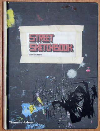
Let me throw some statistics at you. These are from the AOI'S Illustrator's Survey 2008, which can be found here. It's a pretty fascinating read, but here are things that stand out to me:
- 34% of the people surveyed generated the majority of their income from Editorial Illustration. This doesn't surprise me and is quite nice to know actually, being that I enjoy doing Editorial (albeit fake and uncommissioned at the moment) Illustration. Lovely.
- Only 23.5% think that "being an illustrator is very satisfying and I can earn enough money to make a decent living." This is slightly worrying; although what exactly does a 'decent living' mean? Bread and butter or Prada shoes? Somewhere in between?
- 77% of us work at home. This emits a huge 'OMGZ' from me because that's my idea of hell. I. need. to be. around. people. More on this later.
- 22.4% (The highest percentage of all the choices) earn between £0 - £1,000 a year from Illustration. Eek. That's not a lot. But wait...
- Just 7.2% earn between £30k - £40k. 9.8% Earn over 40k. That's not a massive percentage. Well done to those who do earn over 40k though, that's quite...immense.
- However, 30.3% earn LESS than a quarter of their annual income through Illustration. Which means they've all got other jobs. Which is something I have accepted I will have to do maybe for the first year or so but not as a long-term thing. I don't want to be an Illustrator/Waitress. Hi, what do you do? I'm an Illustrator-slash-receptionist. You?
However, I have deducted that, the same amount of people (roughly), who disagreed that "being an illustrator is very satisfying and I can earn enough money to make a decent living," are the same people who earn between £0 - £1000 a year from it, and so are the same people who earn less than a quarter of their annual income through Illustration. Right? So what about the rest?
I guess what I'm preoccupied about is that I want to be good. I make no apologies for the fact that I expect highly of myself, push myself, and want to succeed. So I want to be in that top 8% (ish), earning £30k or more. Of course I do. But 8% of all the thousands of us who will Graduate this time next year is not a lot. To get there I have to work damn hard. And that's fine, that's not what scares me. I suppose what I get scared about are my own limitations. I'll look at some
amazing Illustration/Design/whatnot and think the same old, 'Wow, I am never going to be that good. I'm graduating into the actual real world where actual real people get actual real jobs in one year and I am not that good. I'm going to be a receptionist,' school of thought. Which isn't productive, but what if I'm just
not that good. There's a thought. Failure. What if I want the £40k and the 18 hour days to finish the commission and the sleepless nights and the recognition and the amazing studio with my imaginary Collective and the Prada shoes and.... I'm just not quite good enough. Do we all think like this, us aspiring Student Illustrators?
I suppose there's never an answer to this unless I push myself the hardest and give it my all and be original and be clever and be pro-active, and a little bit lucky, and go out there and find the jobs, and then I'll either be on the ladder on the way or I... won't be. But I know that there's nothing I can imagine myself doing except this. There is no Plan B, because Plan A is what I want to be. So I have to get this right. That's possibly the scariest part of all.
Like everyone, I have short term and long term goals. I need to Graduate. That would help. But first I'd quite like to get a commission. I think that would perhaps calm the little nagging feelings if I know that someone somewhere likes my work and wants to pay me for it. That's what it's about after all, isn't it. But of course to get the coveted first commission people have to actually know I exist. Self promotion first then, eh. But I also think of all these long term things that I want to do, with my imaginary perfect studio and dreams of personal projects and collaborations and all sorts. Maybe I just want the world.
As a side note, and following on from Bullet Point number 3, I read a quote, and it completely slips my memory who said it, but it was something like, "if you want to be an artist, you better like your own company." This really struck me. As an illustrator, I probably should like being on my own if I'm going to do this. That whole image of the lone illustrator working out of the back bedroom. So there is this side of my personality that doesn't quite sit right with my career choice. This adds to this vague worry that is the theme of this post.
Of course, I'd quite like to have a shared studio or even eventually start a Collective. If if maybe.
So I suppose this is just my reach into the dark, with the question, Do we all think like this? 'We' being aspiring Illustrators. And 'this' being the Vague Worry.
Or is it just me?


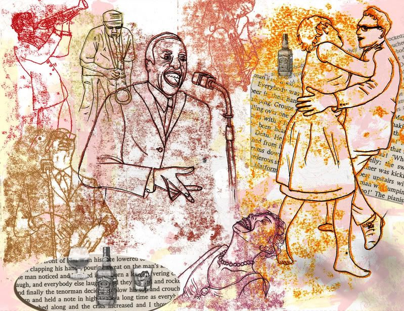
 This spread is supposed to have a yellow theme; yellow ink, yellow text. I have no idea why it's uploaded like this.
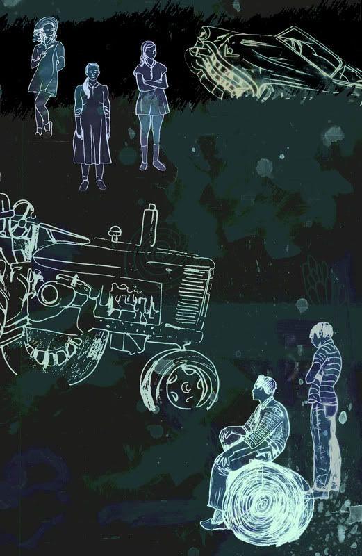
 And again, why does this look brown when the first spread was the right colour? Black black black.

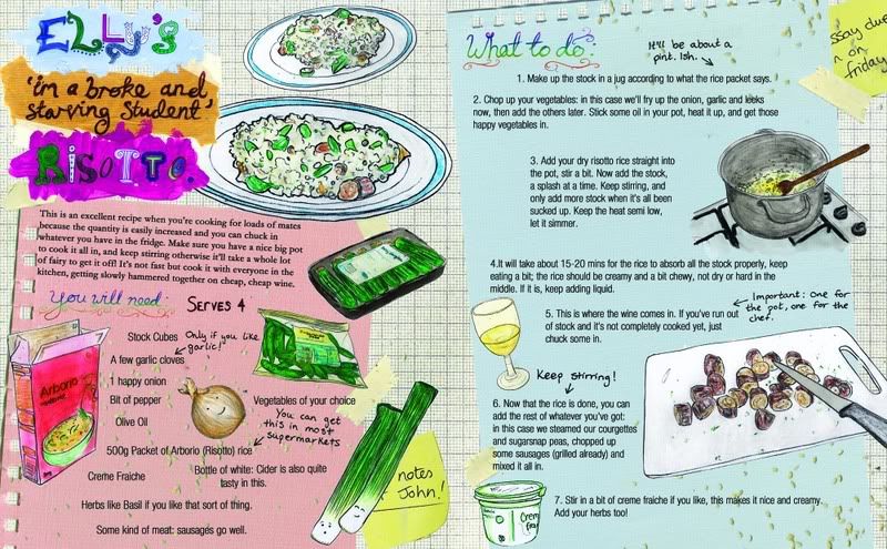
 This is just weird. Psychedelic colours. Sigh. How frustrating. I'll try and sort this out later.


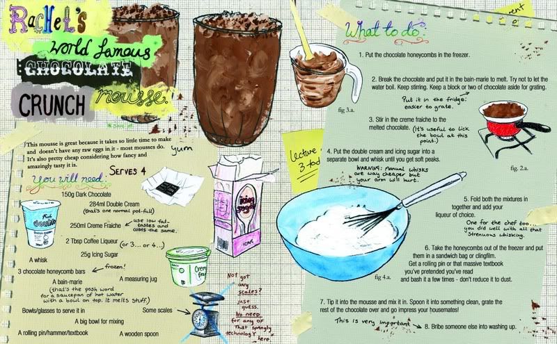
 And here; why has the text randomly disappeared!! It's a jpeg for god's sake. No layers involved here. Silly.
 But yet you can see the text here?