I found out about this a few weeks back and completely forgot to blog about it, so I'm doing it now. I always spend my money on art books and I don't think that's a bad thing. I won £100 of Amazon vouchers last year and that was immense; got so many good books. However, I want to keep adding to my collection so I'm going to have a look at the books mentioned here and see if I want any. Or all. All would be nice. Seeing as they're a set. Ha.
To celebrate 60 years of Thames & Hudson, they have created a collection of 20 books, each with special edition covers, that encapsulate the range of books that they publish. From their website:
"Thames & Hudson was founded in 1949 by Walter and Eva Neurath. Their passion and mission for T&H was that its books should reveal the world of art to the general public, to create a ‘museum without walls’ and to make accessible to a broad, non-specialist reading public, at prices it could afford, the research and the findings of top scholars and academics. "
Which is pretty much exactly what they've done. They always publish really interesting books and I'm excited about this collection, they've picked some great books and some that I haven't heard of, and it's making me itch to 'complete the set' as it were. All of these have been previously released in 'normal mode' but they've just decided to give them all a unifying cover design so they function as a set. I'll post all the titles in the range, probably tell you if i'm interested in it, go check it out in the library soon-ish, update with a lil' review, then tell you if I buy it. Right now I can't comment on the design/layout as I haven't seen most of them so that'll get mentioned too.
So this is what I'm calling a 'live' post - definitely leave comments as I go along guys, if you've got any of these books, would be nice to have a little collective of opinions. I'll blog on the main page whenever I have anything new to say on this post.
That sounds like a plan. A very long plan. Er.... Let's have a look....

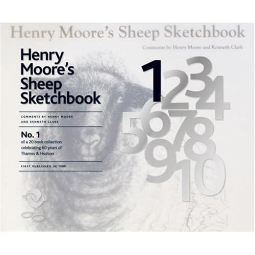
1.
Henry Moore's Sheep Sketchbook.Apparently, Henry Moore liked to draw sheep. Well, why not, I say. If you're really into Henry Moore then this will probably be quite a nice purchase, reproductions of artist's sketchbooks usually are quite interesting and insightful. Probably not one that I'll rush to buy though. I'll see if it's in the library (I'll bet it is) and see what it's like.
Amazon link.
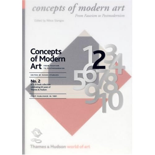
2.
Concepts of Modern Art by Nikos StangosI quite like having books like this - something to dip in and out of and refer to every so often. I'm quite a fan of some (not all) modern art movements and find the theories and concepts behind them really interesting. (See my
Futurism post) so I'll definitely check this one out.
Amazon link.
3. The Shock of The New: Art and the Century of Change by Robert Hughes
For some reason there's no link to this on the Thames & Hudson website - there's 2 and then there's 4.
Look. So you'll just get the Amazon link. Reading the reviews on there, this seems like a really good book - I'll definitely buy this one I think. I lack 'general art' books, as I'd call this.
Amazon link.
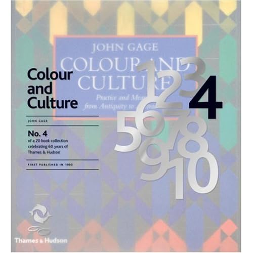
4. Colour and Culture by John GageThis is basically a big book on colour theory. While interesting and actually quite relevant to my work, I never really read much on colour theory during my course. Possibly should have. I just find the idea a bit dull... I'll have a flick through this, and unless it's amazing I doubt I'll be rushing to get it. I may be proven wrong; I might suddenly love the whole idea of colour theory. Who knows. Let's find out.
Amazon link.
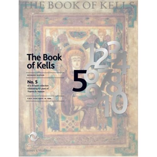
This doesn't really interest me at all to be honest. Maybe it's the religous aspect to it, or the fact that I don't love medieval art. I recognise how important manuscripts have been in shaping books and art in general, but to be honest, this just doesn't float my boat. It's probably nice to flick through, and I'm sure some people would love this kind of thing, but I don't.
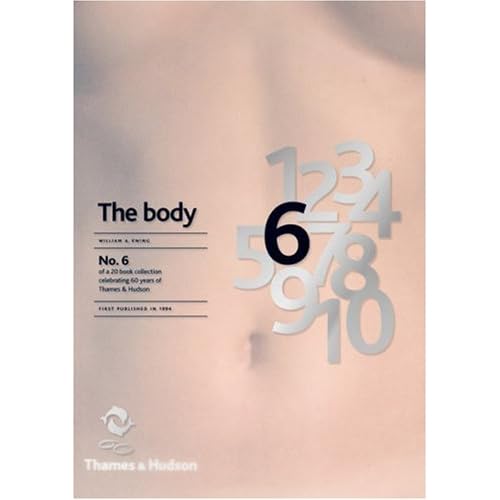
Amazon link. 6. The Body: Photoworks of the Human Form by William A. Ewing
I don't actually own any photography books - I should do, I'm sure. This one sounds fairly interesting - different photographers through the ages depicting the body in various ways and meanings. Could be cool. I'll let you know.
 7. Derek Jarman's Garden
I definitely want to take a good look at this one. The premise sounds awesome: "It is a fitting memorial to a brilliant and greatly loved artist and film maker who, against all odds, made a breathtakingly beautiful garden in the most inhospitable of places – the flat, bleak, often desolate expanse of shingle overlooked by the Dungeness nuclear power station." What an amazing concept. I love the idea of new things growing from death and desolation, this book documents the growing process of the garden and I bet it's fascinating. Actually my mum would probably like this, she's very much into gardening. Actually, gardening has suddenly got really 'cool' recently -
even the fash pack are doing it - which amuses me slightly. It's not exactly a bad thing though, us young, trendy people
should be interested in nature and plants and growing your own vegetables and pretty things. This is a tangent. Back to the books.
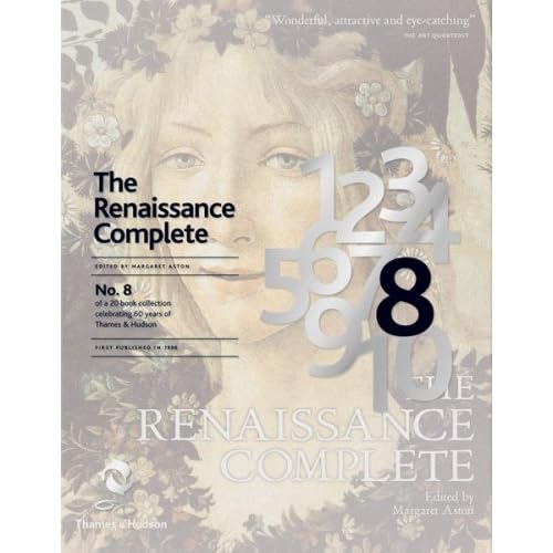
 8. The Renaissance Complete by Margaret Aston
All about the Renaissance, basically. Can't really say a lot until I have a look. I'm not rushing out the buy it though - the renaissance was arguably the most important period in history for art and culture but I'm not sure if I could take a whole book of it.
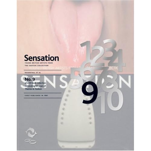
 9. Sensation: Young British Artists from The Saatchi Collection
This could be good. I don't know a lot about the exhibition this book is centered around, which was called 'Sensations' and ran in the early ninties; showcased artists like Tracy Emin, Damien Hirst, Rachel Whiteread, all of who are terribly famous now. But as I was probably about 6 when this exhibition was running I'm sure I can be excused. I'll reserve judgement because I have strong feelings about some 'modern art' but then love others. Tracy Emin's tent I though was actually quite good. The unmade bed though, oh dear. Apparently this exhibiton was quite important to British art so this book should hopefully educate me a bit. Innit.


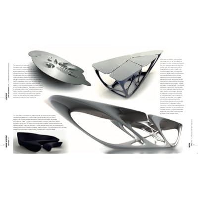
10. The Complete Zaha HadidSo this is the first book that I've found inside spread images on Amazon. I'm not hugely into architecture - too technically and maths based for me. So I can't imagine I'll look much at this really. From what I can see, her building designs look quite interesting, but yeah. It's architecture. I'm not really an architecture girl unless I'm looking at some kind of Georgian/Victorian features. The most I can say is 'Ooo I like that, that's nice'. I stick to 2D designs.

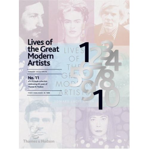
11. Lives of the Great Modern Artists by Edward Lucie-SmithThis on the other hand, looks great; I love reading about the background of artists that inspire me. Hopefully it's more than just a collection of run of the mill biographies - a bit of a deeper insight into the way that these 'great modern artists' think and operate would be really tasty.

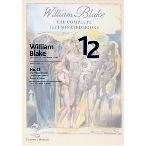
12. William Blake: The Complete Illuminated BooksAh, good ol' Will B. He's a bit of a staple of my humble literary/artistic state school education. Definitely worth a look, this one. "This edition, produced together with The William Blake Trust, contains all the pages of Blake’s twenty or so illuminated books reproduced in true size, an appendix with all Blake’s text set in type and an introduction by the noted Blake scholar, David Bindman." Nice one.
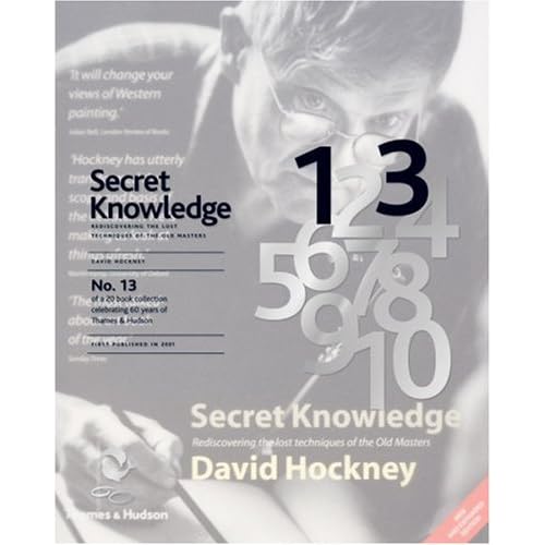
 13. Secret Knowledge: Rediscovering the lost techniques of the Old Masters by David Hockney
Quite an interesting premise this one, I can't really explain it better than this: "
Secret Knowledge created an international sensation when it was published in 2001. David Hockney’s enthralling story of how some of the great works of Western art were created with the help of mirrors and lenses and how the optical look came to dominate painting attracted major media attention around the world and generated intense debate in the fields of science and art history." I'll have a look at this one excitedly; in fact it might even go on my 'to buy' list. (Which is extensive). It sounds a fascinating read, I don't know a lot about the old Masters aside from who they are and their most famous pieces of work. Everyone knows they are geniuses... uncovering exactly how they produced the stunning artworks that they did, especially with David Hockney doing it, sounds awesome.
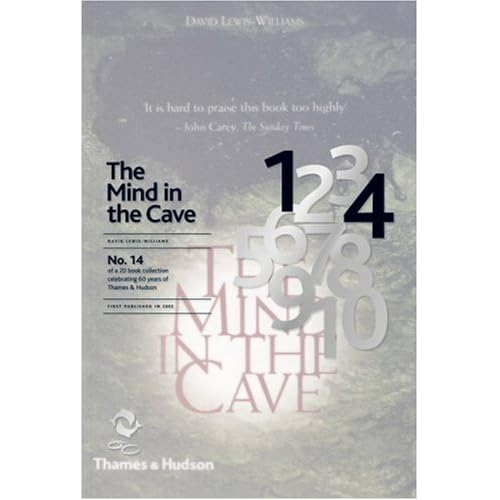
 14. The Mind in the Cave: Consciousness and the Origins of Art by David Lewis-Williams
Cave painting, many would say, is the first example of illustration in human history. I'd tend to agree with that. Illustration is essentially either story telling or depicting an idea, which is what cave paintings generally did - before letterforms and written language were developed. So this could be a useful one for me, it definitely makes me curious.
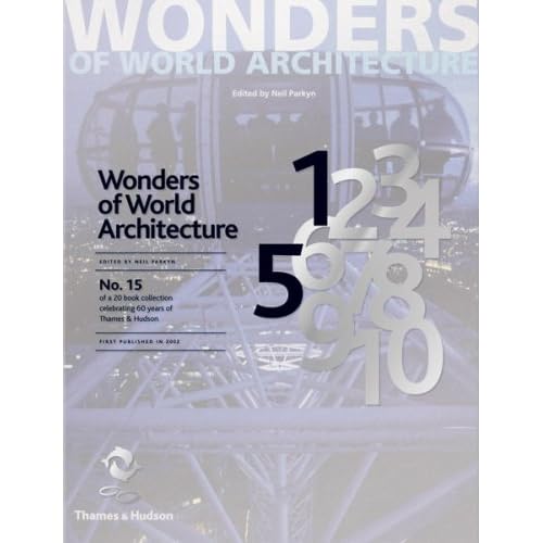
 15. Wonders of World Architecture by Neil Parkyn
Well, it's an architecture book, and as previously mentioned, I don't dig this. I'm sure it'll be pretty to look at with some breathtaking feats of engineering and the like, but, you know, I'm just not that interested =/ As all the other books in this series though, I'll give it the once over when I find it. It might be awesome, who am I to judge? I feel a bit guilty for not getting over excited about building design. I don't do 3D, ok.
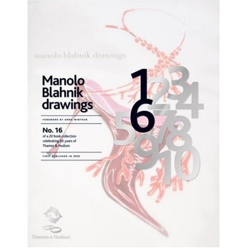
 16. Manolo Blahnik Drawings by Anna Wintour
This on the other hand, is first on my list. I love Manolo Blahnik shoes... of course I don't own any but they are definitely some of my favourite elaborant shoe designs and his drawings are just amazing. So fluid, and dramatic, and just uber everything. Maximalism at it's best. As most people know I do love a bit of high fashion and couture (from afar) and fashion illustration is so exciting to me. It's strange because I don't actually do much fashion illustration even though fashion is really important to me =/ Probably something to do with the fact I still can't draw figures as well as I should. Sort it out Rach. Oh, and the foreword is written by Anna Wintour, who is a fashion legend. She's who they based Devil Wears Prada on. Awesome.
 17. Sneakers: The Complete Collectors' Guide by Unorthodox Style
If you're into 'sneakers' (or trainers, as we like to call them over here) then this looks pretty sweet. I'll bet it's fun to look at even if you're not obsessed with casual footwear. I'll give this more than 2 minutes of my time for sure, but probably wouldn't buy it. I'm more of a heels girl. See no.16.
 18. Factory Records: The Complete Graphic Album
Even the title of this makes me wee a bit. This book looks immense. Everyone knows how awesome and influential Factory Records were in the 80's (was it 80's? I'm pretty sure), and this book is full of album covers, poster designs, everything visually tasty from the legendary record label. This is also high on my list - I'm a sucker for music design of every kind and can't believe I never knew about this book until now.
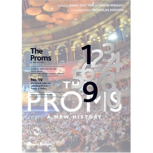
 19. The Proms: A New History
Er. I'd be lying if I said I'd ever watched the proms. Not really one for me, this book. I'll give it a browse but it's probably aimed at someone who is a bit more interested than I am. Oh how uncultured of me.
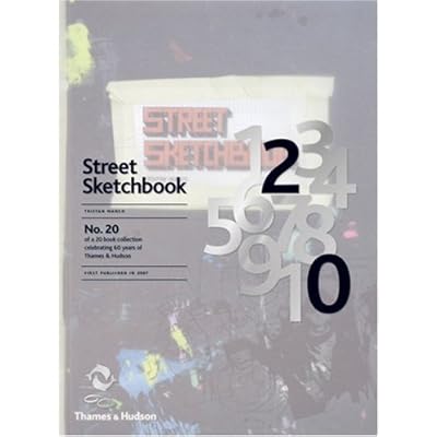
 20. Street Sketchbook by Tristan Manco
Hurrah! The one book I own in this collection :) I can actually tell you my actual opinions about it now, actually. The author, Tristan Manco, did a lecture at my Uni, Wolverhampton a while back,
I mention it here, really interesting; he's actually a graduate of my Uni so isn't that cool. He's a bit obsessed with graffiti and street art and has become a bit of an authority on it, going all over the world and talking to the artists who make it happen. The main reason why I love this book is because it has rounded corners - it feels like an oversized moleskine. Which is a bit exciting to a strange person like me. And the cover feels nice. Haha. But honestly, this is a great book because it's split into two halves - one half is 'street', images of the graffiti in situ, and the other half is 'sketchbook', all the sketches and initial doodlings and ideas from these artists, which is my favourite half. I love seeing sketchbooks from any kind of artist, but graffiti artists in particular because there's no preconceptions, (and often no observational drawings) just purely what comes out of their heads. It's a great book and I'd recommend it to anyone who has an interest in visual communications, not just graffiti art.
What an epic post!
(All the images are just copied and pasted off Amazon btw, I don't own them.)
Lastly, I can't round up without featuring the Limited Edition cover design. I think it's brilliant, really subtle but ties all 20 books together so well. The idea of having this semi-transparent layer over the top of the original covers, with the number of the book in black bold - looks really good. I love how all of the numbers are there, faded out in grey, then just the ones that are needed are picked out; they never move from book to book, it's just the correct numbers that are picked out in black. And it doesn't feel like it interfers with the original cover too much - repeating the title over the top in the same type and positioning on every book helps bring the series together visually, and it makes it easier to read which is a bonus. Nice one, I can't really fault it. I want to see one in real life now. Off I go...