My blog has moved!

You should be automatically redirected in 6 seconds. If not, visit
http://rachelsayshello.com
and update your bookmarks.

Welcome to rachelsays... The blog of Rachel Lewis, containing my thoughts and musings on illustration, design, fashion, music, cakey-bakey goodness, culture and things that I generally find cool. There's also a good chance my own illustration work will pop up on here.

All work on this blog is copyright to me unless I state that it isn't. Obviously. Don't do stealing, kids.

So come on in, have a look around, and leave a comment if you like what you see.

www.rachelsayshello.com
contact [at] rachelsayshello.com

Showing posts with label book design. Show all posts

Wednesday, May 19, 2010

Coveting: Computer Arts Book of Inspiration

This is a fairly simple thing to covet - it's not out of my meager price range so will probably be in my happy hands in no time. I thought of waiting until then but I want to share it now - it looks so tasty. Computer Arts' Book of Inspiration:


Looks pretty sexual doesn't it. "The Book of Inspiration is a new luxury volume from the makers of Computer Arts magazine, featuring 192 pages of the world’s very best digital art, design and illustration."

It's £14.99, and has interviews and work from some really inspirational people - James Jean, Non-Format, Neville Brody, Airside, Hort, Vault49... It's also got a  foil blocked and die cut cover, which is always a winner with design fetishists. Like moi.

I wouldn't say that it's particularly groundbreaking - I can't see any emerging artists there, just established ones with amazing work. Which is nice, but these people already have their work everywhere. Inspiration comes in many forms, and it is nice to have books like this to flick through. 

Once I've bought it, I'll tell you more...

Monday, January 11, 2010

How to: Make a Self Promotional Mini Portfolio

There have been various options going round my head of how best to make this sort of thing. I really enjoy bookbinding, even though I've never actually been taught properly how to do it; it wasn't a part of my Uni course at all. But, like most things, that never stopped me. I made all my own sketchbooks in the last 2 years of my course, nothing fancy, just binding them myself when I was all done. Then, for my Seven Sins project, I made a handmade book as the outcome, of which you can see here. I followed a tutorial in Computer Arts, which you can download the PDF of here. It was definitely a trial and error thing, and a labour of love. Came out well but much too time consuming to make 20, or 50 of. Which is about how many I need, to promote myself effectively.

So after a bit of internetting, I decided upon a Concertina book. Seemed the easiest to make and the easiest to alter the contents of, from book to book; this means that I can slightly tailor the insides according to who I'm sending it to and what sort of illustration they commission. Aha.

You can buy books that teach you how to make handmade books, the simplest one I found was Handmade Books: Binding, Folding and Decorating by Heather Weston. Cheap, too. I probably will buy it at some point (I wonder if you can get it at the library..) but as I'm trying to spend as little money as possible here, I just found a tutorial off the internet and made it up as I went along.


Here's how I did it.

1. Learn how a concertina book works.
The websites that I found seemed to make it sound harder than it is. Basically, you need lots of sheets of paper, the same size, folded to make a small flap on each side to glue to the next piece, and so on, until you get one long massive piece of paper that folds together. You then need some hard board, slightly bigger than the area of the paper, to stick to each end, and end papers if you want. That's about it. You can get complicated with spines and all that, but I'm doing simples.

Taken from this website - follow it if you wish, it's not so simples.

I decided that I wanted my book to be A5, landscape - A5 is a good size for a mini portfolio, and I chose landscape because a lot of my work is landcsape; just fits the pages better.

I did a lot of experimenting with scrap paper to figure out how to fold the flaps and where they had to be:


Before I decided to go landscape.It's a lot easier to do this because you can figure out what side the flaps have to be in relation to which side of the paper is getting printed on.

So I decided that the easiest thing for this was to set up an A4 portrait sheet, with the flap folds on the right hand side, of 7mm. Then I could slice each sheet in half once printed to make my A5 landscape ones, and glue together.


2. Set up a document in Indesign/Illustrator to work from.

This is probably the most important step, so spend lots of time getting it right. I used InDesign for this as you can set up the Master pages then just add content from there, but I guess you can also use Illustrator just as easily, with separate layers for each page. Whatevs.

If you click on that image up there you'll be able to see what I did a bit more clearly. Use whatever system you find easiest; this is just one that I understand and know works. Again, experiment with it, print out some test sheets, find out if it all works ok.
Gridlines and margins obviously don't print, so I added tiny dotted lines so I knew where to fold, and where to cut, once it was printed. Image above is without margins etc. Nice.
Experiment with colours and fonts at this stage too. Before you print out 20. Just a heads up.

Once you have the format perfect, save it, and keep it forever - you can change images, add or take away pages etc, but your rules and spacing will always keep it pretty.

3. Start adding content.
This is the fun part.

Add your images and descriptive text, fiddle about with alignment, size, etc. I added a few more rules for myself at this stage, like where to align the text to, etc. It all ends up quite organic though, if you want to ignore your lovely grid, then do. It's what looks best, after all.
Choosing fonts is important - I went with 2, which could even be too many, one more decorative for my website title and one for the descriptive text. I decided a sans serif font was less conspicuous, as a lot of my work already has type in it and I wanted to be as discreet as possible. So Gill Sans saved the day.

4. Print out your pages and start folding.
Start off with printing enough for just one book first, ok. You just don't know if something's gone tits up and you have to reconfigure your creation. Once you've made one from start to finish perfectly, then you can get into assembly line mode and make as many as you need.
So here are all my lovely pages. I figured out while doing this that when assembling single pages like this, your first page's flap needs folding up, the second one needs folding down, and so on. The flap sticks to the underside of the next page, so you'll see why.
Eventually they were all stuck together in a several foot long book of joy. I just used pritt stick (other types of glue stick are available) but a more permanent choice would be double sided tape.

Next I added coloured end pages to each end - just so the hard board has something interesting to stick to. I chose blue because... I like blue.


What the book looks like as you turn each page over.

The front page, with the blue end papers. My hand looks strangely tanned. It's not. I'm as white as a sheet =/
The back, which I'm going to add something to; more later.

It's already pretty lovely, but won't withstand any kind of manual handling.

5. Make it sturdy.
You need some kind of hard board or mounting board for this. These days you can get mounting board in all kinds of colours, which would be a fine choice. I however, wanted to go for the more rustic, grey board look, for reasons you shall find out.

Cut your board so that it's about 1cm larger than your paper on every side. This means that it's all protected inside and has an attractive overhang.

Don't stick the hard board to it yet - we need to decorate it.

This is the back of my portfolio. Before sticking the end paper down, I made 4 slits to hold one of my postcards. This is just so that the recipient has something to stick on their desk/wall too - the dangers of a mini book like this is they get looked at, then put in a drawer. Postcards are more likely to be left in a place where they'll get looked at.

6. Design your cover.
You can do this anyway you like. Draw on it, screenprint it, stamp it. I'm banning glitter though. No no.
What I have decided is to use tracing paper as an overlay onto the card. That way, you can still see the natural colour of the board, but with a layer of plastic-ness. It's a nice juxtaposition, and you can print straight on to tracing paper, if you've got an inkjet printer.

I designed a simple pattern for the front, and decided to just go with my name. I could have done 'Rachel Lewis, Illustrator' or 'portfolio' or something, but I think you need something striking and uncomplicated. This fits in with the rest of my identity (speech bubble, colours).
Cut the corners of the tracing paper and fold round the back of the board - stick down. Don't stick the front, just the underside - that way there's a slight separation from the board and the tracing paper, which I think gives a nice feel.

7. Attach the hard board to the book.
Stick your end papers to the board with something better than glue stick - double sided tape is best, or industrial strength glue. Don't glue your hand to your face.

8. Admire your handiwork.


The one thing to remember about a concertina book is that it will all just fall out into one big line if you're not careful. You can fold it like a book but if you drop one end it'll just concertina out. Of course. So you might decide to seal the pages together, if you feel that's an issue. Make sure you include all your contact details somewhere in or on the book - in my case, I used my business card stamp to stamp the reverse. I'm also going to experiment with paper luggage tags too, as a 'to and from' thing.

9. Make as many as you need and send the bad boys out to prospective clients.
This particular one was made to leave behind at a recent interview I had, at AMV.BBDO. I'm buying more hard board tomorrow and spending this week making ones to send out. Having spare ones at hand to take to interviews/portfolio meetings is a good idea I think. And remember what I said, you can customise each book with different examples of your work in relation to who you are sending it to.

Good luck! And if you make this, please leave a comment telling me how you went with it! :D

Sunday, December 06, 2009

Book City Jackets - Make Every Book Beautiful

I stumbled across these lovely little things, from Book City Jackets. A great idea:

"Even as you polish off Eat, Pray, Love and dive into the Twilight series*, “Reading List” ensures that you always look classy. Perfect for the aspirational reader. $12 for set of 3."


Basically, if you're reading a book that's kinda not cool, or has a rubbish cover, or is one of those stupid 'How to be amazing at everything' self help books that you SHOULD be embarrassed to read, you stick these wonderful modern/bauhaus esque looking book covers on. Minimal and typographic porn. And you look clever because you're 'reading' some great literary classics. Noice.
Alternatively, they always do Artist editions, which are my favourite:


Now how lovely are those? They are also accepting submissions for new artists covers, I'm going to see if I can get in on the action.

So you could be reading the worst book ever and you just look cool. A great idea and not too expensive either. A great christmas present for that friend you have who always read's Katie Price's 'novels' and similar drivel. Instant classiness.

Also; "Our covers are off-set printed on recycled kraft paper in downtown New York and “fold-to-fit” almost any book. A Book City Jacket isn’t just beautiful — it also protects from spilled drinks and prying eyes and provides a convenient space to doodle and jot down notes. Book covers were a good idea in junior high school and they’re a good idea now."

Recycled + Brown paper + New York + doodle approved = Rachel likes.

*And yes, I have asked for the Twilight series for Christmas. Can't actually wait. Although I'm not actually ashamed - I do find the twilight covers quite pleasing. Everyone has said the books are better than the films. And the films have been AMAZING. Sooo... yep.

Thursday, November 19, 2009

Penguin Design Award 2010


The Penguin Design Award is such a great competition, I can't really ignore it this year, even though I'm not eligible to enter any more. Such is the way of non-studentness :( However, what's interesting is that for the first time, they are letting MA students take part. This is good news for me as I still aim to do my MA in the next year or two.

I entered in 2008 and 2009, and was lucky enough to be shortlisted for 2009's Penguin Design Award, and it's definitely one of the highlights of my career so far. I blogged about the Awards Presentation Evening back in June, had such a brilliant time, met the other finalists and chin-wagged with the likes of Jonathon Barnbrook and Amelia Noble. Pretty sweet.

This year, they've also added the option to not only design the cover of a Penguin book, but also a Puffin children's book. Which is good as children's illustration is so much harder than you'd imagine. I actually hated it in Uni but that's by the by. Can't be amazing at everything ;) Ha.

So for the Puffin prize, the cover to illustrate is Alice in Wonderland. Which at first is amazing, that story is a classic and there's so much interesting visual imagery that comes to mind instantly. But then you think - actually, it's been done so much. I think it'll be extremely tricky to produce something original:

"Alice’s Adventures in Wonderland was first published in 1865 and has remained in print ever since. Next to the Bible and the works of Shakespeare it is one of the world’s most widely translated works of literature and is the most famous children’s fantasy ever written. Full of riddles, puns and wordplay, it will appeal to readers of all ages, whether they are discovering it for the first time or revisiting it once more.

Students are invited to design a whole new cover look for this classic, reinventing it for a new generation of child readers and ensuring that it remains an integral part of childhood."

That's a challenge and a half.

The Penguin award is equally as good though. The cover to design is for Perfume by Patrick Süskind, which I've never read. There was a film wasn't there? I think I've seen that, it rings a bell. "Survivor, genius, perfumer, killer — this is Jean-Baptiste Grenouille. He is abandoned on the filthy streets of Paris as a child, but grows up to discover he has an extraordinary gift: a sense of smell more powerful than any other human’s. Soon, he is creating the most sublime fragrances in all the city. Yet there is one odour he cannot capture. It is exquisite, magical: the scent of a young virgin. And to get it he must kill. And kill. And kill …"

Yes, I definitely need to read this book.

So I thought, even though I can't enter (boohoo), I'm going to read the book and design a cover anyway. I love illustrating book covers and haven't done a good one in a while; I need to beef up my portfolio with new book covers so this is a great brief for me. The actual submission deadline is sometime in April next year so that's not putting the pressure on me; I imagine I'll get it done before then though as I won't be caught up with mountains of uni work, bar crawls, dramas, impossible ambitions, dancing, pointless lectures, that thing called 'learning new stuff' and endless hangovers any more.
Yay for being a graduate =/ *cries*

Another interesting note to mention is they've slightly changed the judging procedure this year. "To make the process even closer to the way a jacket designer works, once the judges have selected the shortlist, the Penguin / Puffin Art Directors will give the shortlisted entrants feedback and further art direction on their cover submissions. Shortlisted entrants will then be invited to resubmit their work, taking all the comments on board, before the final round of judging." Which I think is really good; real-life design has near constant changes and amends thrown at you so it's good to have a bit of experience at this.

Lastly, the guest judges for the Penguin Award are Marian Deuchars and Will Self. I know right, oh em bloody gee. Both are legends. Lucky people! Good luck anyone who enters, if you get to the ceremony like I did then don't stand around scared chucking wine down your throat like I did until I spoke to people; get in there and talk to these people. They have good advice. It's not that scary. Maybe a bit. The free wine helps. And they literally were forcing it on you, awesome waiters, didn't even have to ask, haha. Good times.

To see my entry last year, have a look here.

Friday, June 12, 2009

Thames & Hudson 20: An ongoing post of my humble thoughts and opinions

I found out about this a few weeks back and completely forgot to blog about it, so I'm doing it now. I always spend my money on art books and I don't think that's a bad thing. I won £100 of Amazon vouchers last year and that was immense; got so many good books. However, I want to keep adding to my collection so I'm going to have a look at the books mentioned here and see if I want any. Or all. All would be nice. Seeing as they're a set. Ha.

To celebrate 60 years of Thames & Hudson, they have created a collection of 20 books, each with special edition covers, that encapsulate the range of books that they publish. From their website:

"Thames & Hudson was founded in 1949 by Walter and Eva Neurath. Their passion and mission for T&H was that its books should reveal the world of art to the general public, to create a ‘museum without walls’ and to make accessible to a broad, non-specialist reading public, at prices it could afford, the research and the findings of top scholars and academics. "


Which is pretty much exactly what they've done. They always publish really interesting books and I'm excited about this collection, they've picked some great books and some that I haven't heard of, and it's making me itch to 'complete the set' as it were. All of these have been previously released in 'normal mode' but they've just decided to give them all a unifying cover design so they function as a set. I'll post all the titles in the range, probably tell you if i'm interested in it, go check it out in the library soon-ish, update with a lil' review, then tell you if I buy it. Right now I can't comment on the design/layout as I haven't seen most of them so that'll get mentioned too.

So this is what I'm calling a 'live' post - definitely leave comments as I go along guys, if you've got any of these books, would be nice to have a little collective of opinions. I'll blog on the main page whenever I have anything new to say on this post.

That sounds like a plan. A very long plan. Er.... Let's have a look....

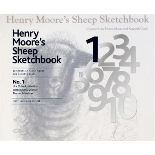
1. Henry Moore's Sheep Sketchbook.
Apparently, Henry Moore liked to draw sheep. Well, why not, I say. If you're really into Henry Moore then this will probably be quite a nice purchase, reproductions of artist's sketchbooks usually are quite interesting and insightful. Probably not one that I'll rush to buy though. I'll see if it's in the library (I'll bet it is) and see what it's like. Amazon link.


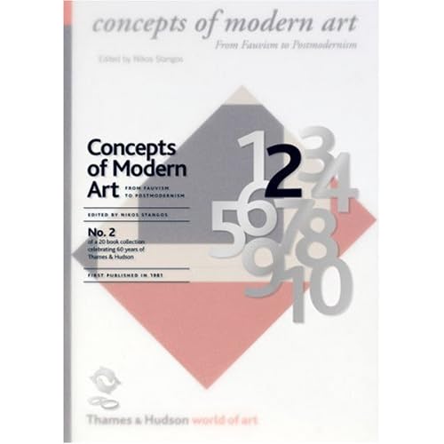
2. Concepts of Modern Art by Nikos Stangos
I quite like having books like this - something to dip in and out of and refer to every so often. I'm quite a fan of some (not all) modern art movements and find the theories and concepts behind them really interesting. (See my Futurism post) so I'll definitely check this one out. Amazon link.


3. The Shock of The New: Art and the Century of Change by Robert Hughes
For some reason there's no link to this on the Thames & Hudson website - there's 2 and then there's 4. Look. So you'll just get the Amazon link. Reading the reviews on there, this seems like a really good book - I'll definitely buy this one I think. I lack 'general art' books, as I'd call this. Amazon link.


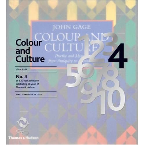
4. Colour and Culture by John Gage

This is basically a big book on colour theory. While interesting and actually quite relevant to my work, I never really read much on colour theory during my course. Possibly should have. I just find the idea a bit dull... I'll have a flick through this, and unless it's amazing I doubt I'll be rushing to get it. I may be proven wrong; I might suddenly love the whole idea of colour theory. Who knows. Let's find out. Amazon link.


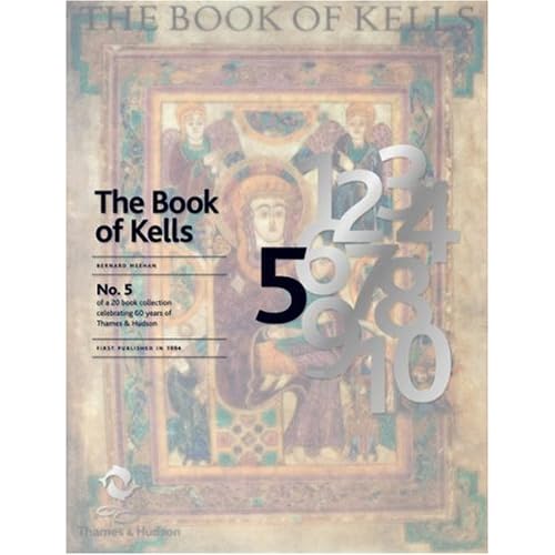
5. The Book of Kells: An Illustrated Introduction to the Manuscript

This doesn't really interest me at all to be honest. Maybe it's the religous aspect to it, or the fact that I don't love medieval art. I recognise how important manuscripts have been in shaping books and art in general, but to be honest, this just doesn't float my boat. It's probably nice to flick through, and I'm sure some people would love this kind of thing, but I don't. Amazon link.


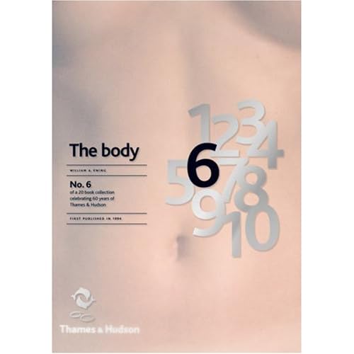
6. The Body: Photoworks of the Human Form by William A. Ewing
I don't actually own any photography books - I should do, I'm sure. This one sounds fairly interesting - different photographers through the ages depicting the body in various ways and meanings. Could be cool. I'll let you know.

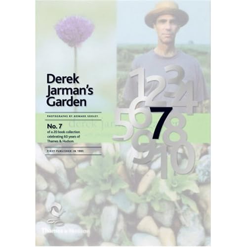
7. Derek Jarman's Garden
I definitely want to take a good look at this one. The premise sounds awesome: "It is a fitting memorial to a brilliant and greatly loved artist and film maker who, against all odds, made a breathtakingly beautiful garden in the most inhospitable of places – the flat, bleak, often desolate expanse of shingle overlooked by the Dungeness nuclear power station." What an amazing concept. I love the idea of new things growing from death and desolation, this book documents the growing process of the garden and I bet it's fascinating. Actually my mum would probably like this, she's very much into gardening. Actually, gardening has suddenly got really 'cool' recently - even the fash pack are doing it - which amuses me slightly. It's not exactly a bad thing though, us young, trendy people should be interested in nature and plants and growing your own vegetables and pretty things. This is a tangent. Back to the books.


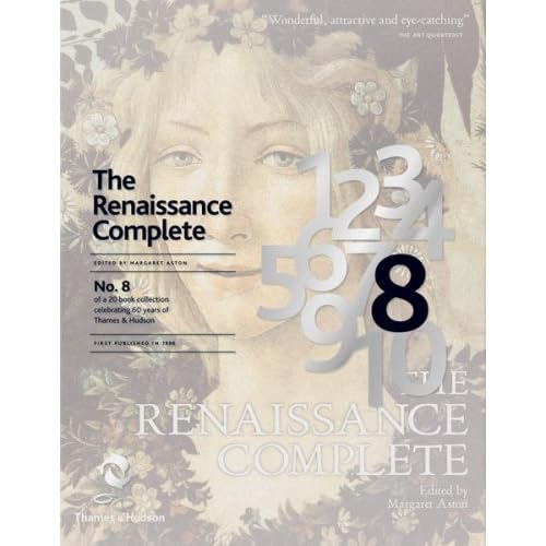
8. The Renaissance Complete by Margaret Aston
All about the Renaissance, basically. Can't really say a lot until I have a look. I'm not rushing out the buy it though - the renaissance was arguably the most important period in history for art and culture but I'm not sure if I could take a whole book of it.

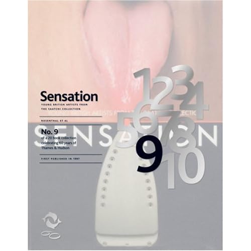
9. Sensation: Young British Artists from The Saatchi Collection
This could be good. I don't know a lot about the exhibition this book is centered around, which was called 'Sensations' and ran in the early ninties; showcased artists like Tracy Emin, Damien Hirst, Rachel Whiteread, all of who are terribly famous now. But as I was probably about 6 when this exhibition was running I'm sure I can be excused. I'll reserve judgement because I have strong feelings about some 'modern art' but then love others. Tracy Emin's tent I though was actually quite good. The unmade bed though, oh dear. Apparently this exhibiton was quite important to British art so this book should hopefully educate me a bit. Innit.


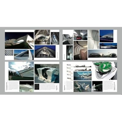
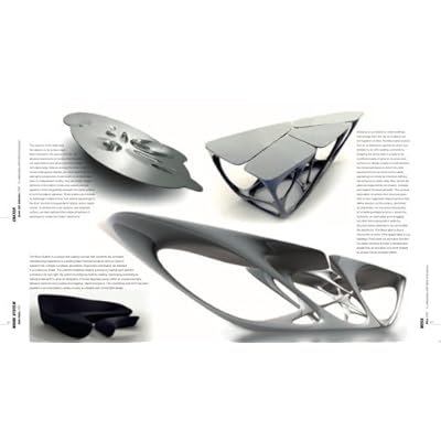
10. The Complete Zaha Hadid
So this is the first book that I've found inside spread images on Amazon. I'm not hugely into architecture - too technically and maths based for me. So I can't imagine I'll look much at this really. From what I can see, her building designs look quite interesting, but yeah. It's architecture. I'm not really an architecture girl unless I'm looking at some kind of Georgian/Victorian features. The most I can say is 'Ooo I like that, that's nice'. I stick to 2D designs.


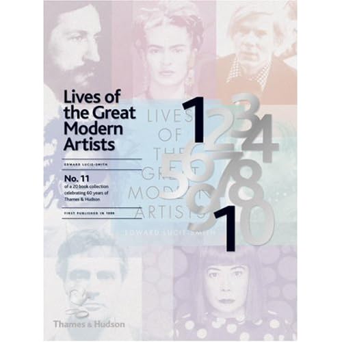
11. Lives of the Great Modern Artists by Edward Lucie-Smith

This on the other hand, looks great; I love reading about the background of artists that inspire me. Hopefully it's more than just a collection of run of the mill biographies - a bit of a deeper insight into the way that these 'great modern artists' think and operate would be really tasty.


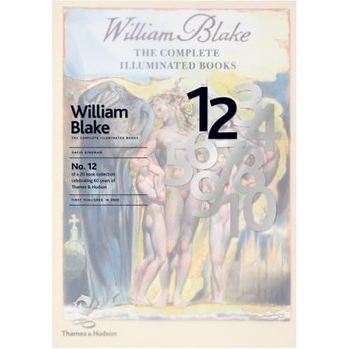
12. William Blake: The Complete Illuminated Books

Ah, good ol' Will B. He's a bit of a staple of my humble literary/artistic state school education. Definitely worth a look, this one. "This edition, produced together with The William Blake Trust, contains all the pages of Blake’s twenty or so illuminated books reproduced in true size, an appendix with all Blake’s text set in type and an introduction by the noted Blake scholar, David Bindman." Nice one.

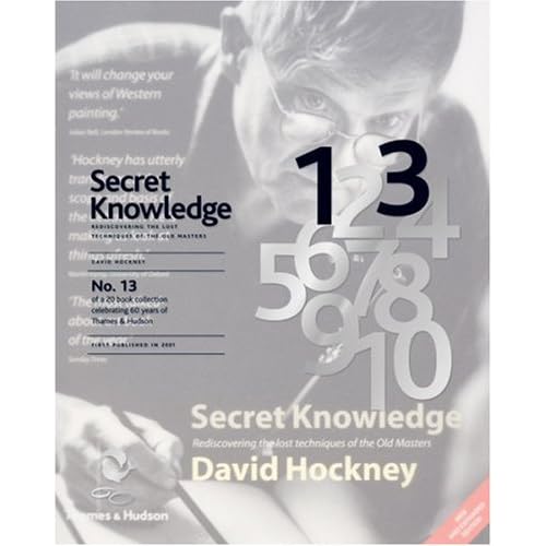
13. Secret Knowledge: Rediscovering the lost techniques of the Old Masters by David Hockney
Quite an interesting premise this one, I can't really explain it better than this: "Secret Knowledge created an international sensation when it was published in 2001. David Hockney’s enthralling story of how some of the great works of Western art were created with the help of mirrors and lenses and how the optical look came to dominate painting attracted major media attention around the world and generated intense debate in the fields of science and art history." I'll have a look at this one excitedly; in fact it might even go on my 'to buy' list. (Which is extensive). It sounds a fascinating read, I don't know a lot about the old Masters aside from who they are and their most famous pieces of work. Everyone knows they are geniuses... uncovering exactly how they produced the stunning artworks that they did, especially with David Hockney doing it, sounds awesome.

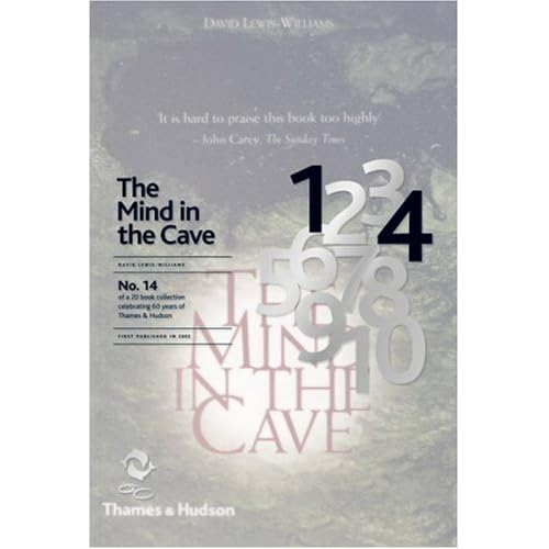
14. The Mind in the Cave: Consciousness and the Origins of Art by David Lewis-Williams
Cave painting, many would say, is the first example of illustration in human history. I'd tend to agree with that. Illustration is essentially either story telling or depicting an idea, which is what cave paintings generally did - before letterforms and written language were developed. So this could be a useful one for me, it definitely makes me curious.

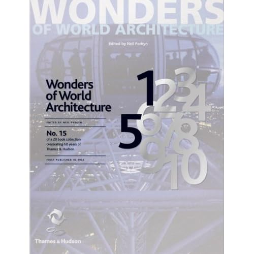
15. Wonders of World Architecture by Neil Parkyn
Well, it's an architecture book, and as previously mentioned, I don't dig this. I'm sure it'll be pretty to look at with some breathtaking feats of engineering and the like, but, you know, I'm just not that interested =/ As all the other books in this series though, I'll give it the once over when I find it. It might be awesome, who am I to judge? I feel a bit guilty for not getting over excited about building design. I don't do 3D, ok.

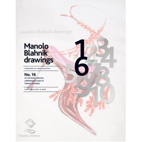
16. Manolo Blahnik Drawings by Anna Wintour
This on the other hand, is first on my list. I love Manolo Blahnik shoes... of course I don't own any but they are definitely some of my favourite elaborant shoe designs and his drawings are just amazing. So fluid, and dramatic, and just uber everything. Maximalism at it's best. As most people know I do love a bit of high fashion and couture (from afar) and fashion illustration is so exciting to me. It's strange because I don't actually do much fashion illustration even though fashion is really important to me =/ Probably something to do with the fact I still can't draw figures as well as I should. Sort it out Rach. Oh, and the foreword is written by Anna Wintour, who is a fashion legend. She's who they based Devil Wears Prada on. Awesome.

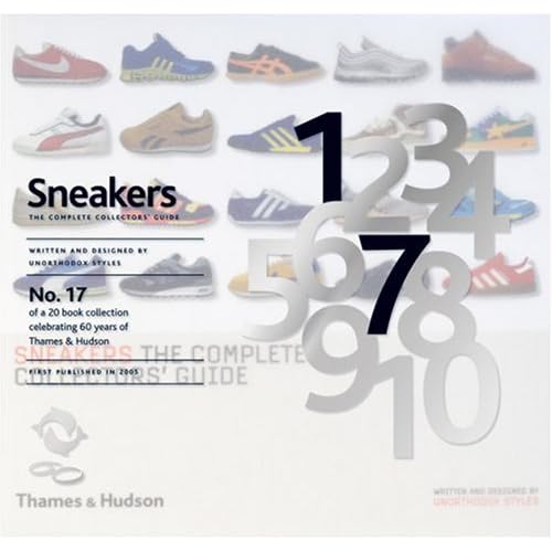
17. Sneakers: The Complete Collectors' Guide by Unorthodox Style
If you're into 'sneakers' (or trainers, as we like to call them over here) then this looks pretty sweet. I'll bet it's fun to look at even if you're not obsessed with casual footwear. I'll give this more than 2 minutes of my time for sure, but probably wouldn't buy it. I'm more of a heels girl. See no.16.

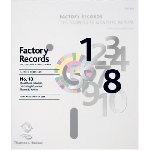
18. Factory Records: The Complete Graphic Album
Even the title of this makes me wee a bit. This book looks immense. Everyone knows how awesome and influential Factory Records were in the 80's (was it 80's? I'm pretty sure), and this book is full of album covers, poster designs, everything visually tasty from the legendary record label. This is also high on my list - I'm a sucker for music design of every kind and can't believe I never knew about this book until now.

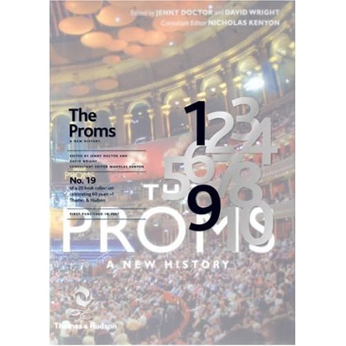
19. The Proms: A New History
Er. I'd be lying if I said I'd ever watched the proms. Not really one for me, this book. I'll give it a browse but it's probably aimed at someone who is a bit more interested than I am. Oh how uncultured of me.

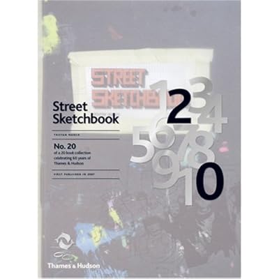
20. Street Sketchbook by Tristan Manco
Hurrah! The one book I own in this collection :) I can actually tell you my actual opinions about it now, actually. The author, Tristan Manco, did a lecture at my Uni, Wolverhampton a while back, I mention it here, really interesting; he's actually a graduate of my Uni so isn't that cool. He's a bit obsessed with graffiti and street art and has become a bit of an authority on it, going all over the world and talking to the artists who make it happen. The main reason why I love this book is because it has rounded corners - it feels like an oversized moleskine. Which is a bit exciting to a strange person like me. And the cover feels nice. Haha. But honestly, this is a great book because it's split into two halves - one half is 'street', images of the graffiti in situ, and the other half is 'sketchbook', all the sketches and initial doodlings and ideas from these artists, which is my favourite half. I love seeing sketchbooks from any kind of artist, but graffiti artists in particular because there's no preconceptions, (and often no observational drawings) just purely what comes out of their heads. It's a great book and I'd recommend it to anyone who has an interest in visual communications, not just graffiti art.

What an epic post!

(All the images are just copied and pasted off Amazon btw, I don't own them.)

Lastly, I can't round up without featuring the Limited Edition cover design. I think it's brilliant, really subtle but ties all 20 books together so well. The idea of having this semi-transparent layer over the top of the original covers, with the number of the book in black bold - looks really good. I love how all of the numbers are there, faded out in grey, then just the ones that are needed are picked out; they never move from book to book, it's just the correct numbers that are picked out in black. And it doesn't feel like it interfers with the original cover too much - repeating the title over the top in the same type and positioning on every book helps bring the series together visually, and it makes it easier to read which is a bonus. Nice one, I can't really fault it. I want to see one in real life now. Off I go...