My blog has moved!

You should be automatically redirected in 6 seconds. If not, visit
http://rachelsayshello.com
and update your bookmarks.

Welcome to rachelsays... The blog of Rachel Lewis, containing my thoughts and musings on illustration, design, fashion, music, cakey-bakey goodness, culture and things that I generally find cool. There's also a good chance my own illustration work will pop up on here.

All work on this blog is copyright to me unless I state that it isn't. Obviously. Don't do stealing, kids.

So come on in, have a look around, and leave a comment if you like what you see.

www.rachelsayshello.com
contact [at] rachelsayshello.com

Showing posts with label Design. Show all posts

Tuesday, May 18, 2010

Inspiration: Turning Leaf and Basso & Brooke

Wine. Everyone loves wine. Nice nice nice. I generally prefer the red variety, on a friday night to melt away the worries of the week. Or, as tonight, on a tuesday night because it was already open and I like to numb things. Wine labels are quite fascinating to me, as an illustrator/designer it's nice to look at the care (or not, in some cases) that are gone into their designs. Who hasn't bought a bottle of wine because the label was nice? (especially if it's half price, that's always good too.)

 So imagine my glee when I discovered that Basso & Brooke, those crazy fashion designers best known for their fearless prints, have teamed up with little known wine company Turning Leaf (well I'd never heard of them) to design these amazing bottles. The first image is from this spanish(?) site, the larger images were kindly emailed to me from Turning Leaf themselves after they saw this original post. Aren't the designs amazing? Here is bit more about the collaboration from Turning Leaf themselves:

- As well as curating a blog for Turning Leaf, where Basso & Brooke will open up their little black book of secrets, the designers will also be developing a range of bespoke, limited edition products with Turning Leaf. 
- Some limited edition products will be available to Turning Leaf customers and others via exclusive retail partners.
- The blog will reveal ‘what’s hot’ during the Spring/ Summer months and will be hosted on the Turning Leaf Wines website 
- Over the next six months Basso & Brooke will also be launching a series of Turning Leaf events, including an exclusive retail partnership and a pop up shop in April.
 - Basso & Brooke will be visiting the Turning Leaf vineyard in California's Sonoma Valley near San Francisco, following their London Fashion Week show on 23rd February
The pop up shop sounds amazing - more info from me on that soon....


Here is a good article from the FT about the collaboration - discussing their inspiration from Jeff Koon's collages, with this great bit - "Brooke presented Dennison with the flamboyant bottle and said, “It’s not particularly conservative.” Dennison inspected it. “And Turning Leaf has traditionally been a conservative brand,” he said.
“But you’ve got to be on people’s lips,” said Brooke. “You’ve got to think out of the box.” Dennison warmed to the idea. “This is going to catch their eyes,” he said. “Then catch their fantasy.”

I think that idea is great - Turning Leaf's motto is 'Taste the Colour' and you certainly get that feeling from the designs, which have snow leopards and volcanoes (how apt) intertwined, among other things. Wine is always seen as so serious - even when you drink it, you feel somehow more restrained, and sometimes wine is fun and you want something that isn't all Serif fonts and cream, heavy matte paper. You know?

As soon as I find more of the shots of the bottles, I'll post them. In the meantime, Basso & Brooke's website is here -beware, you can do nothing but click to open an email, but it's still pretty, and Turning Leaf's site. Here are some images of Basso & Brooke's amazing fashion design to get your juices flowing...


Just beautiful examples of what can be created with digital printing techniques and genius handling of colour. Oh, to wear something like this... and have the legs for it... ah.

All images credited to where I found them, etc etc.

Sunday, December 06, 2009

Book City Jackets - Make Every Book Beautiful

I stumbled across these lovely little things, from Book City Jackets. A great idea:

"Even as you polish off Eat, Pray, Love and dive into the Twilight series*, “Reading List” ensures that you always look classy. Perfect for the aspirational reader. $12 for set of 3."


Basically, if you're reading a book that's kinda not cool, or has a rubbish cover, or is one of those stupid 'How to be amazing at everything' self help books that you SHOULD be embarrassed to read, you stick these wonderful modern/bauhaus esque looking book covers on. Minimal and typographic porn. And you look clever because you're 'reading' some great literary classics. Noice.

Alternatively, they always do Artist editions, which are my favourite:


Now how lovely are those? They are also accepting submissions for new artists covers, I'm going to see if I can get in on the action.

So you could be reading the worst book ever and you just look cool. A great idea and not too expensive either. A great christmas present for that friend you have who always read's Katie Price's 'novels' and similar drivel. Instant classiness.

Also; "Our covers are off-set printed on recycled kraft paper in downtown New York and “fold-to-fit” almost any book. A Book City Jacket isn’t just beautiful — it also protects from spilled drinks and prying eyes and provides a convenient space to doodle and jot down notes. Book covers were a good idea in junior high school and they’re a good idea now."

Recycled + Brown paper + New York + doodle approved = Rachel likes.

*And yes, I have asked for the Twilight series for Christmas. Can't actually wait. Although I'm not actually ashamed - I do find the twilight covers quite pleasing. Everyone has said the books are better than the films. And the films have been AMAZING. Sooo... yep.

Sunday, July 26, 2009

New work: Climate Change Banner for ActionAid's Bollocks to Poverty Campaign

Last week I was working on this banner, which is to be displayed (hopefully, if approved) on ActionAid's website, for their 'Bollocks to Poverty' campaign.

Click for larger image.

The campaign is aimed at getting people motivated to actually do something to help end poverty; instead of just donating money and being a bit passive about the whole thing, it's encouraging people to get involved and get passionate about ending poverty, by putting on events and generally thinking outside the box. Here's a bit from the site:

You can do things a bit differently with Bollocks to Poverty. You don’t need to put on coffee mornings or cake sales, you can do what you love doing. Whatever you’re into you can support people fighting their way out of poverty. Shake a tin at your mates and they might chuck you a pound, but throw them a party and they’ll feel inspired to do much more.

Whether you put on a gig, jump out of a plane, pester your MP or volunteer at a festival, say Bollocks to Poverty and do it with ActionAid.


The site is well worth checking out, there's lots of things to do to get involved in the campaign, my favourite is this, "becoming a Bollocks to Poverty Tour Ambassador to come backstage at this summer's festivals, chat to some bands, write some blogs about it and then organise the mother of all Christmas parties for our amazing tour organisers". Noice.

The focus of the brief for this banner is their Climate Change campaign 'Food vs Dust'. It's basically highlighting the impact that climate change will have on the world's poorest - those who have actually contributed to climate change the least, but who will suffer most through floods, drought, cyclones, all of which will destroy homes and crops and leave to food shortages and ultimately starvation. So banners have been requested to highlight this and to act as a point of inspiration on the website to encourage people to find out more and hopefully get involved with trying to reduce climate change.

I mean, we all know about the damage that climate change is doing and people are beginning to do things to help these days (although my opinion is that its going to take more than a few canvas bags to save us), but people most often think about themselves, and the impact it will have on our children in the future - not about the damage that is happening NOW to people in poorer parts of the world. Just take a look at the photos that the Obama administration has revealed about how quickly polar ice caps are melting - even I didn't think it was happening this quickly.

I always try to get involved with issues to do with the environment, sustainability and living ethically within my work - they're things that I am passionate about and that I believe our industry (design as a whole) are capable of doing something about, even more so than the politicians. We're the ones who design the adverts and the packaging and everything to sell all the stuff - we are the ones who can change public thinking from mass consumerism/needing everything/more stuff right now to... whatever comes next. Post consumerism? Anti advertising? It's still a bit grey. 'Age of austerity' I think David Cameron called it. But it's the designer's who can influence people the most. Interesting really, that this recession has come around now... now that we're questioning what exactly we really need to be spending our money on, we can also start to question not just the impact it's having on our wallets but also on resources and the environment in general. I think most people are agreed that we haven't been living financially or environmentally sustainable for a very very long time. And now look what's happened.

So doing this banner was right up my street - the brief is open and people are encouraged to submit their own banners for the cause. I wanted to create something that had a positive overtone but still reflected the core issues - something to grab people in so they want to learn more, without being too overbearing/negative and more a call to get people motivated to change.

So hopefully it gets used on the site! I'll probably blog about it if it is does anyway.

I start my first day of my placement at The Open Consultancy tomorrow... wish me luck! Really looking forward to it. Early night though defo, had a rather mental birthday party last night so taking it easy today, so that I can be bright and breezy at 6am tomorrow. (Yeah, I have to get up at 6 every day, hello full time work... my student days really are over, aren't they :( can't really complain though, i'm so excited about this placement, i'll practically be leaping out of bed tomorrow).

Ciao for nowwww

Thursday, June 18, 2009

Winners of 2009 Penguin Design Award announced!

I've been looking forward to this!

If you click here you can see all the winners and highly commended/shortlisted people. They were right, the standard of the work is so high, a lot of these covers are amazing.

Well done to Peter Adlington who won 1st Prize and the coveted 6 week placement at Penguin... I really like his design and it's definitely deserving. I'm tres jealous, lol.

Great colours, and very graphic, that's what I'd call it. So modern it looks retro, if that makes sense, and very ambiguous. Great title font too. Niiiice.

Here are my pick of my faves from the selection:

Edward Essex (what a great name) joint 3rd place:
I love the black and white of this, really striking and it feels very busy and manic, but in a good way - reflects the book really well. Great style.

Ben Cain - Highly Commended:

I'm a sucker for inventive use of type and this one pleases me greatly. Really simple execution but a strong idea, I bet this guy played around for hours getting this perfect. Love it.

Sara Mulvanny - Highly Commended:

Really nice illustrative style, good to see something not so 'designy'. Deers seem to have cropped up a lot in these covers (including my own - well we did read the book, you know) but this one seems to have used it the best. Nicely eery and really great type treatment, love those muted colours.

Sonia Poli - Shortlisted:

Again, hand rendered type always goes down well with me, especially massive type that take up nearly the whole cover. This just struck me as understated and simple, but really strong. Ah, there's the good ol' deers.

Sarah Prismall - Shortlisted:

This one is great, I love the geometric shapes and the pure white background, feels really clean and modern. I'd definitely pick this one up on a shelf. I'd perhaps have made the title larger though, or not centre aligned. That's just me though.

(All these images are taken off the Penguin Award website, copyright to their original designers.)

And of course you can see my entry here. It's so exciting finally having it up there, yay! :D

I'm going to the Awards evening next week, I can't wait! I will of course update here with how it goes.

I've been super busy recently so haven't been able to update as much, let alone draw anything. Silly me. I want to do a couple of new Editorials next week, I've found a few good articles so I'll make sure I do that. Also, I got offered a new job today which I'm so happy about, no more being on the dole for me! It's a good number of hours and it means I can finally like... buy stuff. Haha. Omg maybe I can finally replace my holey jeans :O

Friday, June 12, 2009

Thames & Hudson 20: An ongoing post of my humble thoughts and opinions

I found out about this a few weeks back and completely forgot to blog about it, so I'm doing it now. I always spend my money on art books and I don't think that's a bad thing. I won £100 of Amazon vouchers last year and that was immense; got so many good books. However, I want to keep adding to my collection so I'm going to have a look at the books mentioned here and see if I want any. Or all. All would be nice. Seeing as they're a set. Ha.

To celebrate 60 years of Thames & Hudson, they have created a collection of 20 books, each with special edition covers, that encapsulate the range of books that they publish. From their website:

"Thames & Hudson was founded in 1949 by Walter and Eva Neurath. Their passion and mission for T&H was that its books should reveal the world of art to the general public, to create a ‘museum without walls’ and to make accessible to a broad, non-specialist reading public, at prices it could afford, the research and the findings of top scholars and academics. "


Which is pretty much exactly what they've done. They always publish really interesting books and I'm excited about this collection, they've picked some great books and some that I haven't heard of, and it's making me itch to 'complete the set' as it were. All of these have been previously released in 'normal mode' but they've just decided to give them all a unifying cover design so they function as a set. I'll post all the titles in the range, probably tell you if i'm interested in it, go check it out in the library soon-ish, update with a lil' review, then tell you if I buy it. Right now I can't comment on the design/layout as I haven't seen most of them so that'll get mentioned too.

So this is what I'm calling a 'live' post - definitely leave comments as I go along guys, if you've got any of these books, would be nice to have a little collective of opinions. I'll blog on the main page whenever I have anything new to say on this post.

That sounds like a plan. A very long plan. Er.... Let's have a look....

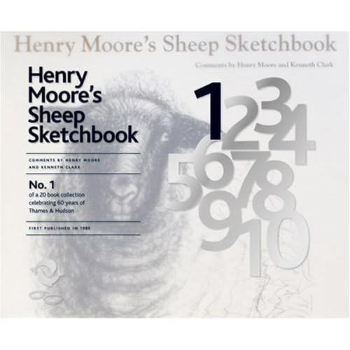
1. Henry Moore's Sheep Sketchbook.
Apparently, Henry Moore liked to draw sheep. Well, why not, I say. If you're really into Henry Moore then this will probably be quite a nice purchase, reproductions of artist's sketchbooks usually are quite interesting and insightful. Probably not one that I'll rush to buy though. I'll see if it's in the library (I'll bet it is) and see what it's like. Amazon link.


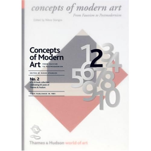
2. Concepts of Modern Art by Nikos Stangos
I quite like having books like this - something to dip in and out of and refer to every so often. I'm quite a fan of some (not all) modern art movements and find the theories and concepts behind them really interesting. (See my Futurism post) so I'll definitely check this one out. Amazon link.


3. The Shock of The New: Art and the Century of Change by Robert Hughes
For some reason there's no link to this on the Thames & Hudson website - there's 2 and then there's 4. Look. So you'll just get the Amazon link. Reading the reviews on there, this seems like a really good book - I'll definitely buy this one I think. I lack 'general art' books, as I'd call this. Amazon link.


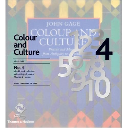
4. Colour and Culture by John Gage

This is basically a big book on colour theory. While interesting and actually quite relevant to my work, I never really read much on colour theory during my course. Possibly should have. I just find the idea a bit dull... I'll have a flick through this, and unless it's amazing I doubt I'll be rushing to get it. I may be proven wrong; I might suddenly love the whole idea of colour theory. Who knows. Let's find out. Amazon link.


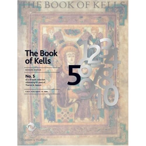
5. The Book of Kells: An Illustrated Introduction to the Manuscript

This doesn't really interest me at all to be honest. Maybe it's the religous aspect to it, or the fact that I don't love medieval art. I recognise how important manuscripts have been in shaping books and art in general, but to be honest, this just doesn't float my boat. It's probably nice to flick through, and I'm sure some people would love this kind of thing, but I don't. Amazon link.


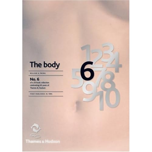
6. The Body: Photoworks of the Human Form by William A. Ewing
I don't actually own any photography books - I should do, I'm sure. This one sounds fairly interesting - different photographers through the ages depicting the body in various ways and meanings. Could be cool. I'll let you know.

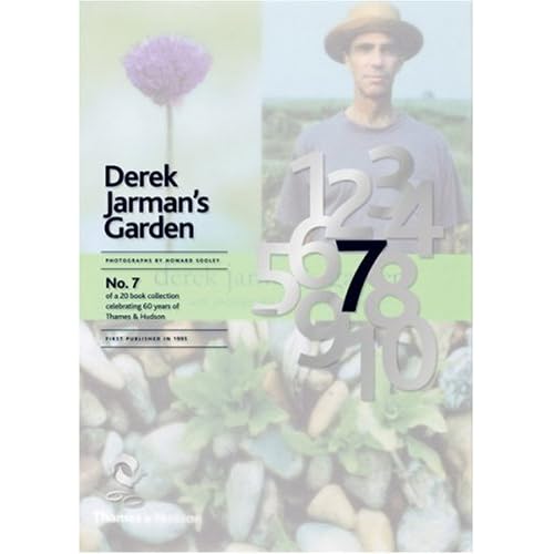
7. Derek Jarman's Garden
I definitely want to take a good look at this one. The premise sounds awesome: "It is a fitting memorial to a brilliant and greatly loved artist and film maker who, against all odds, made a breathtakingly beautiful garden in the most inhospitable of places – the flat, bleak, often desolate expanse of shingle overlooked by the Dungeness nuclear power station." What an amazing concept. I love the idea of new things growing from death and desolation, this book documents the growing process of the garden and I bet it's fascinating. Actually my mum would probably like this, she's very much into gardening. Actually, gardening has suddenly got really 'cool' recently - even the fash pack are doing it - which amuses me slightly. It's not exactly a bad thing though, us young, trendy people should be interested in nature and plants and growing your own vegetables and pretty things. This is a tangent. Back to the books.


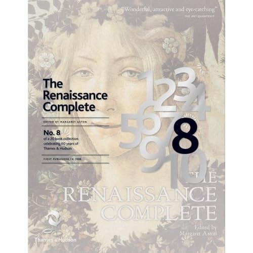
8. The Renaissance Complete by Margaret Aston
All about the Renaissance, basically. Can't really say a lot until I have a look. I'm not rushing out the buy it though - the renaissance was arguably the most important period in history for art and culture but I'm not sure if I could take a whole book of it.

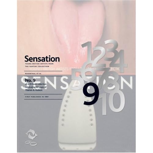
9. Sensation: Young British Artists from The Saatchi Collection
This could be good. I don't know a lot about the exhibition this book is centered around, which was called 'Sensations' and ran in the early ninties; showcased artists like Tracy Emin, Damien Hirst, Rachel Whiteread, all of who are terribly famous now. But as I was probably about 6 when this exhibition was running I'm sure I can be excused. I'll reserve judgement because I have strong feelings about some 'modern art' but then love others. Tracy Emin's tent I though was actually quite good. The unmade bed though, oh dear. Apparently this exhibiton was quite important to British art so this book should hopefully educate me a bit. Innit.


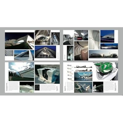
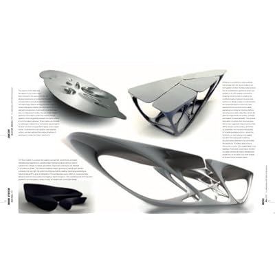
10. The Complete Zaha Hadid
So this is the first book that I've found inside spread images on Amazon. I'm not hugely into architecture - too technically and maths based for me. So I can't imagine I'll look much at this really. From what I can see, her building designs look quite interesting, but yeah. It's architecture. I'm not really an architecture girl unless I'm looking at some kind of Georgian/Victorian features. The most I can say is 'Ooo I like that, that's nice'. I stick to 2D designs.


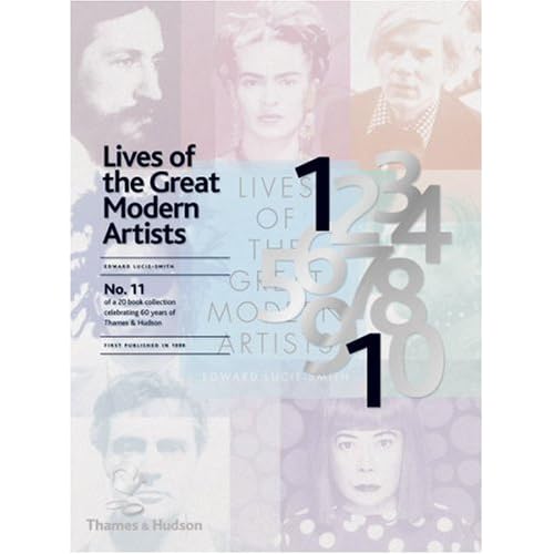
11. Lives of the Great Modern Artists by Edward Lucie-Smith

This on the other hand, looks great; I love reading about the background of artists that inspire me. Hopefully it's more than just a collection of run of the mill biographies - a bit of a deeper insight into the way that these 'great modern artists' think and operate would be really tasty.


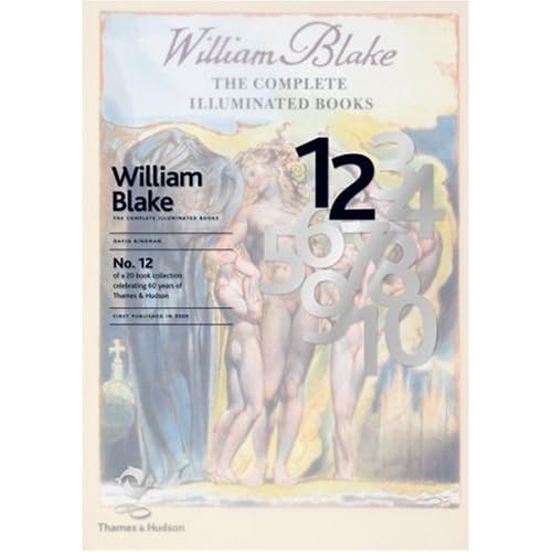
12. William Blake: The Complete Illuminated Books

Ah, good ol' Will B. He's a bit of a staple of my humble literary/artistic state school education. Definitely worth a look, this one. "This edition, produced together with The William Blake Trust, contains all the pages of Blake’s twenty or so illuminated books reproduced in true size, an appendix with all Blake’s text set in type and an introduction by the noted Blake scholar, David Bindman." Nice one.

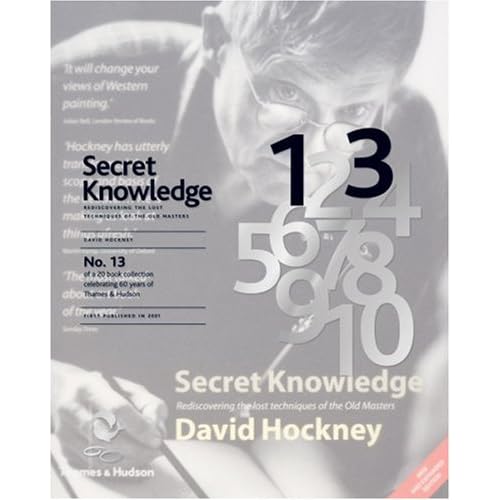
13. Secret Knowledge: Rediscovering the lost techniques of the Old Masters by David Hockney
Quite an interesting premise this one, I can't really explain it better than this: "Secret Knowledge created an international sensation when it was published in 2001. David Hockney’s enthralling story of how some of the great works of Western art were created with the help of mirrors and lenses and how the optical look came to dominate painting attracted major media attention around the world and generated intense debate in the fields of science and art history." I'll have a look at this one excitedly; in fact it might even go on my 'to buy' list. (Which is extensive). It sounds a fascinating read, I don't know a lot about the old Masters aside from who they are and their most famous pieces of work. Everyone knows they are geniuses... uncovering exactly how they produced the stunning artworks that they did, especially with David Hockney doing it, sounds awesome.

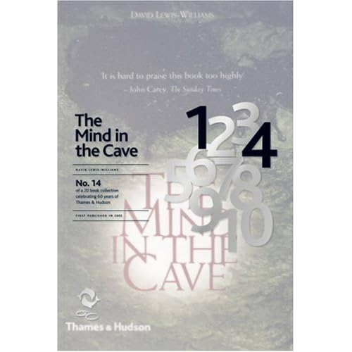
14. The Mind in the Cave: Consciousness and the Origins of Art by David Lewis-Williams
Cave painting, many would say, is the first example of illustration in human history. I'd tend to agree with that. Illustration is essentially either story telling or depicting an idea, which is what cave paintings generally did - before letterforms and written language were developed. So this could be a useful one for me, it definitely makes me curious.

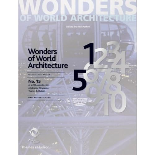
15. Wonders of World Architecture by Neil Parkyn
Well, it's an architecture book, and as previously mentioned, I don't dig this. I'm sure it'll be pretty to look at with some breathtaking feats of engineering and the like, but, you know, I'm just not that interested =/ As all the other books in this series though, I'll give it the once over when I find it. It might be awesome, who am I to judge? I feel a bit guilty for not getting over excited about building design. I don't do 3D, ok.

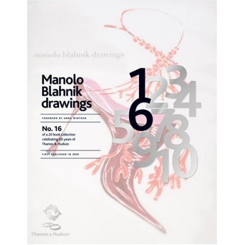
16. Manolo Blahnik Drawings by Anna Wintour
This on the other hand, is first on my list. I love Manolo Blahnik shoes... of course I don't own any but they are definitely some of my favourite elaborant shoe designs and his drawings are just amazing. So fluid, and dramatic, and just uber everything. Maximalism at it's best. As most people know I do love a bit of high fashion and couture (from afar) and fashion illustration is so exciting to me. It's strange because I don't actually do much fashion illustration even though fashion is really important to me =/ Probably something to do with the fact I still can't draw figures as well as I should. Sort it out Rach. Oh, and the foreword is written by Anna Wintour, who is a fashion legend. She's who they based Devil Wears Prada on. Awesome.

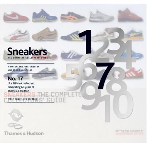
17. Sneakers: The Complete Collectors' Guide by Unorthodox Style
If you're into 'sneakers' (or trainers, as we like to call them over here) then this looks pretty sweet. I'll bet it's fun to look at even if you're not obsessed with casual footwear. I'll give this more than 2 minutes of my time for sure, but probably wouldn't buy it. I'm more of a heels girl. See no.16.

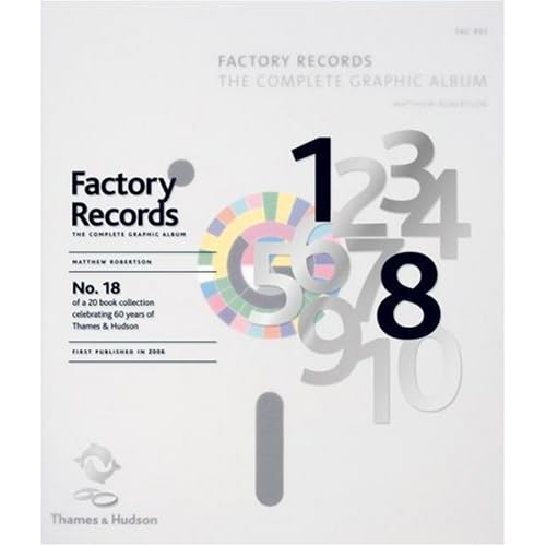
18. Factory Records: The Complete Graphic Album
Even the title of this makes me wee a bit. This book looks immense. Everyone knows how awesome and influential Factory Records were in the 80's (was it 80's? I'm pretty sure), and this book is full of album covers, poster designs, everything visually tasty from the legendary record label. This is also high on my list - I'm a sucker for music design of every kind and can't believe I never knew about this book until now.

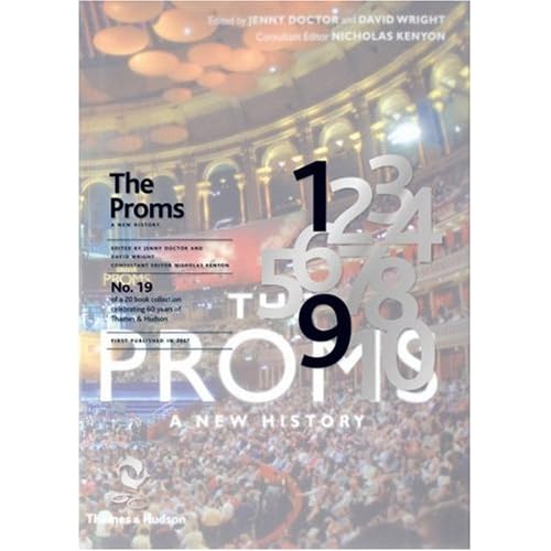
19. The Proms: A New History
Er. I'd be lying if I said I'd ever watched the proms. Not really one for me, this book. I'll give it a browse but it's probably aimed at someone who is a bit more interested than I am. Oh how uncultured of me.

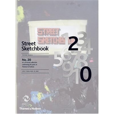
20. Street Sketchbook by Tristan Manco
Hurrah! The one book I own in this collection :) I can actually tell you my actual opinions about it now, actually. The author, Tristan Manco, did a lecture at my Uni, Wolverhampton a while back, I mention it here, really interesting; he's actually a graduate of my Uni so isn't that cool. He's a bit obsessed with graffiti and street art and has become a bit of an authority on it, going all over the world and talking to the artists who make it happen. The main reason why I love this book is because it has rounded corners - it feels like an oversized moleskine. Which is a bit exciting to a strange person like me. And the cover feels nice. Haha. But honestly, this is a great book because it's split into two halves - one half is 'street', images of the graffiti in situ, and the other half is 'sketchbook', all the sketches and initial doodlings and ideas from these artists, which is my favourite half. I love seeing sketchbooks from any kind of artist, but graffiti artists in particular because there's no preconceptions, (and often no observational drawings) just purely what comes out of their heads. It's a great book and I'd recommend it to anyone who has an interest in visual communications, not just graffiti art.

What an epic post!

(All the images are just copied and pasted off Amazon btw, I don't own them.)

Lastly, I can't round up without featuring the Limited Edition cover design. I think it's brilliant, really subtle but ties all 20 books together so well. The idea of having this semi-transparent layer over the top of the original covers, with the number of the book in black bold - looks really good. I love how all of the numbers are there, faded out in grey, then just the ones that are needed are picked out; they never move from book to book, it's just the correct numbers that are picked out in black. And it doesn't feel like it interfers with the original cover too much - repeating the title over the top in the same type and positioning on every book helps bring the series together visually, and it makes it easier to read which is a bonus. Nice one, I can't really fault it. I want to see one in real life now. Off I go...

Thursday, June 11, 2009

D&AD New Blood 2009 - I'll be there

I'm really excited about this. I'll be exhibiting at D&AD New Blood with some others from my course, from 29th June to 1st July. It's going to be so awesome, and possibly overwhelming... there's going to be so many talented people in that place. I usually visit New Designers every year and so haven't ever been to New Blood any previous years - the closer it gets, the more excited I'm getting.
The advertising campaign theme for this year's show is 'I'll be there' - if you go on the site it shows loads of successful design-type-people pledging that they'll be attending the show, plus a facility to upload your own photo and be part of the happy 'look we're all together in this isn't it great we're all gonna be there!' collective.

At first glance, it struck me as pretty cool, everyone saying they're gonna be there - the important designers pledging that they will so all us student plebs go "omg so-and-so is there that makes me feel uber special and talented" and then we can spy on our competitors - sorry co-exhibitors - and everything is awesome and SO design-y.

Creative Review have an article talking about the advertising posters and show images of them (below). What's really interesting is the general feedback about the campaign - read the comments, they're well worth it.


Images robbed off the creative review post - I ain't taking no credit for 'em.

My first reaction agreed with a lot of what people were saying - they look like they take themselves way too seriously. Now, I'm not going to pretend that I know who all of them are (I know a few) because I don't really believe in celebrity-fying artists or designers or whatever - they're just normal people like us who are very good at what they do. It's great to aspire to and be inspired by these people, you should really, but I don't deify any of my inspirations.

So was that the intention of the images? To make themselves appear really lofty? To me it kind of says "I'll be there - how lucky are you! I'm awesome, you'll get to stand in the same room as me." But then a part of me thinks that maybe they're meant to be a bit spoof-like, sort of taking the piss out of the fact that people do deify top designers sometimes, and just using a nice bit of sarcasm.

I honestly can't tell, to be honest. I do like the idea... but maybe it just failed to get across somehow. I don't think the intention was to make these designers look like pretentious bastards. It makes me a bit wary of them actually, as another person who will 'be there'... I'm a lowly illustration graduate, not worthy. They might rip me to shreds... or at least they look like they will from these photos.
I won't go so far as to agree with everything that a lot of people said in comments over on Creative Review, but I have to say that I don't love these photos. One poster sums it up really well, he didn't have a link, just called Edward:
'I have a slight issue with the whole concept, it reminds me of Grafik a few years ago with the 'celeb' shots on the front. 'Industry professionals' should have a responsibility to provide a correct image of what students and designers alike should aspire to be i.e. Designing work which makes an impact inside the public realm, not just as a self gratifying means of gaining recognition and respect from their peers. Designer are just workers, the same as everyone else, perhaps we should all think about getting our priorities straight.'
I remember those Grafik covers actually, they were portrait shots of various designers and photographers running over about issues - much like these photos; beautifully shot but coming across a bit pretentious:


I much prefer Grafik's recent covers, they've been image based, some illustrated, which is nice of course. Actually I can't really fault Grafik much, been a subscriber for years, I love it lots. Anyway.

On a different note, all the 'I'll be there' designers are wearing snazzy outfits. I can't fault any of them, except Neville Brody. Who is a ledge, lets face it, but a tracky jacket? Oh dear. I even love the white suit that is being rocked. And I hate white suits usually, but I give a thumbs up to that one.

Caroline Pay looks like a waxwork in her photo - I don't know if that's good or not. She looks a bit uncomfortable.

Sunday, May 10, 2009

Formula 1 and Design

Most of my friends know I have a bit of an obsession with Formula 1. This is at odds to my environmental beliefs, I know, but I just love it. (It's not exactly the most sustainable form of entertainment after all...) It's the only sport I'm really into. I just love all the technical side to it, the strategies, the competitiveness, the speeeed, of course. So, I watched today's Barcelona race, of course, and it reminded me how much I love the F1 logo:

Which I've taken down because apparently you can't use it without a license!

It's ridiculously simple, but I think it's one of, if not my absolute favourite logo around at the moment. It's so clever. Using the F and the red section (which is vaguely in the shape of a 1) to silhouette the shape of the 1... nicely hidden but it does jump out at you. Ah it's just so perfect. I really hope whoever designed it (f you know, please say, I can't find it anywhere) just stumbled upon this solution, after a bit of doodling. And the red spikes, well, you can't really say 'this is a fast and sometimes dangerous but pretty jolly exciting sport' any other way. I do prefer it without the 'Formula 1' type at the bottom though, when it's on your telly it doesn't have that and it looks slicker. It's just a good, clean design, which isn't too fancy for itself, hasn't got shiny vector glossy bits, and almost understates the multi-million dollar industry that F1 is. It says 'Hello, yes, you know what F1 is, we don't have to sell it much to you, we're good and that's that. Vrooooooom...'

There's all kinds of logos out there, good, bad and the boring, and I'm sure people can think of better ones than this. But for me, it's genius.

So while on the subject of F1, I also want to talk about Brawn GP. For those who don't know, they're a bit of a Phoenix-from-the-ashes; evolving from Arrows to Honda, almost dying over the winter then being reborn through Ross Brawn, of former Ferrari fame. And just look at them. They're proving to be the best in the field (although Red Bull aren't far behind), Ferrari and McLaren are mid-runners these days. It's mental, I love it. Who'd have thought?

But it's the look of the car that I love. Because of the speed at which they put the team together, they didn't have time to get any sponsors, aside from Virgin. This means the car is... well, virginal:

And look at the shape of that nose cone... it just feels magically retro and futuristic at the same time. Mmmm. Can I be a track girl?

It's so lovely. And refreshing. All other F1 cars look like adverts have thrown up on them. This one is sexual and clean and new. And the colour scheme... what genius. Black, white, and NEON yellow? Yes please. It's like some nu-rave indie kid has shown up at a high-class dinner party, eaten all the raspberry meringue, stuck his tongue out then sped off in a stream of neon and giggles. And the rest of the dinner party/teams are going '....Oh. I say. He's rather good, isn't he. Who invited him?'

So well done to Button and Barrichello today, getting 1st and 2nd. Legends. And Button so deserves it, he's been stuck in rubbish cars for so long, always too good for them. I'm a Hamilton fan all the way but Brawn have got my heart right now.

Here's an interesting proposition for the Brawn GP team, by Daniel Eatock. I highly recommend you read it, he's got some good points. And it would be an excellent use of the white space on the car... a white space that will no doubt be swallowed up by the beginning of the next season as sponsors clamour to throw up on it.

Which will be a shame, because it's so god damn pretty like it is.

Any thoughts? What's your favourite logo ever? Do you think Brawn should go with Eatock's idea?