My blog has moved!

You should be automatically redirected in 6 seconds. If not, visit
http://rachelsayshello.com
and update your bookmarks.

Welcome to rachelsays... The blog of Rachel Lewis, containing my thoughts and musings on illustration, design, fashion, music, cakey-bakey goodness, culture and things that I generally find cool. There's also a good chance my own illustration work will pop up on here.

All work on this blog is copyright to me unless I state that it isn't. Obviously. Don't do stealing, kids.

So come on in, have a look around, and leave a comment if you like what you see.

www.rachelsayshello.com
contact [at] rachelsayshello.com

Showing posts with label new work. Show all posts

Monday, June 21, 2010

New Work! Recipe Illustrations for Cleo Magazine Australia

This is awesomely exciting: I was contacted recently by the lovely people at Cleo Magazine, in Australia, who really like my recipe illustrations and wanted me to produce some more for a feature in the September issue! Amazing!

So I allowed them to reproduce two of my old ones, and did two new ones for them as well, which I want to post up here:


This recipe is one from my mum - she always makes this at BBQs and get-togethers etc and it's so amazing (as the title suggests), and pretty easy too. The feta and the capers make it stand out against shop-bought couscous, it's perfect for summer days!

 I've made this a few times and it is easy - the ready made cake mix is a bit of a cheat so sometimes I do make it from scratch. Using the orange juice instead of water is genius and they taste amazing - especially the next day when the orange zest has had time to sink into the icing and give it flavour.
 Nom nom nom.

So these illustrations will be in the September issue of Cleo, out in August. If (like me) you don't live in Australia then you won't be able to get your hands on a copy, but I have some friends in Oz who hopefully can send me it!

This is the first time my work has been published onto actual physical paper so I'm really happy. It's just on an exposure basis but who knows what could come from this? Good times! Thanks Australia, very random but cool!


Wednesday, May 19, 2010

Exciting Happenings: Me and my work featured on Crushable.com!

I did this interview a couple of months back, and then my life went into overdrive with my new job that I completely forgot to actually talk about it! Which is crazy seeing as I was damn excited about it.


The really awesome Tom Rosinski, who is a writer and graphic designer at Crushable.com, contacted me saying he really liked my work and wanted to feature me! Click here for the full interview.


Crushable is a really great fashion/design/entertainment/culture online magazine, based in America, I suggest you save it as one of your bookmarks.

Woo!


Wednesday, May 05, 2010

New Work: Leith Festival Fundraiser Poster Designs

Never underestimate the power of Twitter. I would never have got involved with this if I hadn't seen the RT on my feed. Leith Festival (just outside of Edinburgh) needed a poster doing for their fundraiser, which sounds like it'll be great - Leith's Found Fashions:

'The Evening will showcase outfits designed by local designers and outfits created in association with local charity shops!

There will be Live music from Leith's Very own Obehi: www.obehimusic.com
www.facebook.com/obehionline

There will also be an opportunity for you to purchase the fashions on show and fashions that were not displayed on the catwalk!'


So I sent them a few rough drafts and they chose mine for the final designs! Nice.

I wanted to give the designs a real vintage feel, so used found imagery coupled with classic fonts (Gill Sans and Futura to name a few) and am really happy with the outcome. The first is a much more fun, kitsch tongue in cheek look & feel, with a cute curly typeface called 'Kushtie' which I love. The second is an old Vogue Pattern Design amended to include all the information and to show off the idea of Vintage Fashion.

It was a pleasure to be part of this and I hope they do well to promote the fundraiser. Click here for the facebook group which has details of the event. If you're anywhere near Leith (I am not... lol) then do go and take part!

What do you think?

I am of course available for future design and illustration commissions :)

Friday, April 09, 2010

New Work! Illustrations for Amelia's Magazine - 'Inside The Book Club'

Tres exciting news guys! I've loved Amelia's Magazine for ages, and even though it's not published anymore, the website lives on and also has a plethora of great articles up there.

I was asked to illustrate an article about The Book Club bar in Shoreditch - a really great place that I went to recently at the Glug Notworking event. Here are my illustrations: Higher res will be up on my website later.


I was supplied photos and told to put my stamp on them; I really enjoyed doing these and am so pleased with how they came out - I haven't done line drawings with collage for a lonnng time and they've ended up summing up the place well I think. It's really eclectic and so much creativity goes on in there, but it's also very grungy in feel - low ceilings, warehouse-y, exposed bricks, rooms leading onto others etc, so I wanted to get that across too. I also cheekily put my own artwork in the frames on the walls! Ha. I wish ;) It's a bar primarily, but it also holds club nights, life drawing classes, club nights with live DJs, it's got a table tennis table and pool tables, they serve food (gooood food), it's pretty damn awesome. I'd be in there all the time if I lived anywhere near Shoreditch. Maybe soon. It's on Leonard St, quite tucked away... I've had a hard time finding it tbh before. 

As Amica's article explains really well; there just isn't this kind of place very much in the UK. In New York, I feel right at home there because there are so many venues like this, that go from cafe in the day to nightclub at night, with a healthy dose of alternative culture thrown in. It's great. (And one of the many reasons why I want to move to NY, eventually) but The Book Club is pushing the boundaries over here and I love the concept so much.


Friday, February 12, 2010

New Work: Editorial Illustration


This was a piece I did for an article I found in The Times, written by Giles Coren called 'You've never heard of Paddington Basin, the little sink from darkest Peru?'.

The article has a few different tangents to it, but the one I focussed on was the trouble Giles is having with his new resolution - B.O.O.M, or Back Off On Meat when eating out at restaurants, especially when having Dim Sum at a restaurant in the newly developed Paddington Basin. Hence the title of the article - the original illustration was a take on that title, with Paddington etc, but I wanted to steer away from that and do something more food related. So I just did a spread of dim sum with a nice bit of Pak Choi as the main focus - relating to what the article says about trying to order lots more vegetables.

It's not my favourite piece I've ever done, I think the colours are too pastel-y and it's just not that visually interesting. Here's it superimposed into the original article for context:


I've realised I need to do a lot more editorials for my portfolio, as that's the area I'm trying to get work in. So I've been scouring newspapers and magazines etc for interesting articles to illustrate. It helps if I get someone else to cut out the original illustration (which was actually commissioned for the article) so that I'm not influenced by it. So it's not a dig at the original illustrator, thinking that I can do better than what they did etc, it's just a lot easier if I take existing articles and create an illustration for them - it's the only thing I can do until I get real commissions to fill my portfolio.

So I'm aiming to do one or two new pieces today :)

Sunday, February 07, 2010

New Work: 'I Fear The Distraction' Art & Fear Submission

This piece of work was created last week specifically for a submission for Underground Art School's Magazine. Issue 5's theme is Art & Fear and they wanted a focus on hand-drawn typography for this issue. "The two topics seem to go hand in hand. Create, draw, or design us your favorite quotes, lyrics, and positive affirmations that inspire you to move past the fear toward creativity. What are your creative fears? What worries you?"

This is an entirely hand-rendered piece, nothing done in Photoshop except tweak the contrast a bit. It is all rendered in HB and 4B pencil, with a hand drawn version of Adobe Caslon Pro, including ligatures.

I've just discovered ligatures and what they're actually for. I thought they were just typographic decoration. Designers showing off. Not so. "Ligatures usually replace consecutive characters sharing common components and are part of a more general class of glyphs called "contextual forms" where the specific shape of a letter depends on context such as surrounding letters or proximity to the end of a line." So there. And of course, the ampersand is a ligature; of et. Now everything in the world makes sense. There are all sorts of rules too, here's an article that looks at 18th Century ligatures, for all you history people.

Being that I never had any formal typography learnin's during Uni, I didn't know any of this. I am intrigued.

The quote is something I made up, addressing the worries that a lot of freelance artists/designers have when starting up; I need a 'real job' to tide me over before I start making a lot of money from what I do, but I don't want this job to take up so much of my time that I can't create/design when I want to. It's a common thing. I feel it a lot. It's easy to say, oh just do your illustration in the evening/night, but I don't want to do the thing I love at night. It's draining and tiring and above all, I want to spend my working time working on things that I love doing, not in a shop. Etc. The intended slight illegibility of the piece is supposed to evoke the frustration that this situation causes.

The whole idea was inspired by an interview I read in the current issue of Grafik magazine, with Project Projects, where they discuss a similar thing.

I'd quite like to turn it into a screenprint eventually. That'd look ace I reckon. Just need to get near to a screenprinting bed. I can't believe I lost my uni ID - can't use the facilities now :( Major lame.

I hope it makes it into the Issue anyway, I'm pleased with how it turned out; it was a labour of love and took a while, but I love doing hand drawn type and it was a departure from a lot of my work.

Tuesday, January 12, 2010

Nonsensical Spam Project: Let's take our chance together...

One of the very first nonsensical spam comments I got was this one. 'Let's take our chance together to get rid of nastiness of the life'. Strangely sad, I thought. Sort of lonely. So here's the illustration I came up with to accompany it. It made me think of one side of a conversation, like you hear when people are on the phone. The grammatical error just made it all the more sad, kind of childlike actually. I almost went on a more naive style for this, but I'm really happy how this came out. Haven't done anything collagey/scribbly like this since my Seven Sins project.

It feels great to have some new work done. Soo great. Photoshop, how I have missed thee.

Still thinking of a better project title =/ Read about the beginnings of the project here.

Monday, November 23, 2009

Guest Post on Domestic Sluttery!


Totally exciting news; today I've been featured on the awesome blog, domesticsluttery.com! :D

For those of you who don't know about the domestic sluts, where have you been? I've been following them for a good few months now, and they've been taking the home & lifestyle world by storm in their own stylish way. Their About page describes them best:

"Domestic Sluttery: The home and lifestyle blog for women who have better things to do.

Women don't have time to decorate, or to spend hours in the kitchen. We work, we go out and we have fun. We basically live our lives and would rather shag than do the dishes.

But that doesn't mean that we don't want our homes to be beautiful. If anything, they mean more to us because the time we spend at home is more precious."

Pretty rockin', I reckon, and simply the best name for a website, ever. And definitely the way forward. I'm all for endless pretty things, as well as having time to you know, have a life!

They are of course advocates of the life-saving properties of the humble cupcake, so to aid my obsession with drawing and eating said cakey-bakeyness, I dropped them a line to see if they'd like an illustrated recipe :)

Click on image to enlarge so you can read the instructions.

Christmas is a mere 5 weeks away, so it's time to crack out the food colouring and get festive with this christmas cupcake recipe! I like to illustrate my recipes with as little text as possible, letting the images speak for themselves and to create a really rich and inviting recipe that I think feels more cosey and easy to make than food photography does.

I've had some really amazing feedback on the guest post already through twitter - here are a few of the comments. Seriously, made me feel very warm and fuzzy, thanks to everyone. If anyone has a go at the recipe, please let me know @rachillustrates! Would be great to see.

I've done a few more illustrated recipes which you can see on my website, click here. Also, there's a few more hanging around on this blog too, in a more sketchy sort of form.

I love doing these and will do lots more in the future, maybe some kind of savoury based substance next as I might end up in a constant state of sugar high.

Food illustration is just one area that I love working in; I am of course available, as always, for illustration commissions on any project you can throw at me, especially ones involving cakes and pretty things. Just drop me a line!

I'm now off to gush about Paperchase's newest offerings... it's always a financial mistake to let me loose in that shop.

Thursday, October 15, 2009

The Daily Ampersand Project

Since leaving Uni I haven't really started any new projects. I've done lots of drawing here and there but now I think it's time to embark on something with weight and that has structure, and is something I can do everyday and stick to it.

This idea originally started as a Font Book - I wanted to create a small handmade book which included all 26 letters, handdrawn, from 26 of my favourite/most interesting looking fonts. I still may do that, one day. But last night it came to me (I always think of stuff at night, gift and a curse) that this might be more interesting if it just focussed on one letterform - my favourite of which is the Ampersand.* Has been ever since I discovered it in year 5 or something - all my prose at school was filled with '& then jack & jill went to the shops & they met sam & sue', which of course is terrible grammar, improper use of the ampersand, and would mean I got red circles all over my stories. But I loved writing that letter so much! So swirly. I was the only one out of my friends who could do it without it going fat and lopsided.

*I also really like the letter Y a lot, it was a tough call.

So I thought about it, and there are so many crazy variations of ampersands in all the typefaces that I could fill a whole book of them. So this is the plan...

  • Every day, draw one ampersand. They will be hand drawn/traced from an actual real font, or taken from a photograph of any ampersands I find in the real world, or they will be designed by me.
  • I have given myself no limitations on the medium - pencil, biro, collage, paint, stencil, anything.
  • My limitations are that I must not use a computer to create the ampersands, save for scanning the finished piece in.
  • They are going straight into a nice new clean moleskine sketchbook, not a handmade book, which is slightly smaller than A4 - no drawing on a seperate piece of paper and sticking in. Unless it's a collage piece.
  • Every day I will scan it in and post it on this blog.
  • I am setting a target of 30 ampersands - 30 days, starting from today (15th October). If I want I might do more, but no less than 30.
The History of the Ampersand: Taken from wikipedia, click here for more.

The symbol is a ligature of the letters in et, Latin for "and".

The word ampersand is a corruption of the phrase "and pe eminti and", meaning "and [the symbol which] plus this [is] and". The Scots and Scottish English name for & is epershand, derived from "et per se and", with the same meaning. Traditionally, in English-speaking schools when reciting the alphabet, any letter that could also be used as a word in itself ("A," "I," "&" and, at one point, "O") was preceded by the Latin expression "pe eminti" (Latin for "plus this"). Also, it was common practice to add at the end of the alphabet the "&" sign, pronounced "and". Thus, the recitation of the alphabet would end in: "X, Y, Z and per se and." This last phrase was routinely slurred to "ampersand" and the term crept into common English usage by around 1742.

The modern italic type ampersand is a kind of et-ligature that goes back to the cursive scripts developed during the renaissance. After the advent of printing in Europe in 1455, printers made extensive use of both the italic and Roman ampersands. Since the ampersand's roots go back to Roman times, many languages that use a variation of the Latin alphabet make use of it.

I find that quite interesting, I had never really thought of where it came from. While researching this project, I wanted to see if anyone else out there had done anything similar to this; I didn't want to recreate a project that had already been done. There are a few ampersand projects out there but none exactly like this.

Existing Ampersand Projects I have found:

Students from Bath Spa Uni took part in a project to design their own ampersands. They then screen printed them onto t-shirts and took photos. They look pretty damn awesome if you ask me! This was found at an Ampersand Blog, http://ampersand.gosedesign.net/.

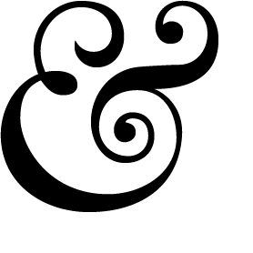
That blog is great for anything to do with ampersands - tattoos, photos, user designed ones, lots of great stuff. And the ampersand they have at the top of the site is one of my favourites - Baskerville 169 Italic, or a variation on that:

Which may just be my first ampersand of the project - kicking things off in a flamboyant way :)

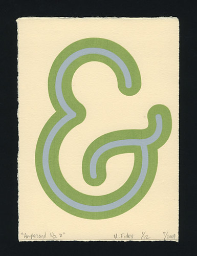
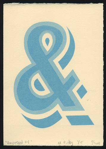
The last project I found is by M.Finley Designs, a final year american uni project where the ampersands will be screenprinted. Sounds like a really great project; there's no images of it on that site, but on his Flickr Page there's a good selection:


An important part is what to call this project. I tried to think of a really exciting name, and very nearly called it The 27th Letter Project. (It's on wikipedia - apparently the ampersand is known as the 27th letter of the alphabet) But I thought, that's a bit ambiguous, so I've gone for The Daily Ampersand Project. I might change it, it feels a bit dull.

So i've started my first one - i'm off to an interview and visit my grandparents so I will finish it tonight and post it here. They will all have the 'daily ampersand project' tag.

Sunday, July 26, 2009

New work: Climate Change Banner for ActionAid's Bollocks to Poverty Campaign

Last week I was working on this banner, which is to be displayed (hopefully, if approved) on ActionAid's website, for their 'Bollocks to Poverty' campaign.

Click for larger image.

The campaign is aimed at getting people motivated to actually do something to help end poverty; instead of just donating money and being a bit passive about the whole thing, it's encouraging people to get involved and get passionate about ending poverty, by putting on events and generally thinking outside the box. Here's a bit from the site:

You can do things a bit differently with Bollocks to Poverty. You don’t need to put on coffee mornings or cake sales, you can do what you love doing. Whatever you’re into you can support people fighting their way out of poverty. Shake a tin at your mates and they might chuck you a pound, but throw them a party and they’ll feel inspired to do much more.

Whether you put on a gig, jump out of a plane, pester your MP or volunteer at a festival, say Bollocks to Poverty and do it with ActionAid.


The site is well worth checking out, there's lots of things to do to get involved in the campaign, my favourite is this, "becoming a Bollocks to Poverty Tour Ambassador to come backstage at this summer's festivals, chat to some bands, write some blogs about it and then organise the mother of all Christmas parties for our amazing tour organisers". Noice.

The focus of the brief for this banner is their Climate Change campaign 'Food vs Dust'. It's basically highlighting the impact that climate change will have on the world's poorest - those who have actually contributed to climate change the least, but who will suffer most through floods, drought, cyclones, all of which will destroy homes and crops and leave to food shortages and ultimately starvation. So banners have been requested to highlight this and to act as a point of inspiration on the website to encourage people to find out more and hopefully get involved with trying to reduce climate change.

I mean, we all know about the damage that climate change is doing and people are beginning to do things to help these days (although my opinion is that its going to take more than a few canvas bags to save us), but people most often think about themselves, and the impact it will have on our children in the future - not about the damage that is happening NOW to people in poorer parts of the world. Just take a look at the photos that the Obama administration has revealed about how quickly polar ice caps are melting - even I didn't think it was happening this quickly.

I always try to get involved with issues to do with the environment, sustainability and living ethically within my work - they're things that I am passionate about and that I believe our industry (design as a whole) are capable of doing something about, even more so than the politicians. We're the ones who design the adverts and the packaging and everything to sell all the stuff - we are the ones who can change public thinking from mass consumerism/needing everything/more stuff right now to... whatever comes next. Post consumerism? Anti advertising? It's still a bit grey. 'Age of austerity' I think David Cameron called it. But it's the designer's who can influence people the most. Interesting really, that this recession has come around now... now that we're questioning what exactly we really need to be spending our money on, we can also start to question not just the impact it's having on our wallets but also on resources and the environment in general. I think most people are agreed that we haven't been living financially or environmentally sustainable for a very very long time. And now look what's happened.

So doing this banner was right up my street - the brief is open and people are encouraged to submit their own banners for the cause. I wanted to create something that had a positive overtone but still reflected the core issues - something to grab people in so they want to learn more, without being too overbearing/negative and more a call to get people motivated to change.

So hopefully it gets used on the site! I'll probably blog about it if it is does anyway.

I start my first day of my placement at The Open Consultancy tomorrow... wish me luck! Really looking forward to it. Early night though defo, had a rather mental birthday party last night so taking it easy today, so that I can be bright and breezy at 6am tomorrow. (Yeah, I have to get up at 6 every day, hello full time work... my student days really are over, aren't they :( can't really complain though, i'm so excited about this placement, i'll practically be leaping out of bed tomorrow).

Ciao for nowwww

Thursday, July 16, 2009

Placement at The Open Consultancy! And other exciting things...

I've been a bit quiet in the blogging front these days... this is because I've been soo busy these past few weeks! Ever since New Blood, I haven't really stopped, due to a number of various things:

I moved into a new house with some friends and there was much room swappage, it took me about 2 weeks to finally unpack and get my room into MY room because I was back and forth to London and such places so much. Anyway I've finally got my posters up and I bought a new clock so that's nice.

I started a new job the week before New Blood, it's a monday to friday admin thing and work really takes the hours out of your day! Amazing, really. Actual employment. So all internet/creativity/posting/stuff takes place after 4pm now.

When I got back from New Blood (literally the day after) I was invited for an interview at The Open Consultancy, in Worcester. I had applied for a 2 month placement there and was soo excited to get an interview! We were set 2 briefs to complete and present at the group interview, which was about 4 days later. Argh. So every day after work I trekked over to Uni (it's dead quiet there in the studios now) and stayed until they kicked me out until I got the work done. That's when real life hits you really, none of this 12 week deadline nonsense with uni work, in the real world you've got 4 day deadlines AND a proper job to go to. Lot of red bull and chocolate was consumed. It was fun though, I love a bit of pressure, me.

One of the briefs was to create a 'thunkstick', which basically are like physical 'what are you thinking' Twitter style mailings. And they're awesome. I like anything like this, they're basically stickers on grey board with awesome shiny bits (mmm shiny) with a really simple, striking ideas that get sent out to people in the creative industries, as a sort of 'bumper sticker for your desk'. This was mine:
It came from the feeling that I keep getting recently that I'm glued to technology... either at work staring at a screen or at uni on Photoshop or at home trawling the internet or facebook or twitter or blogs or anything... or listening to my ipod, or texting my friends, and I just want to unplug! Go for a walk, read a book, draw something random, all things that I love doing and don't do enough. Do you ever feel like that? Technology is immense and helps me in all sorts of places but sometimes I feel like I'm turning into binary.

It went through many incarnations, but one of my favourite things that I didn't use was this:

Loved doing this though, to have a brief which is so open in many ways; 'design a thought' but so constricted in terms of sizing is a real treat. It was so nice to be actually designing something again, I really really need to get some new illustrations done, haven't done anything significant since finishing uni and it's making me restless.

So the interview went great and this monday I was offered the placement!! Which made me do a silly chair bouncy dance lol. I was so happy! I didn't blog about any of this until now because I didn't want to jinx it lol, but now that I actually got offered it I thought it was time to talk about what I've been doing! I can't wait, I've got just over a week left at my current job and then I start at Open on the 27th July. It's going to be so exciting working there. I will definitely update on it all when I start!

The weather is horrible today, I think it's going to be worse tomorrow. Time for a cider and a film I think.

Oh that reminds me, I saw Public Enemies last night, great film! The way it's shot is really interesting, feels almost documentary style, I dunno, the quality was strange. In a good way. And very lacking in music. Also in a good way. And full of Depp and Bale. In a very good way.