My blog has moved!

You should be automatically redirected in 6 seconds. If not, visit
http://rachelsayshello.com
and update your bookmarks.

Welcome to rachelsays... The blog of Rachel Lewis, containing my thoughts and musings on illustration, design, fashion, music, cakey-bakey goodness, culture and things that I generally find cool. There's also a good chance my own illustration work will pop up on here.

All work on this blog is copyright to me unless I state that it isn't. Obviously. Don't do stealing, kids.

So come on in, have a look around, and leave a comment if you like what you see.

www.rachelsayshello.com
contact [at] rachelsayshello.com

Showing posts with label portfolio. Show all posts

Thursday, February 18, 2010

5oup.net - My profile is featured!

A few days ago I joined 5oup, which is a creative social network, portfolio showcase site, that type of thing. Well my profile has been chosen for the 'fresh list' on there and will be displayed on the front page for the next five days!

Go take a look.

Sunday, January 24, 2010

AOI Open Portfolios Evening

On thursday 21st Jan I went to an AOI Portfolio Evening. This was my first one I'd been to, they do them every 6 months or so, and thought it would be really great to get advice on my portfolio, now that I've graduated.

I'm an AOI member so it only cost me £11, which was a fair price really. It was held in the depths of Bethnal Green (well not that deep, a few minutes from the tube station lol..) but still a bit of a dodgy walk! Thank god for my heavy portfolio, I'd give an assailant a whack with that. Anyway, it lasted a good 3 hours, and I found it so invaluable. I met with Abby Glassfield, who works at Eastwing Illustration Agency; I decided to book with her as I know that I really want to get picked up by an agency so was good to have advice on what kind of thing they look for. I actually thought it would be individual one on one sessions, but it was actually a group thing, which I much preferred.

There were about 8 or 9 of us meeting with her, and it was really nice to see other people's work; there were people from all stages of their career, a girl like me who graduated last year, a couple of graphic design-type people who wanted to branch more into illustration, a few who already had an illustration career behind them but wante dto either change direction or get newer clients as work was drying up. So that was good, to see lots of varying styles and approaches. I always miss group crits from uni where we analyse each other's work and this felt a bit like this, it was nice to get input not only from Abby but also from the others too.

So I got some really good advice on what I should do and what to focus on, the main points I have to consider are:

  • Keep doing new work, constantly. A lot of the work in my portfolio is from Uni and I need to make sure that in a year's time, it's all fresh and new.
  • Do a lot of practice editorial work, get friends to give you articles which have had the original cut out so you're not influenced.
  • When it comes to my work, I should try not to not include so much text in all of my images; even though I love working with text, I need to make sure the images speak for themselves.
  • Do more book covers, I only have 2 in there.
  • Concentrate on including figures whenever I can.
It was great, I felt really energised to do lots of new work, so am working on things as we speak. I should have a good 2 or 3 new pieces by the end of the week!

I'm still in the process of making and sending out my self promo books, it takes me about 3 hours to make 4, I'm trying to make 4 a day to get them all done and sent out.

Monday, January 11, 2010

How to: Make a Self Promotional Mini Portfolio

There have been various options going round my head of how best to make this sort of thing. I really enjoy bookbinding, even though I've never actually been taught properly how to do it; it wasn't a part of my Uni course at all. But, like most things, that never stopped me. I made all my own sketchbooks in the last 2 years of my course, nothing fancy, just binding them myself when I was all done. Then, for my Seven Sins project, I made a handmade book as the outcome, of which you can see here. I followed a tutorial in Computer Arts, which you can download the PDF of here. It was definitely a trial and error thing, and a labour of love. Came out well but much too time consuming to make 20, or 50 of. Which is about how many I need, to promote myself effectively.

So after a bit of internetting, I decided upon a Concertina book. Seemed the easiest to make and the easiest to alter the contents of, from book to book; this means that I can slightly tailor the insides according to who I'm sending it to and what sort of illustration they commission. Aha.

You can buy books that teach you how to make handmade books, the simplest one I found was Handmade Books: Binding, Folding and Decorating by Heather Weston. Cheap, too. I probably will buy it at some point (I wonder if you can get it at the library..) but as I'm trying to spend as little money as possible here, I just found a tutorial off the internet and made it up as I went along.


Here's how I did it.

1. Learn how a concertina book works.
The websites that I found seemed to make it sound harder than it is. Basically, you need lots of sheets of paper, the same size, folded to make a small flap on each side to glue to the next piece, and so on, until you get one long massive piece of paper that folds together. You then need some hard board, slightly bigger than the area of the paper, to stick to each end, and end papers if you want. That's about it. You can get complicated with spines and all that, but I'm doing simples.

Taken from this website - follow it if you wish, it's not so simples.

I decided that I wanted my book to be A5, landscape - A5 is a good size for a mini portfolio, and I chose landscape because a lot of my work is landcsape; just fits the pages better.

I did a lot of experimenting with scrap paper to figure out how to fold the flaps and where they had to be:


Before I decided to go landscape.It's a lot easier to do this because you can figure out what side the flaps have to be in relation to which side of the paper is getting printed on.

So I decided that the easiest thing for this was to set up an A4 portrait sheet, with the flap folds on the right hand side, of 7mm. Then I could slice each sheet in half once printed to make my A5 landscape ones, and glue together.


2. Set up a document in Indesign/Illustrator to work from.

This is probably the most important step, so spend lots of time getting it right. I used InDesign for this as you can set up the Master pages then just add content from there, but I guess you can also use Illustrator just as easily, with separate layers for each page. Whatevs.

If you click on that image up there you'll be able to see what I did a bit more clearly. Use whatever system you find easiest; this is just one that I understand and know works. Again, experiment with it, print out some test sheets, find out if it all works ok.
Gridlines and margins obviously don't print, so I added tiny dotted lines so I knew where to fold, and where to cut, once it was printed. Image above is without margins etc. Nice.
Experiment with colours and fonts at this stage too. Before you print out 20. Just a heads up.

Once you have the format perfect, save it, and keep it forever - you can change images, add or take away pages etc, but your rules and spacing will always keep it pretty.

3. Start adding content.
This is the fun part.

Add your images and descriptive text, fiddle about with alignment, size, etc. I added a few more rules for myself at this stage, like where to align the text to, etc. It all ends up quite organic though, if you want to ignore your lovely grid, then do. It's what looks best, after all.
Choosing fonts is important - I went with 2, which could even be too many, one more decorative for my website title and one for the descriptive text. I decided a sans serif font was less conspicuous, as a lot of my work already has type in it and I wanted to be as discreet as possible. So Gill Sans saved the day.

4. Print out your pages and start folding.
Start off with printing enough for just one book first, ok. You just don't know if something's gone tits up and you have to reconfigure your creation. Once you've made one from start to finish perfectly, then you can get into assembly line mode and make as many as you need.
So here are all my lovely pages. I figured out while doing this that when assembling single pages like this, your first page's flap needs folding up, the second one needs folding down, and so on. The flap sticks to the underside of the next page, so you'll see why.
Eventually they were all stuck together in a several foot long book of joy. I just used pritt stick (other types of glue stick are available) but a more permanent choice would be double sided tape.

Next I added coloured end pages to each end - just so the hard board has something interesting to stick to. I chose blue because... I like blue.


What the book looks like as you turn each page over.

The front page, with the blue end papers. My hand looks strangely tanned. It's not. I'm as white as a sheet =/
The back, which I'm going to add something to; more later.

It's already pretty lovely, but won't withstand any kind of manual handling.

5. Make it sturdy.
You need some kind of hard board or mounting board for this. These days you can get mounting board in all kinds of colours, which would be a fine choice. I however, wanted to go for the more rustic, grey board look, for reasons you shall find out.

Cut your board so that it's about 1cm larger than your paper on every side. This means that it's all protected inside and has an attractive overhang.

Don't stick the hard board to it yet - we need to decorate it.

This is the back of my portfolio. Before sticking the end paper down, I made 4 slits to hold one of my postcards. This is just so that the recipient has something to stick on their desk/wall too - the dangers of a mini book like this is they get looked at, then put in a drawer. Postcards are more likely to be left in a place where they'll get looked at.

6. Design your cover.
You can do this anyway you like. Draw on it, screenprint it, stamp it. I'm banning glitter though. No no.
What I have decided is to use tracing paper as an overlay onto the card. That way, you can still see the natural colour of the board, but with a layer of plastic-ness. It's a nice juxtaposition, and you can print straight on to tracing paper, if you've got an inkjet printer.

I designed a simple pattern for the front, and decided to just go with my name. I could have done 'Rachel Lewis, Illustrator' or 'portfolio' or something, but I think you need something striking and uncomplicated. This fits in with the rest of my identity (speech bubble, colours).
Cut the corners of the tracing paper and fold round the back of the board - stick down. Don't stick the front, just the underside - that way there's a slight separation from the board and the tracing paper, which I think gives a nice feel.

7. Attach the hard board to the book.
Stick your end papers to the board with something better than glue stick - double sided tape is best, or industrial strength glue. Don't glue your hand to your face.

8. Admire your handiwork.


The one thing to remember about a concertina book is that it will all just fall out into one big line if you're not careful. You can fold it like a book but if you drop one end it'll just concertina out. Of course. So you might decide to seal the pages together, if you feel that's an issue. Make sure you include all your contact details somewhere in or on the book - in my case, I used my business card stamp to stamp the reverse. I'm also going to experiment with paper luggage tags too, as a 'to and from' thing.

9. Make as many as you need and send the bad boys out to prospective clients.
This particular one was made to leave behind at a recent interview I had, at AMV.BBDO. I'm buying more hard board tomorrow and spending this week making ones to send out. Having spare ones at hand to take to interviews/portfolio meetings is a good idea I think. And remember what I said, you can customise each book with different examples of your work in relation to who you are sending it to.

Good luck! And if you make this, please leave a comment telling me how you went with it! :D

Tuesday, October 13, 2009

Coveting: Simon Cook's Christmas Cheat Sheets

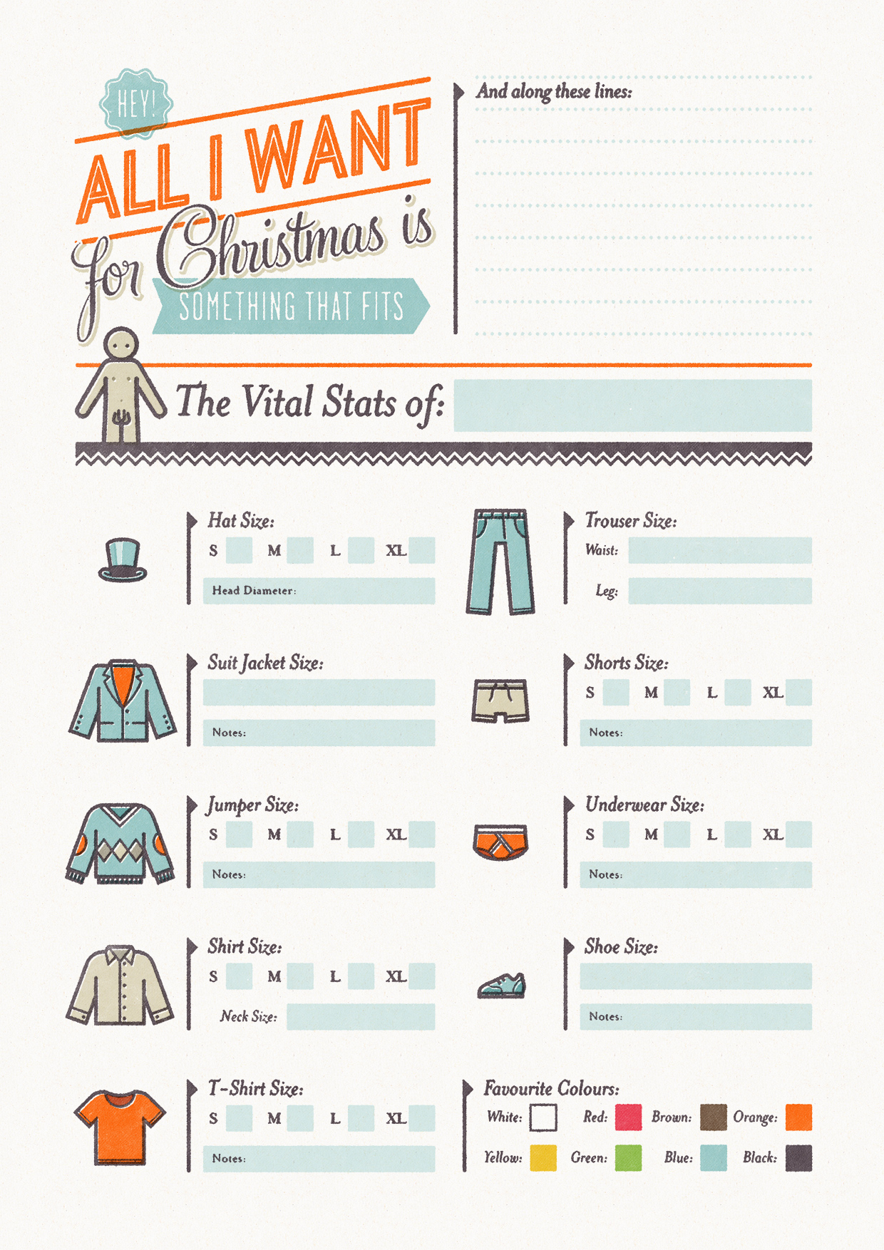
I saw these and thought they were brilliant. Simon Cook is a very talented illustrator, but also a genius in my books for inventing these 'christmas cheat sheets', which is his "attempt to solve the age old problem of buying clothes for your better half at Christmas time... So basically you fill out one and give it to your boyfriend/girlfriend (or whoever you're expecting a present off), or get them to fill out one for you so you don't blow a surprise by asking for a particular."

Pretty damn simple, and simply damn pretty too:

Clicky for bigger.
This is the girls version - there is also the boys version too. Here's a few close ups:

haha, ring size. Won't be needing that.

I love the retro typography and the really limited colour use, feels very 50s and vintage and I like that. It also has that screenprinted feel which makes it seem very personal and tailored.

I really want to use it myself but don't have anyone to give it to =/ Save parents. And they never buy me clothes. They know better than that.

Great idea though. Found via Drawn!

You can read and see more about Simon Cook aka Cookie over at his website and blog, which is full of tasty things like:

Align Centreand
and
Beautiful.

All images are copyright to Simon Cook of course. Chuh.

Monday, June 22, 2009

Portfolio review with Airside!

As I mentioned before, I'm going to be exhibiting at D&AD New Blood next week. That in itself is pretty damn exciting, but my tutor also told me that they'd be booking me in for a portfolio review with an art director/someone in the industry/person. I got an email today saying that my Review will be with Chris Rain, who is one of the Senior Designers at Airside. So exciting... I did a little girly squeal when I read it actually, I love Airside's work and they've cropped up in sketchbooks of mine here and there. I can't wait! :D

One of my favourite projects they've done is the Identity for Airplot, a Greenpeace initiative where they've bought a piece of land right where the proposed 3rd runway for Heathrow is going to go. Which means they can't build it, if Greenpeace have got anything to do with it. It's a great cause and I love the identity for it:
Taken from their blog post: "In 2008 Greenpeace secretly bought a plot of land within Heathrow’s proposed expansion zone and asked Airside to develop an identity that would be able to weather the storms of what could be a very long, unpredictable and difficult protest. With the need for clear communication amongst fast changing circumstances, Airside’s goal was to create an identity that would stretch much further than a single logo. Greenpeace’s latest campaign would have to communicate many different things to many different people and considering Airplot’s abstract form of protest, Airside made a conscious decision to make what needs to be communicated central to the identity. A volatile campaign such as this needed a language."

What I also love is this post here, which explains the process behind creating the logotype, sketches that sort of thing.


Cardboard stamps, printed then scanned in. Sooo simple but looks great. I love this kind of thing - reminds me that I need to experiment with printing so much more.

They've also done...

Title sequences for The No.1 Ladies' Detective Agency, on BBC

TV adverts for Virgin Trains (with the hoppy frogs and 'big train' music.... we all know this one)

A series of short films to demonstrate Fiat's new eco:Drive technology

and... (weirdly/coincidentally) the Identity and interior for Wolverhampton Art Gallery's new Pop Art gallery. I didn't actually know that. This was a big deal when it opened for the city, I remember being bombarded with those pop stickers in 1st year. It's actually had some pretty amazing stuff in there so far, I'm not a huuuge fan of Pop Art (take it or leave it, me) but for lil' ol' Wolvo, it's quite spesh.

All of these images are from Airside's website and so copyright is theirs, obviously.

So yeah, pretty excited/scared/humbled to be having a Portfolio Review with someone who is part of a design studio I admire so much. Better make sure my portfolio is as good as it can be, now. Which reminds me I need to go and pick it up from Uni tomorrow so I can work on it a bit. So much to do....

I'm also going to be attending 8x8 on 1st July as I'll already be in London for D&AD so making the most of it! One of the members of Airside will be giving a talk there too, as will 7 other design-type-people, like Matt Dent (who designed the new coins, surely you know that), Alex Bec & Will Hudson from HudsonBec, and each will be speaking for 8 minutes. Hence 8x8 :) I'm looking forward to that too, should be fast, intense and inspiring! Like it.

I sense a lot of blog posts next week.

Sunday, December 14, 2008

Seven Deadly Sins: Finished Project

I never actually thought I would be able to finish this in time for deadline. This project has been so stressful; fun though. And even though I had to rush these a bit, I'm really pleased with them. Here we go:


I won't put the titles up; one of the ideas of the project was to create a sense of ambiguity with the sins; I know some are more obvious than others. I was looking at perception and the way text can influence an image, so I suppose it's interesting if people have their own perceptions of which Sin each image represents. My three favourites are Pride, Sloth and Envy; they definitely came out the best.

I also want to upload this image as well, it's my favourite drawing from the project. I've noticed I have actually improved over these past 12 weeks. It works quite well as a piece on it's own:


I handed in today; such an amazing feeling. Now I can have a bit of a relax over Christmas, while I start applying for my MA. Scary stuff.

I'll post my finished magazine next...

Monday, September 01, 2008

My Online Portfolio on Creativematch.co.uk

So I've now got a Student portfolio on creativematch.co.uk, which is rather nice. Exposure and all that jazz.

You can check it out here.

It's all on this blog anyway but slightly easier to manoevre around. Clap clap for me.

Apart from that, no new work to post yet. Might do IF this week though, we'll see.