Welcome to rachelsays... The blog of Rachel Lewis, containing my thoughts and musings on illustration, design, fashion, music, cakey-bakey goodness, culture and things that I generally find cool. There's also a good chance my own illustration work will pop up on here.
All work on this blog is copyright to me unless I state that it isn't. Obviously. Don't do stealing, kids.
So come on in, have a look around, and leave a comment if you like what you see.
I saw this Hush Puppies Shoeperstar competition when it came out and thought it was a great idea. I didn't take part because... well I can't design shoes. I wasn't entirely sure what the outcome would be, because while Hush Puppies are amazingly comfortable (I bought some while I worked at Schuh, in a plum kind of colour, so nice to walk around in heels that don't kill you) they're not exactly Irregular Choice in the looks department. That's fine for most who need them for work and who can't wear crazy shoes, but I likes crazy shoes. That's why when I saw the winner, I was most excited:
So cute! And so summery. They also come in black too:
Which I like, but not as much as the purple. I like the white heel and the floral strap, and I'm rocking a lot of purple right now thanks to my splurge at H! by Henry Holland (Henry likes purple, it seems...) so they would go with so many outfits. And the best part? They are guaranteed to be comfortable, cos Hush Puppies rock like that.
The only downside is that they are £65... oh if only I still had my Schuh discount! I will have to save up for a summer treat.
"Laura is 36, a mum to one year old Bonita and currently teaches textiles part time in Turves Green Girls School, Northfield. When not teaching she spends the rest of her time painting and does portraits, designing women’s clothing and accessories as well as working with local artists in the community to coordinate and implement a programme of arts events for disadvantaged youths.
Laura’s shoe design was inspired by the need for a funky, feminine yet practical shoe that could take a working mum from school run to office to evening drinks – all in relevant comfort. The shoe itself is an all-season style and has vintage influences with a modern twist."
Red Lemon Club is a nice little website giving loads of good advice on Online Self Promotion for Creatives. If you're a freelancer then the site is a must to check out - some really useful hints and tips on there.
I entered a competition to get free advertising on the site for a month - it was one of those 'Retweet to win' competitions on twiiter, always good - and I actually won! So my humble little banner...
...With a link to my website is now up on the homepage for the next month!
I'm really excited about this year's YCN Student Awards Briefs. There are so many good ones! It took me a while to to decide which one to do... I almost thought of doing 2 but didn't want to make life stupidly hard for myself. Here are the ones which I found most interesting:
ActionAid I thought would be a good one, because I've done work for their Bollocks to Poverty campaign before and so have a good grasp of it.
Fedrigoni would be a really interesting one because you could do all sorts with paper; I would have gone down the origami/paper art route, creating a viral/ad something made entireley out of folded paper. Something.
Feel Good Drinks are a great little brand, not unlike in feel to Innocent, although much smaller. A good brief that I feel I could execute well, print ads, that sort of thing, and I almost chose it. Almost.
Ted Baker leapt out at me because the brief is to design a new store window design for this year's A/W collection, utilising digital media, not traditional advertising. So this was a bit of a winner for me - I can use my design/illustration/fashion knowledge to create a beautiful/crazy window display, and then use my brilliant marketing skills (lols) to dream up crazy digital media uses to get the word out there. Augmeted reality anyone? Oh yes. Rachel will have fun with this.
The 02 sounded like a good, solid, easy brief. Create a few illustrations. Could have done that. But it felt too easy... not challenging, not pushing me in new directions.
The general idea is to 'devise a campaign for the launch of the Ted Baker Autumn/Winter collections, that makes use of our store windows as its primary vehicle, and utilise other media – digital, ambient, etc – to bring the idea to life, but not traditional press or TV advertising.'
Immediately my mind ran away with me; live fashion shows in store, live mannequins, parties/events, interactive twitter feeds, give aways in store that gave you links to download stuff, possibilities are endless really. I love the idea of augmented reality in windows, this is something that's just starting to appear but Hugo Boss have done it brilliantly:
If you can't be arsed to watch the video all the way through (you should though), the idea is that you are given a card in the store, when you hold the card up to the screen, it does all kinds of magical things and opens up and gives you your own catwalk fahsion show. Spesh. You then take smae card into store, put it against a different camera window, it then plays blackjack and you might win a £50 real voucher to spend in store. It's the perfect way of getting people curious, excited, then get them into store, give them a gift/giveaway (£50!) and they then spend spend spend. Done.
Other examples of this kind of video technology and augmented reality without the use of iphones as a platform are:
Some hockey mask brand using it so you can see what the hockey mask looks like when it's on:
This kind of thing has infinite possibilities in the fashion world. I'm thinking, virtual changing rooms, oh I like that top but can't be bothered to wait in the queue, step in front of the camera, yeah that's a good look. Hmmmm :)
Lego using this to brilliant effect in store:
This is great from Lego's perspective because the buyer can see what the model looks like once it's been made; not always easy to tell from the picture on the box. Kids love this, I bet. I'm jealous of the kids of today. In my day, we had Playdays. On VHS.
The reason why I'm interested in this sort of technology without the use of iphones etc is because it's easier to implement in a shop window, rather than relying on people actually owning iphones, they just step up to it with the trigger which is a card given away/product box/clothing etc. There's lots of 'Real life' AR apps out there - Foursquare, TwittARound, that rely on location and what other people are posting. Not sure if that kind of thing would work here.
Themes: So I'm set for various ideas of how to market/implement the shop window and it's interactiveness, but before this becomes more concrete, I really need to nail the theme of the window. The brief says 'Just think about how many store windows have leaves in them come September/October. We need something distinctly more interesting than this. We could even ignore the fact it’s Autumn completely. Everyone has a calendar and knows when the season’s change. So perhaps a celebration of new Ted Baker collections is more apt. Or something completely different.' And I agree. Leaves/orange/trees/weather in autumn windows and L&F are everywhere. Themes that I'm playing with at the mo are:
Future Retro Death (as in, the death of summer, which is the reason I hate autumn, and also links with Halloween) Medieval/Victoriana Circus Casino Tea Party (this is my fave so far... obviously... I want cupcakes in there somewhere.)
These are all very initial, just visual themes that I love and fit in well with Ted Baker's humour/sense of british/fun/irreverent feel it's got going on. I'm doing lots of visual research on crazy window displays and images of these themes in general, here is a tiny selection of my random brain:
I have an obsession with Union Jack cushions. No really. Maybe that'll feature.
So these are all my initial thoughts, and I'm feeling really positive about it. I've even bought myself a new sketchbook/notebook for this, so I make sure I keep my thoughts organised. Feels just like being back at uni, this is how I used to approach my uni projects. Good times.
I will update when I find anything interesting and relevant to the project; not sure how much of my idea I'm going to post when I've decided on it - I'm aware this is a competition and don't want my ideas to be used by other people before I've entered myself! Such is the woes of t'internet.
The Penguin Design Award is such a great competition, I can't really ignore it this year, even though I'm not eligible to enter any more. Such is the way of non-studentness :( However, what's interesting is that for the first time, they are letting MA students take part. This is good news for me as I still aim to do my MA in the next year or two.
I entered in 2008 and 2009, and was lucky enough to be shortlisted for 2009's Penguin Design Award, and it's definitely one of the highlights of my career so far. I blogged about the Awards Presentation Evening back in June, had such a brilliant time, met the other finalists and chin-wagged with the likes of Jonathon Barnbrook and Amelia Noble. Pretty sweet.
This year, they've also added the option to not only design the cover of a Penguin book, but also a Puffin children's book. Which is good as children's illustration is so much harder than you'd imagine. I actually hated it in Uni but that's by the by. Can't be amazing at everything ;) Ha.
So for the Puffin prize, the cover to illustrate is Alice in Wonderland. Which at first is amazing, that story is a classic and there's so much interesting visual imagery that comes to mind instantly. But then you think - actually, it's been done so much. I think it'll be extremely tricky to produce something original:
"Alice’s Adventures in Wonderland was first published in 1865 and has remained in print ever since. Next to the Bible and the works of Shakespeare it is one of the world’s most widely translated works of literature and is the most famous children’s fantasy ever written. Full of riddles, puns and wordplay, it will appeal to readers of all ages, whether they are discovering it for the first time or revisiting it once more.
Students are invited to design a whole new cover look for this classic, reinventing it for a new generation of child readers and ensuring that it remains an integral part of childhood."
That's a challenge and a half.
The Penguin award is equally as good though. The cover to design is for Perfume by Patrick Süskind, which I've never read. There was a film wasn't there? I think I've seen that, it rings a bell. "Survivor, genius, perfumer, killer — this is Jean-Baptiste Grenouille. He is abandoned on the filthy streets of Paris as a child, but grows up to discover he has an extraordinary gift: a sense of smell more powerful than any other human’s. Soon, he is creating the most sublime fragrances in all the city. Yet there is one odour he cannot capture. It is exquisite, magical: the scent of a young virgin. And to get it he must kill. And kill. And kill …"
Yes, I definitely need to read this book.
So I thought, even though I can't enter (boohoo), I'm going to read the book and design a cover anyway. I love illustrating book covers and haven't done a good one in a while; I need to beef up my portfolio with new book covers so this is a great brief for me. The actual submission deadline is sometime in April next year so that's not putting the pressure on me; I imagine I'll get it done before then though as I won't be caught up with mountains of uni work, bar crawls, dramas, impossible ambitions, dancing, pointless lectures, that thing called 'learning new stuff' and endless hangovers any more. Yay for being a graduate =/ *cries*
Another interesting note to mention is they've slightly changed the judging procedure this year. "To make the process even closer to the way a jacket designer works, once the judges have selected the shortlist, the Penguin / Puffin Art Directors will give the shortlisted entrants feedback and further art direction on their cover submissions. Shortlisted entrants will then be invited to resubmit their work, taking all the comments on board, before the final round of judging." Which I think is really good; real-life design has near constant changes and amends thrown at you so it's good to have a bit of experience at this.
Lastly, the guest judges for the Penguin Award are Marian Deuchars and Will Self. I know right, oh em bloody gee. Both are legends. Lucky people! Good luck anyone who enters, if you get to the ceremony like I did then don't stand around scared chucking wine down your throat like I did until I spoke to people; get in there and talk to these people. They have good advice. It's not that scary. Maybe a bit. The free wine helps. And they literally were forcing it on you, awesome waiters, didn't even have to ask, haha. Good times.
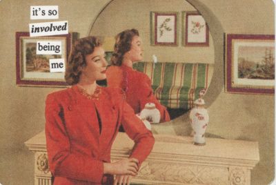
I completely forgot that I did this. Dawdlr is a great little site, a small pocket of rebellion against an online world that is 'updated' every single second with what people are doing, where, through status updates, twitter, you know all that jazz. Dawdlr asks the question "What are you doing, you know, more generally?" and you have to answer on a postcard. The site is updated not twice a minute, but twice a year. Simple, really, and charming and so interesting what people say, some are ambiguous, some are frank.
So I sent one in in february (according to the postmark, 2nd Feb), and it's just been posted up:
Completely forgot I wrote that. And the slightly saddening thing is it's all still true; and I didn't get into RCA. Or St. Martin's.
When my spangly promotional postcards turn up I'll send a new one in. I like seeing something from the past turn up; maybe what I write next won't be true when it finally turns up on the site.
This has taken me a while to post this. Anyway, the charity Chickenout! and Compassion in World Farming ran a competition a few weeks back, to redesign the Standard Chicken label for Tesco.
"Pick up a standard chicken in most supermarkets and the package is unlikely to tell you much about how that chicken was produced.
Around 90% of chickens in the UK are farmed in intensive systems in conditions like those shown in the video here.
By law, egg boxes must be labelled with the farming method and this has decreased sales of battery eggs. So why can't chicken be honestly labelled too? "
That was the basic premise. Come up with a chicken label that depicts honestly the lives of the chickens that most people buy: the standard ones. This is so that consumers can make a more informed choice about where the food they eat comes from; but making sure it's not a high-horse 'you should eat free range you're so bad' type of thing, because some people (myself included, being a student) can't afford to eat free range chicken. I wish I could, and I aspire too, but it simple is too expensive.
This was my entry :) It's not the most amazingly beautiful piece of work I have ever created, but I think it did the job.
Anyway I didn't win. You can see the winning entry here. There are also some 'highly commended' ones up there. I disagree wdith the winning choice for 'best design work' but there you go... design is opinion after all, and just because I didn't like it, doesn't mean I'm right I suppose. That's not the point really, the point is to get the message across to Tesco, the other supermarkets, and eventually you and me, exactly how our chickens are kept before slaughter, so are choices are clearer.
It's catch 22 really though because as I said earlier, I can't afford to buy free range all the time. I'm a poor student. But if everyone bought free range, there'd be more demand and it'd be cheaper. Something to think about... consumer deman can be a powerful thing. It's just getting that message across to consumers that there are alternatives to the fast-grown, barn-reared chickens that most of us eat - it's sad, when you see it, they have such poor life qualities. Watch this video, it's only a couple of minutes long, but it explains exactly what I mean:
From the Chickenout.tv website
And that's the job of design, I think. That's our responsibility, not just to design stuff to sell to consumers, but to design stuff to make consumers more aware. The power of design is huge and it's in our hands to do something about causes and topics such as animal welfare. The same goes for environmental issues and sustainability - I wrote my Dissertation on this exact topic, and it's so important that designers and artists of all types recognise their responsibility when it comes to environmental issues. We are probably in a greater position of power than anyone, including government, to change attitudes towards the environment - images and words can be extremely powerful things.
I want to post more about this subject in the future - possibly bits from my dissertation, and my opinion on the whole environment/sustainability debate. Watch this space (or blog ;)
On the subject of competitions, I'm entering the Penguin Design Award again this year, so I'll be posting my work in progress for that this weekend I hope. It's going well ^.^
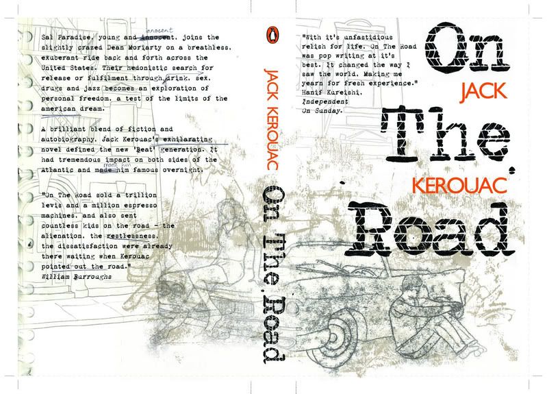
This project was tough but I loved it. It was based around the Penguin Design Award competition; it wasn't compulsory to enter to pass the module but of course I did. As well as producing the book cover for our chosen book, we had to also illustrate a Single and Double page spread from an extract of our choosing from the book. The book I chose was On The Road. What a classic.
I was quite proud of my entry; I didn't win though. Or get anywhere close. But then looking at the standard of the shortlist and winners on the website, it's easy to see why. I think the drawing in this could be improved. Actually it was a monoprint, but I think I would have done a much more detailed pencil drawing if I was going to do this again. Oh well. This killed me to get it finished in time, but that's always fun :)
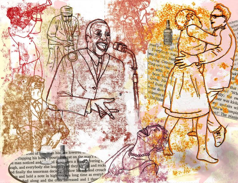
This is my Double page spread, from an extract in the book where there's a great description of a jazz bar, all heat and noise. Hence, this illustration.
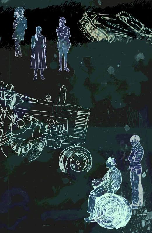
This was my single page spread. I'm not keen on this one actually. It was rushed to meet deadlines and just not as good as it should have been. It was based on a scene in the book where Dean crashes their borrowed Cadillac into a ditch, a farmer has to pull it out in the rain (which I forgot to add in, haha) while his mysterious daughters look on. Meh. That doesn't really come across.
One more project to go: Next year I'll be able to submit work here much sooner after it's creation, thankfully.