Semester 2: Image & Text Project
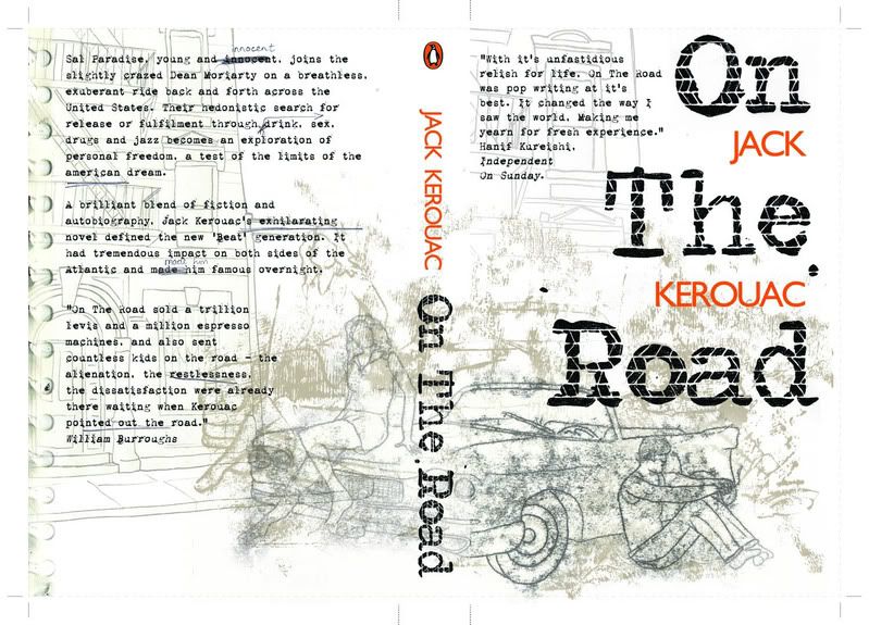
This project was tough but I loved it. It was based around the Penguin Design Award competition; it wasn't compulsory to enter to pass the module but of course I did. As well as producing the book cover for our chosen book, we had to also illustrate a Single and Double page spread from an extract of our choosing from the book. The book I chose was On The Road. What a classic. I was quite proud of my entry; I didn't win though. Or get anywhere close. But then looking at the standard of the shortlist and winners on the website, it's easy to see why. I think the drawing in this could be improved. Actually it was a monoprint, but I think I would have done a much more detailed pencil drawing if I was going to do this again. Oh well. This killed me to get it finished in time, but that's always fun :)
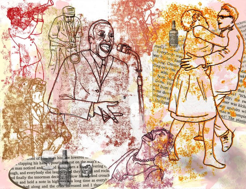
 This is my Double page spread, from an extract in the book where there's a great description of a jazz bar, all heat and noise. Hence, this illustration.
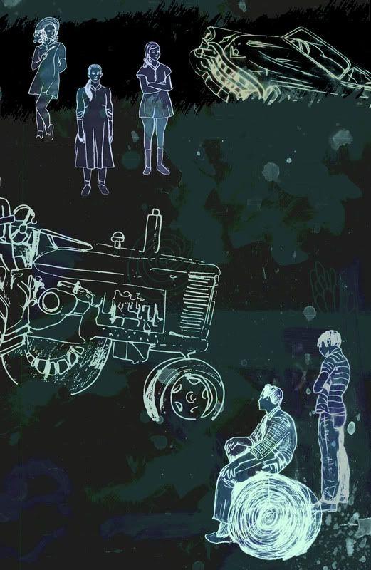
 This was my single page spread. I'm not keen on this one actually. It was rushed to meet deadlines and just not as good as it should have been. It was based on a scene in the book where Dean crashes their borrowed Cadillac into a ditch, a farmer has to pull it out in the rain (which I forgot to add in, haha) while his mysterious daughters look on. Meh. That doesn't really come across.
One more project to go: Next year I'll be able to submit work here much sooner after it's creation, thankfully.


1 comment:
That Kerouac book cover turned out really nicely, good work! Don't be too hard on yourself Rachel, we've all still got alot to learn, persistence is the key. It might not seem much of a consolation but at least we're all in this together. Keep at it dammit!
Post a Comment